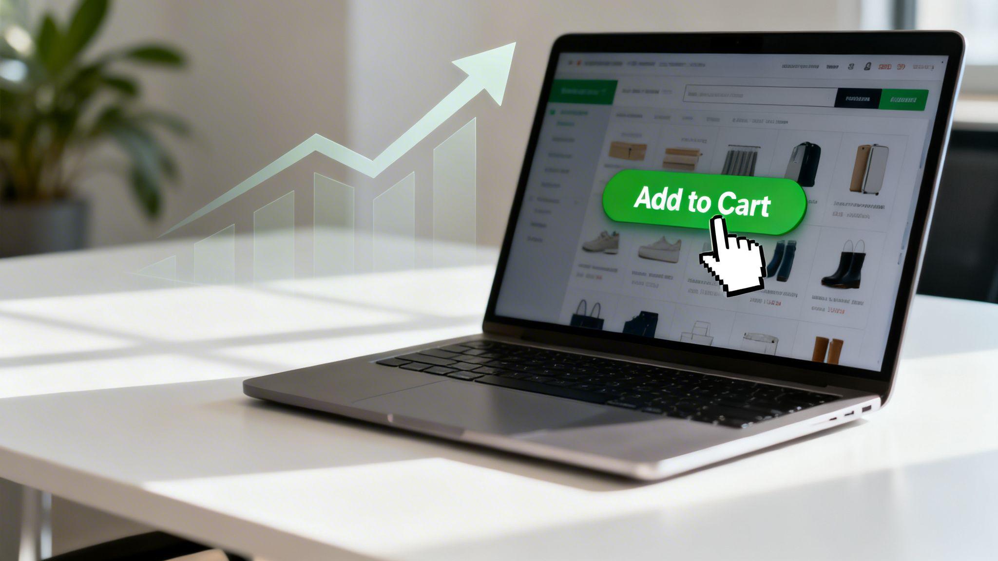
That little "Add to Cart" button on your website? It’s the single most valuable click in your entire e-commerce journey. This is where a casual browser signals they're ready to become a customer. Getting this one element right is one of the fastest ways to boost your sales.
Why Your Add to Cart Button Is the Most Valuable Click
Think of your website like a physical shop. A customer walks in, browses, and picks up an item. The moment they place that item into their shopping basket, their intent to buy becomes real.
Your add to cart button does the exact same thing online. It's the digital nod of commitment.
For small businesses and entrepreneurs, every click has a job. This button is a direct report card on your e-commerce strategy. A healthy number of clicks tells you that your product photos, descriptions, and pricing are hitting the mark.
Understanding the Financial Impact
Small tweaks to this one button can lead to significant revenue growth. You don't need a massive marketing team. With a straightforward tool like the Solo AI Website Creator, anyone can build and refine a high-performing button without ever touching a line of code. The goal is to remove any friction and make saying "yes" as easy as possible.
Actionable Tip: The add to cart button is the gateway to your checkout. Every visitor who hesitates to click it represents a lost sale. To fix this, focus on making the path to purchase completely seamless—clear design, obvious placement, and trustworthy language.
The numbers back this up. The global average add-to-cart rate hovers around 6.52%. But some industries, like food and beverage, can hit rates as high as 13.14%. This data gives you a clear benchmark for what's possible.
Benchmarking Your Success
So, how does your site measure up? Comparing your add-to-cart rate to industry averages is a great way to spot opportunities. A quick glance at the table below gives you a rough idea of where you stand.
| Industry | Average Add-to-Cart Rate |
|---|---|
| Food & Beverage | 13.14% |
| Health & Beauty | 8.63% |
| Home & Garden | 7.54% |
| Apparel & Accessories | 6.71% |
| Electronics | 5.45% |
Don't be discouraged if your numbers aren't at the top—think of it as a starting point. Every industry is different, but this gives you a target to aim for as you start optimizing.
This chart helps visualize what that difference looks like. It compares the global average, a top-performing industry, and where your site might fall, showing just how much room for growth there often is.

As you can see, the gap between an average site and a high-converting one can be huge. For a small business, closing even a small fraction of that gap can directly boost your bottom line.
Alright, you know why the Add to Cart button is a non-negotiable part of your online store. Now, let's build one.
The good news? You don't need to be a coding wizard to create a button that people want to click. The Solo AI Website Creator is built for this exact purpose—letting you add powerful features without the technical headache. We’ll walk through adding the button, placing it where it can’t be missed, and making sure it's linked correctly.
Adding the Button in the Editor
Adding functional pieces to your site is straightforward with the Solo AI Website Creator. In the editor, you'll see a menu of components you can add to your page. Adding the button is as simple as dragging it from the menu and dropping it into place.
Here’s a quick peek at the intuitive interface you'll be working with.
The editor gives you a clean, visual map of your page. This what-you-see-is-what-you-get approach removes the guesswork, so you know exactly what your customers will see.
Once your button is on the page, the next move is placing it. You want it "above the fold"—meaning it's visible the second the page loads, no scrolling required. One study showed that buttons placed prominently above the fold can boost conversions because they are seen by 100% of visitors immediately.
Customizing Placement and Size
The flexibility of the Solo AI Website Creator lets you easily tweak the size and position of your button to match your page's design.
Is the button too small? Bump up its size with a simple slider. Does it feel crammed next to your product description? Just drag it over to create some breathing room.
Actionable Tip: White space is your best friend. Don't crowd your Add to Cart button. Giving it space to breathe makes it pop off the page and acts like a visual spotlight, guiding your user's eye directly to the most important action.
Here's how this applies to different products:
- Digital Course: Use a large, bold "Enroll Now" button right under your course summary and price.
- Freelance Service: If you're booking consultations, a "Book My Call" button should sit right next to your calendar.
- Handmade Product: For a physical item, the "Add to Cart" button belongs near the quantity selector and product options, like color or size.
This level of control means your button can do its job effectively without you ever having to touch a line of code.
Linking Your Button to the Cart
An unlinked button is just a decoration. The final, critical step is making it work.
Thankfully, this part is mostly automated on product pages within the Solo AI Website Creator. When you drop in an Add to Cart button, the system knows it should add that specific product to the shopping cart.
Your job is simply to double-check that it’s all connected properly. After placing and styling your button, always use the "Preview" mode to test it.
Actionable Tip: Click the button yourself. Does it add the right item to the cart? Does the cart icon in your header update? A quick 30-second test can save you from lost sales due to a tiny, preventable glitch.
The Psychology of a High-Converting Button

An add to cart button is more than just a functional element; it's a silent conversation with your customer. When done right, it uses subtle psychological cues to nudge them toward a click. This isn’t about trickery; it’s about making the buying decision as smooth and intuitive as possible.
Let's dig into what makes people click, from the power of color to the specific words you choose.
Color and Contrast: The Ultimate Attention Grabbers
The color of your button is a hot topic. Colors evoke emotion, and understanding the psychology behind common choices can give you an edge.
- Green: Signals "go," safety, and positivity. A popular choice where building trust is key.
- Red or Orange: Creates a sense of urgency and excitement. These colors are attention-grabbers.
- Black: Communicates sophistication and exclusivity, perfect for luxury brands.
Actionable Tip: The most important rule isn't the specific color, but the contrast. Your button must stand out from the background. If your website has a cool blue and white theme, a bright orange or green button will be almost impossible to ignore.
What Your Button Says Matters
The words on your button—the microcopy—are just as critical as its color. "Add to Cart" is the gold standard because it's universally understood and direct.
But tailoring the copy to your specific product can provide a conversion lift. Your goal is to use language that feels right for the action. For more inspiration, check out our guide on crafting high-converting call-to-action examples.
Here are a few scenarios:
- Selling digital products: "Get Instant Access" or "Enroll Now" feels more immediate.
- Booking appointments: A freelancer using the Solo AI Website Creator will see better results with "Book My Consultation."
- Fashion retail: Many brands prefer "Add to Bag" for its personal, boutique-like vibe.
The key is to match the text to the customer's mindset. Are they buying a physical item, accessing a service, or joining a community? Use words that reflect that specific goal.
Size, Placement, and Performance Insights
Where you put your button and how big it is should be guided by user behavior. Eye-tracking studies show that users expect to find the add to cart button right next to the product title, price, and main image. Stick with what people know.
Your button needs to be large enough to be easily tapped on a phone. It should also look like a button—give it a clear shape and defined edges.
Nailing these details has a real impact. On average, add-to-cart rates worldwide hover between 9-18%, with the US around 10%. Performance often varies by device; rates on smartphones can dip to 9.4% compared to 12.5% on desktops. This is why responsive design, a core feature of the Solo AI Website Creator, is crucial for capturing sales from every visitor.
Advanced Strategies to Increase Conversions

You've got a solid 'Add to Cart' button. Now it’s time to move beyond the basics with simple, powerful tactics to boost your conversion rates. These are psychology-backed tweaks that make your add to cart button work harder for you.
Make Your Button Sticky
We’ve all been there: you scroll down a long product page, and when you decide to buy, the button is gone. You have to scroll all the way back up to find it. This is a classic conversion killer.
Actionable Tip: Use a sticky add to cart button. This is a button that "sticks" to the top or bottom of the screen as someone scrolls, keeping the call to action in view at all times. In the Solo AI Website Creator, place your button inside a sticky header or section to remove this friction.
Use Motion to Capture Attention
Our eyes are hardwired to notice movement. You can use this to your advantage with a subtle animation on your button—just enough to guide a user’s gaze without being distracting.
Actionable Tip: Implement a simple hover effect. A gentle pulse or a slight color shift when a visitor’s mouse moves over the button confirms that it’s clickable and makes the experience feel more responsive. These "micro-animations" can make your button feel more alive.
Build Trust Right at the Point of Sale
Just as a customer is about to click "Add to Cart," last-minute doubts can appear. Quiet these fears by adding trust signals right next to your button. These are small visual cues that build confidence.
Actionable Tip: Place these signals near your button:
- Payment Logos: Show icons for Visa, Mastercard, and PayPal to signal you accept secure options.
- Security Badges: A simple "Secure Checkout" badge with a lock icon can make a huge psychological difference.
- Review Snippets: Displaying a star rating (like "4.8/5 stars") provides immediate social proof.
By putting these signals next to the add to cart button, you’re answering subconscious questions right before they act. Of course, these button-specific tactics are just one part of the puzzle. Truly effective online growth strategies always involve looking at the entire customer journey.
Create Urgency and Scarcity
When used ethically, psychological triggers like the fear of missing out (FOMO) can motivate hesitant shoppers to buy now.
Actionable Tip: Add a small line of text near your button to create urgency. Examples include:
- Scarcity: "Only 3 left in stock!"
- Urgency: "Sale ends tonight."
When someone sees a product is almost gone or a special price is about to disappear, it creates a sense of immediate value.
How to Measure Your Button’s Performance
Building a great add to cart button is step one. Step two is measuring its performance. You can't improve what you don't measure. The goal isn’t to drown in data—it’s to find clear, actionable insights that help you drive more sales. With the Solo AI Website Creator, you can easily connect tools like Google Analytics and stop guessing.
Setting Up Your Measurement Tools
First, you need to know when someone clicks your button. The best way to do this is by setting up click tracking in Google Analytics. This is done by creating an event.
Simply put, an event is a specific action you tell Google Analytics to watch for, like a click on your add to cart button. By setting this up, you get a hard count of how many people are showing real intent to buy.
Key Metrics That Actually Matter
Once you're tracking clicks, focus on the Add-to-Cart Rate. This number tells you the percentage of visitors who add at least one item to their cart.
Actionable Tip: To calculate it, divide the number of sessions where an item was added to the cart by the total number of sessions, then multiply by 100. For example, 800 cart additions from 10,000 sessions gives you an 8% add-to-cart rate. One retailer used these insights to boost revenue by 300%!
Another great tool is a heatmap. A heatmap gives you a visual overlay of where people are clicking. Are they clicking near your button but not on it? That’s a huge clue that the button isn't obvious enough. You can learn more about how to create a heat map to get a visual pulse on user behavior.
A Simple Guide to A/B Testing
Now for the fun part: making your numbers better. A/B testing is a simple experiment where you compare two versions of your button to see which one performs better. You create Version A and Version B, show each to a different group of visitors, and see which one gets more clicks.
Stop guessing what works and start testing. The smallest changes can lead to surprising results, and A/B testing is the only way to know for sure what your audience truly responds to.
Here are two simple A/B tests you can run right now:
Button Color Test:
- Version A: A green button (signals "go" or safety).
- Version B: An orange button (creates urgency and stands out).
- Run the test for a week, then check your analytics to see which color got a higher add-to-cart rate.
Button Copy Test:
- Version A: "Add to Cart" (the classic, understood text).
- Version B: "Buy Now" (a more direct, high-urgency phrase).
- Compare the click rates. "Buy Now" often performs better for single-item purchases, while "Add to Cart" is best for stores where people buy multiple products.
By running simple experiments, you shift from guesswork to a process of continuous improvement.
Your Add to Cart Button Questions Answered

Here are answers to the most common questions about the add to cart button. This is your go-to cheat sheet for fixing problems and making smart choices.
My Add to Cart Button Is Not Working. What Should I Do?
This is usually an easy fix. Follow these steps:
- Check the Link: First, confirm the button is linked to a product inside the Solo AI Website Creator.
- Republish Your Site: This is a crucial step that pushes all your latest updates live.
- Clear Your Browser Cache: Your browser might be holding onto an old, broken version of your site. Clearing the cache forces it to load the fresh, working version. A quick search for "how to clear cache" for your specific browser will show you how.
- Check Mobile View: If the button only seems broken on mobile, another element might be overlapping it. Use the editor’s responsive view to check for and fix any layout issues.
What Is a Good Add to Cart Rate for a New Website?
For a brand-new site, an add-to-cart rate between 3% and 5% is a great start. Don't get hung up on the global average of 6.5%; it varies wildly by industry, product price, and traffic source.
Your first mission is to attract the right visitors. After that, focus on making your product pages irresistible with great photos and clear pricing.
Your initial add-to-cart rate is not a final grade; it's a baseline. The goal is to establish your starting point and then focus on making small, consistent improvements over time.
Should My Button Say “Add to Cart” or Something Else?
"Add to Cart" is the industry standard for a reason: everyone understands it. For most stores selling physical goods, it's the safest and most effective choice.
However, you can sometimes get a bigger impact by customizing the text to fit what you're selling.
Actionable Tip: Think about your customer's goal. Are they buying a thing, accessing a resource, or joining a program? Match your button copy to that specific action.
- Fashion Retailers: "Add to Bag" feels more personal.
- Digital Products: "Get Instant Access" or "Enroll Now" creates immediacy.
- Service Providers: A button like "Book My Consultation" will outperform a generic one every time.
How Should I Handle Out of Stock Products?
An error page or a vanished button is a guaranteed way to lose a customer. You must manage the out-of-stock experience to avoid frustrating your visitors.
Actionable Tip: Don't just show "Out of Stock." Turn a dead end into a lead. Replace the disabled button with an email signup form that says, "Notify Me When Available." This is simple to set up with the form features in the Solo AI Website Creator. You capture their interest, build your email list, and get a second chance to make the sale later.
Ready to build a website with an add to cart button that drives sales without the technical headaches? The Solo AI Website Creator gives you all the tools you need to create a stunning, high-converting online store in minutes. Start building for free today.
Where should an add to cart button go on a product page?
Place it where shoppers expect to find it: next to the product title, price, and main image. It should also appear above the fold so visitors can see it immediately without scrolling, and on long pages a sticky button helps keep the action visible.
What text works best on an add to cart button?
“Add to Cart” is the strongest default because it is direct and universally understood. For specific offers, tailor the microcopy to the action, such as “Get Instant Access” for digital products, “Book My Consultation” for services, or “Add to Bag” for fashion retail.
How do color and design affect e-commerce conversion?
Contrast matters more than any single color choice because the button must stand out from the page background. Size, clear edges, breathing room, and subtle hover effects also make the button easier to notice and confirm that it is clickable.
What can increase clicks besides changing the button itself?
Trust signals and urgency cues near the button can reduce hesitation at the point of sale. Payment logos, a secure checkout badge, review snippets, low-stock messages, and sale deadlines help answer last-minute doubts and encourage quicker decisions.
How should you measure add to cart button performance?
Track button clicks as events so you can count how many visitors show purchase intent. Compare your add-to-cart rate to common benchmarks, then test changes to placement, copy, size, and design to see which version improves performance.