How to Create Heat Maps to Understand Your Website Visitors
This article was assisted with AI. We may include links to partners.
A heat map is one of the most powerful tools for understanding how people interact with your website. Think of it as putting on a pair of thermal goggles: you can instantly see the "hot" spots where visitors click and linger, and the "cold" areas they're ignoring.
This guide gives you actionable steps to turn complex visitor data into a simple, colorful story you can understand at a glance.
What Are Heat Maps and Why Do They Matter?
Let’s say you just launched a new landing page with the Solo AI Website Creator. It looks great, but are people actually clicking your main call-to-action? Do they scroll far enough down to see your pricing? A heat map removes the guesswork.
The concept isn't new. In the 1990s, a software designer named Cormac Kinney trademarked 'heatmap' for a tool that visualized real-time financial market data. It was a game-changer for traders, turning dense spreadsheets into easy-to-read visuals.
That same principle now helps website owners see what's working and what isn't. The goal is to get clear insights to improve your site's performance.
The Main Types of Heat Maps
To get a complete picture of user behavior, you'll want to look at a few different kinds of heat maps. Each one tells a unique part of the story.
- Click Maps: These show you exactly where people click their mouse. Bright red "hotspots" appear over popular buttons and links, while ignored elements look cool and blue.
- Actionable Tip: Look for clicks on things that aren't links, like an image or a headline. This is a clear sign that visitors expect something to be clickable. Making it a link is an easy win.
- Scroll Maps: This type reveals how far down your page visitors scroll. The map starts hot (red) at the top and gradually cools (blue) as fewer people reach the bottom.
- Actionable Tip: If your scroll map shows that only 25% of visitors see the bottom half of your page, move your most important content and call-to-action higher up.
- Move Maps: Also called hover maps, these track where users move their mouse cursor. Since people often move their mouse where they are looking, this gives you a good idea of where their attention is focused, even if they don't click.
This image shows what you're looking for. The red areas get all the attention, while the blue and green spots are cooler.
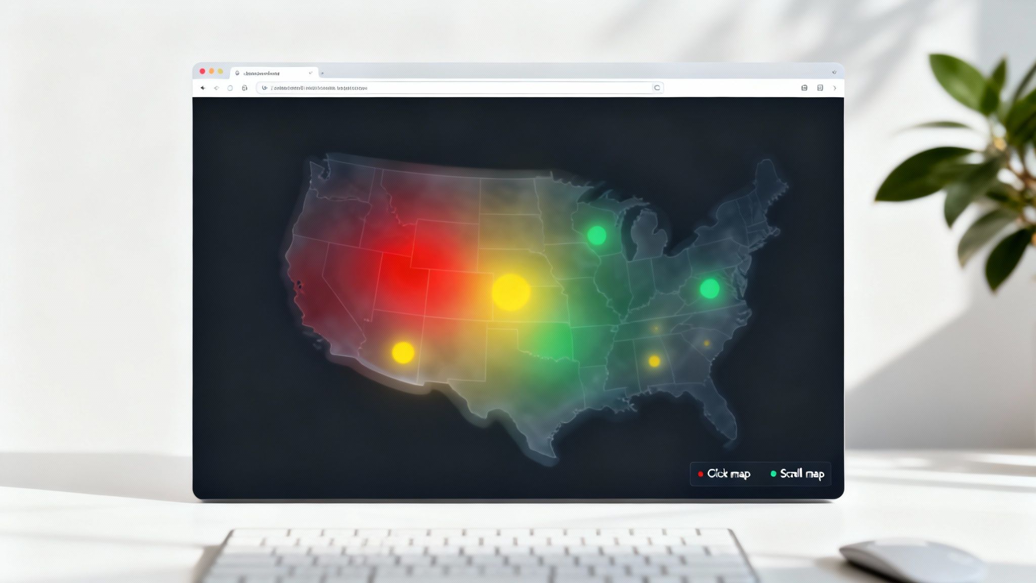
This visual data gives you clear direction on where to focus your design efforts.
By combining these different views, you get a powerful understanding of your visitor's journey. It's the foundation of great user experience design, helping you stop guessing and start making decisions backed by real data.
Now, let's get into picking the right tool to create your heat maps. This doesn't have to be a big decision. Once you know what each platform offers, you can find one that fits your goals and budget.
The best part? You don't need a massive budget. Most modern tools are built for small business owners, freelancers, and anyone using a platform like the Solo AI Website Creator.
Comparison of Popular Heat Map Tools
Here’s a quick breakdown of three top contenders. This table cuts through the noise and lays out the key features, pricing, and who each tool is really for.
| Tool | Key Features | Pricing Model | Best For |
|---|---|---|---|
| Hotjar | All-in-one suite: heat maps, session recordings, surveys, feedback widgets. | Freemium (Free basic plan, paid plans for more features/traffic) | Users who want both user activity data (what users do) and direct feedback (why they do it) in one place. |
| Microsoft Clarity | Heat maps, session recordings, rage click/dead click tracking. | Completely Free | Beginners, startups, or anyone on a tight budget who needs powerful, essential analytics without any cost. |
| Crazy Egg | Advanced visualizations like Confetti Maps, Scrollmaps, and A/B testing features. | Paid (Subscription-based) | Marketers who want to see how different types of visitors (e.g., from different ads) behave and run tests to optimize pages. |
Each of these tools is a great choice, but they shine in different scenarios. Think about your immediate needs: are you just trying to fix one confusing page, or are you looking to run a full-scale conversion optimization strategy? Your answer will point you in the right direction.
For the Budget-Conscious Starter: Microsoft Clarity
If you're just starting out or have a $0 budget, look no further than Microsoft Clarity. It is 100% free, which is almost unbelievable for the features you get.
Clarity gives you heat maps and session recordings. A session recording is a video replay of a user's visit. This is an incredibly powerful combination. You can use a heat map to spot a problem—for example, nobody is clicking your main button—and then watch session recordings to see exactly what users did on that page. It helps you uncover the "why" behind the data.
Actionable Tip: For anyone new to website analytics, Clarity is the perfect entry point. It gives you the core tools to understand your visitors without overwhelming you with features or costing you money.
For the All-in-One Growth Seeker: Hotjar
You've probably heard of Hotjar. It’s an industry standard for good reason. It’s more than a single tool; it's a complete user behavior analytics suite. Beyond heat maps, Hotjar includes tools for on-site surveys, feedback widgets, and even user interviews.
This is where you go when you want to connect what people are doing with what they are thinking. For example, if your scroll map shows a huge drop-off halfway down a page, you can set up a simple survey to pop up right at that point asking, "Did you find the information you were looking for?"
While Hotjar has robust paid plans, its free basic plan is more than enough to get you started and provide serious value.
For the Visual Data Specialist: Crazy Egg
Crazy Egg has been a key player in this space for a long time, largely because of how it visualizes data. Its standout feature is the "Confetti Map." A normal heat map shows you where the most clicks are, but a confetti map goes deeper. It breaks down those clicks by things like traffic source (e.g., Google, Facebook), device type, or if they are a new vs. returning visitor.
Imagine discovering that visitors from your email newsletter click on one part of your homepage, while visitors from a Facebook ad click on a completely different area. That’s gold. This insight allows you to fine-tune your pages for specific audiences. Crazy Egg is a paid tool, but its visual approach is valuable for marketers focused on precise optimization.
Installing Your Heat Map Tracking Code
Alright, you've picked your tool. Now for the slightly technical part: connecting it to your website. Don't worry, this usually just involves a simple copy-and-paste. Your tool will give you a small piece of JavaScript code—often called a tracking snippet—that you need to add to your site's settings.
This snippet lets the tool monitor what your visitors do and turn that data into heat maps. It’s designed to be lightweight and runs "asynchronously," a technical term meaning it won't slow your site down.
Finding and Adding Your Code Snippet
Let's use Hotjar as an example. The steps are very similar for other tools like Microsoft Clarity or Crazy Egg.
- Find Your Tracking Code: After you sign up, the tool will guide you through setup. In your Hotjar dashboard, you'll find the code under a section like 'Sites & Organizations.' It’s a block of code ready for you to copy.
- Add It to Your Solo AI Website Creator Site: Log into your Solo AI Website Creator account. Go to your site settings and look for 'Custom Code' or 'Code Injection.' You’ll see a field, usually for the
<head>section of your site, where you can paste the code. - Paste and Save: Drop the entire code block into that field and click 'Save' or 'Publish'. That’s it! Your heat map tool is now live.
Actionable Tip: You don't need to be a developer. The process is similar to adding other analytics tools. For a related walkthrough, check out our guide on how to add Google Analytics to a website.
This flowchart gives you a quick visual comparison of the top tools to help you feel confident in your choice.
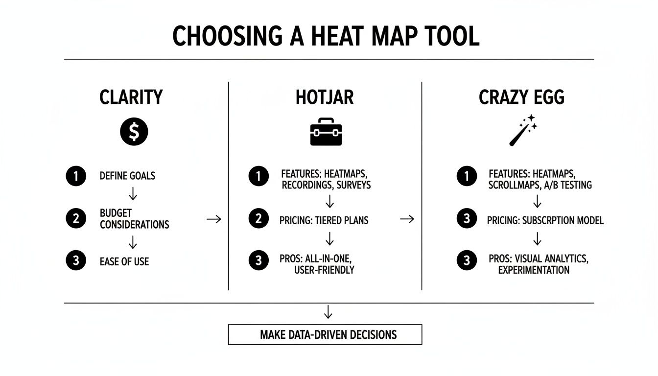
This side-by-side view reinforces that while a tool like Hotjar has a full suite of features, a free option like Clarity is just as powerful when you're starting out.
Installation on Other Popular Platforms
What if your site isn't built with the Solo AI Website Creator? No problem. The process is just as straightforward on other platforms.
- For WordPress: The easiest way is to use a plugin. Search for your tool's official plugin (e.g., "Hotjar" or "Microsoft Clarity"), install it, and follow the instructions to connect your account.
- For Shopify: This requires a small theme edit. Go into your theme's code editor, find the
theme.liquidfile, and paste the tracking snippet just before the closing</head>tag.
The use of these tools is growing fast. The global heatmap software market was valued at USD 3.52 billion in 2023 and is projected to hit USD 6.77 billion by 2029. Why? Because an estimated 80% of Fortune 500 e-commerce sites rely on them to make smarter design choices. You can dig into more data on TechSci Research.
With your tracking code in place, it’s time to tell your tool what you want to monitor. Getting this initial setup right means you’ll collect useful data, not just digital noise.
Your first move is to decide which pages are most critical to your goals. You can't track everything—and you shouldn't. Focus on the high-impact pages.
- Your Homepage: This is your digital storefront. A heat map shows if people understand what you do and where they try to go next.
- Key Landing Pages: If you're running ads or a specific campaign, tracking its landing page is essential.
- Pricing or Service Pages: A heat map reveals if your pricing is confusing, which features grab the most attention, and where people hesitate.
- Checkout or Sign-up Forms: Heat maps are brilliant for spotting exactly where people get stuck or abandon the process.
Configuring Your Data Capture Settings
Once you’ve picked a page, you need to decide how much traffic to record. Most tools don't capture every single visitor by default, especially on free plans. You'll usually set a "snapshot" size—for example, the first 2,000 visitors who land on that page.
This is typically enough data to see real patterns emerge. It’s like a political poll: you don’t need to ask every single voter to get an accurate read on public opinion.
You can also apply filters to get answers to specific questions. For instance, create a heat map that only tracks:
- New Visitors: Perfect for understanding first impressions.
- Mobile Users: A must-do. This is the only way to see if your design is easy to use on a small screen.
- Visitors from a Specific Campaign: Want to know if traffic from your newsletter behaves differently than traffic from Instagram ads? This is how you find out.
Actionable Tip: Don't jump to conclusions too quickly. Wait until your heat map has collected enough data—at least 1,000-2,000 pageviews for the specific page you’re watching. Making big design changes based on what 50 visitors did is a recipe for disaster. Let the data pile up so you can act with confidence.
Turning Heat Map Data Into Actionable Insights
Once you've collected enough visitor data, it's time to translate those colorful visuals into smart decisions that will improve your website. Think of yourself as a detective looking for clues. A heat map is your evidence.

Reading the Clues in Your Click Map
Your click map is often the first place you'll have an "aha!" moment. Look for hotspots—both where you expect them and where you don't.
-
Dead Clicks: See a bright red spot on an image or phrase that isn't a link? That's a dead click, a clear sign of user frustration. Your visitor thought something was clickable.
-
The Fix: If it makes sense, make the element clickable. Link that image to a relevant page or expand on the phrase. If not, redesign it so it no longer looks like a button or link.
-
Ignored Calls-to-Action (CTAs): Is your most important button—like "Book a Consultation" or "Buy Now"—getting ignored? If it’s blue or green on your heat map, people are scrolling right past it.
-
The Fix: This is a major red flag. Experiment with changing the button's color to make it stand out, rewrite the text to be more compelling (e.g., try "Get Your Free Quote" instead of "Submit"), or move it higher on the page.
Uncovering Insights from Your Scroll Map
A scroll map tells a simple story about attention spans. Look for sharp, sudden color changes from hot (red) to cold (blue).
If your page goes from red to blue about halfway down, you’ve found a "false bottom." This means a large number of your visitors think the page has ended and never see the valuable content below that point.
Actionable Tip: This pattern is very common. Real-world data shows that 70% of visitors focus on content "above the fold" (what's visible without scrolling). Moving key information higher on the page can improve engagement significantly.
Turning Patterns Into Fixes
Once you've identified these patterns, you can make targeted improvements.
| Pattern Identified | The Likely Problem | What to Do About It |
|---|---|---|
| Hotspots on non-links | User frustration and confusion. | Make the element clickable, or redesign it so it no longer looks interactive. |
| Low clicks on main CTA | The button isn't visible or compelling enough. | Change the button's color, text, or position on the page. Test new variations. |
| Sharp drop-off on scroll map | Visitors are losing interest or think the page ends there. | Move your most critical information or CTA above that drop-off point. |
These small, data-driven tweaks are how you optimize your site. The global heatmap software market is booming because it empowers businesses to make effective changes. You can learn more about this $3.52 billion market in this detailed report.
Ultimately, analyzing heat maps is about developing empathy for your users. For a deeper dive into this, check out our guide on how to improve website conversion rates.
Common Questions About Creating Heat Maps
Diving into heat maps usually brings up a few common questions. Here are clear answers to help you get started with confidence.
How Many Visitors Do I Need for a Reliable Heat Map?
There's no single magic number, but a good goal is at least 1,000 to 2,000 pageviews for the specific page you're analyzing. This sample size is usually large enough to show meaningful patterns.
If your page has lower traffic, you can still get great insights. You’ll just need to let the heat map run for a longer period to gather enough data. The key is to avoid making big decisions based on a small, inconclusive sample.
Will a Heat Map Tool Slow Down My Website?
This is a valid concern—site speed is crucial. The good news is that modern heat map tools are designed to be very lightweight.
They use asynchronous JavaScript, which is a technical way of saying their tracking code loads separately in the background without interfering with your website’s main content. Reputable tools like Hotjar and Microsoft Clarity are so well-optimized that the impact on speed is practically unnoticeable to your visitors.
Are Heat Maps Compliant with Privacy Laws like GDPR?
Yes. Major heat map tools are designed with privacy regulations like GDPR and CCPA in mind. They automatically block sensitive information, so they won't capture keystrokes in password fields or credit card forms.
Actionable Tip: Most tools also allow you to manually exclude specific on-page elements from being recorded, giving you full control. However, it's still your responsibility to update your privacy policy to disclose your use of analytics tools and get user consent where required by law.
By keeping these points in mind, you can move forward knowing the data you're collecting is both reliable and handled responsibly.
Ready to build a website that you can easily analyze and optimize? The Solo AI Website Creator makes it simple to launch your online presence and integrate powerful tools to understand your visitors. Get started for free and build your professional website in minutes at https://soloist.ai.