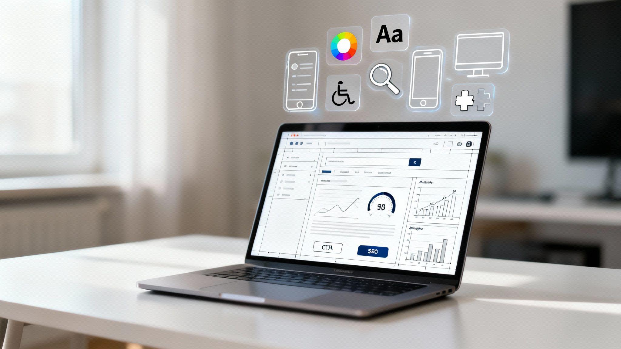
When we talk about the core elements of web design, we're discussing the essential pieces that determine how your website looks, feels, and functions. This includes the visual components you see—like the layout, color scheme, and fonts—and the functional aspects you experience, such as how easy it is to navigate, use on a phone, and how quickly it loads. Getting these elements right is the key to creating a website that not only looks professional but also effectively converts visitors into customers.
Your Website Is Your Digital Storefront

Think of your website as the front door to your business. If a customer walked into your physical shop and found it cluttered, confusing, and hard to find anything, they’d walk right back out. Your website is no different. A poorly designed site makes visitors leave in seconds, often for good.
Great web design is about more than just looks. It's about creating a thoughtful, strategic online experience that builds trust, clearly shows what you offer, and guides visitors to take action.
This isn’t just a creative opinion; it directly impacts your business. Research shows that 38.5% of people will judge a business by how its website looks on first glance. An even more significant 94% of first impressions are tied directly to design. Simple choices in color, fonts, and images can make or break a visitor's trust before they read a single word.
Why Every Business Needs Great Web Design
A professional website isn’t a luxury; it’s a fundamental tool for growth. It works 24/7 as your marketing hub, customer service portal, and most dedicated salesperson. Here’s why investing in solid web design is one of the smartest moves you can make:
- It Builds Credibility: A clean, modern design instantly signals to visitors that you are a professional and trustworthy business.
- It Improves User Experience: When people can easily find what they need, they stay longer and are more likely to become customers.
- It Drives Conversions: Smart design, like clear call-to-action buttons, guides users toward making a purchase or contacting you.
- It Strengthens Your Brand: Consistent colors, fonts, and images reinforce your business identity and help people remember you.
The best websites feel effortless. They anticipate what a user needs and provide a clear, logical path from the homepage to the final goal—whether that's buying a product or booking a service.
This guide will break down the essential elements of web design in simple terms for business owners, not coders. We’ll explore everything from the visual touches that grab attention to the technical details that keep it all running smoothly. For a closer look at your most important page, check out our article on homepage design best practices.
You'll also see how tools like the Solo AI Website Creator make this all surprisingly simple, helping you build a professional site that gets results—without any technical headaches.
Mastering Your Visual First Impression
Your website’s design is the digital equivalent of a firm handshake. It’s the very first thing people notice, and it instantly sets the tone for their entire visit. These core visual elements work together to create a look that feels professional, builds trust, and makes your site easy to use.
Think of it like setting up a physical storefront. You wouldn't just throw your products on the floor. You’d arrange displays for a natural flow, pick a color scheme to create a mood, and add touches that make the space feel uniquely yours. The same logic applies to your website.
Layout: The Blueprint for Clarity
Your website's layout is its structure—how content is organized on the page. A good layout guides your visitor's eye where you want it to go, making information easy to find and understand.
It's the difference between a well-organized store with clear aisles and a chaotic market where you have to hunt for everything.
Two key components of a great layout are grids and white space.
- Grids: Imagine an invisible framework that keeps your text, images, and buttons aligned. This creates order and balance, making the page feel structured and professional.
- White Space: This is the "empty" space around your content. It’s not wasted; it's breathing room that prevents your site from feeling cramped and helps users focus on one thing at a time.
Actionable Tip: When designing a page, step back and see if it feels cluttered. If so, add more spacing between sections or images. This simple change can dramatically improve readability.
To really nail that first impression, it’s worth digging into the essential user interface design best practices that top-tier sites follow.
How Solo AI Website Creator Helps: The professional templates in Solo AI Website Creator are already built on clean grid systems with plenty of balanced white space. You don’t have to guess at what looks good; the structure is optimized for a fantastic user experience right out of the box.
Color Theory: Communicating Without Words
Color is a powerful communication tool. It isn't just decoration; it triggers emotions and instantly tells people about your brand's personality. The colors you choose can make visitors feel excited, calm, or secure.
A study found that color increases brand recognition by up to 80%. Picking the right palette literally helps people remember who you are.
Think about the messages different colors send:
- Blue: Often associated with trust, security, and professionalism. It's a favorite in finance and tech.
- Green: Suggests nature, health, and growth, making it a go-to for wellness and eco-friendly brands.
- Red: Evokes energy, passion, and urgency. It’s perfect for grabbing attention on sales banners or call-to-action buttons.
Actionable Tip: Choose a simple color palette. A good starting point is one main color for your brand, a secondary color for accents, and a neutral color (like gray or white) for backgrounds. If you're not sure where to begin, learning how to create a brand that clicks with your ideal customer is a great first step.
Typography: The Voice of Your Website
If color sets the mood, then typography—the style of your text—is your website's voice. The fonts you choose say a lot about your brand. A classic, formal serif font might be perfect for a law firm, while a clean, modern sans-serif font feels right for a tech startup.
Above all else, your typography must be readable. If your text is a chore to read, your entire message is lost.
Here are two quick rules of thumb:
- Limit Your Fonts: Stick to two, or at most three, fonts for your entire site. A common approach is one for headings and another for the main body text.
- Ensure High Contrast: Black text on a white background is the gold standard for a reason—it’s the easiest to read. Avoid combinations like light gray text on a slightly-less-light-gray background.
Actionable Tip: Use a font size of at least 16 pixels for your main body text. This ensures it's comfortable to read on most screens without forcing users to zoom in.
How Solo AI Website Creator Helps: Solo AI offers curated font pairings that are professionally selected for readability and visual appeal. It automatically applies them consistently across your site, so your brand's "voice" always comes through clearly.
Imagery: Connecting Through Visuals
In a digital world, high-quality imagery is non-negotiable. Photos, videos, and graphics are the fastest way to forge an emotional connection. They can show your products in action, introduce your team, and tell your brand's story in a way words can't.
Stock photos can be a decent starting point, but nothing beats authentic images of your actual business, products, and team. People can spot a generic stock photo from a mile away.
Actionable Tip: Use your own high-resolution photos whenever possible. A picture of your actual team or product makes your business feel real, relatable, and trustworthy.
Creating an Effortless User Journey
Beyond just looking good, the best websites are incredibly easy to use. This is where we focus on the user's journey, shaped by two critical elements: navigation and interaction. A smooth journey gives visitors confidence and control—the bedrock of building trust.
Think of it this way: if your visual design is the decor in your store, then navigation is the layout of the aisles and signs. It's your website's GPS, helping people find what they're looking for without a second thought. Confusing navigation is like a store with no signs—people get frustrated and leave.
This chart breaks down how layout, color, and typography work together to support a clear and intuitive user journey.

As you can see, a logical layout is the foundation. Color and typography then add layers of meaning that guide the user's eye and make the whole experience feel natural.
Before we dive deeper, here's a quick checklist to keep these core elements in mind.
Web Design Elements Checklist
Use this scannable checklist to review the essential web design elements, their purpose, and a key tip for implementation.
| Element | Its Purpose | Actionable Tip |
|---|---|---|
| Layout | To structure content logically and guide the user's eye. | Use a grid system to create a balanced and organized look. |
| Typography | To ensure text is readable and conveys brand personality. | Choose 2-3 complementary fonts and stick to them. |
| Color | To evoke emotion, create contrast, and draw attention. | Pick a primary color, a secondary, and an accent for CTAs. |
| Imagery | To engage users visually and communicate complex ideas quickly. | Use high-quality, authentic images that reflect your brand. |
| Navigation | To help users find what they need quickly and easily. | Keep your main menu simple, with no more than 7 items. |
| Responsiveness | To provide a consistent experience on all devices. | Test your site on a real phone, tablet, and desktop. |
| Accessibility | To ensure everyone, including people with disabilities, can use your site. | Use descriptive alt text for images and ensure good color contrast. |
| Performance | To load your site quickly and keep users from leaving. | Compress images before uploading them to your website. |
| SEO | To help your site rank higher in search engine results. | Include relevant keywords naturally in your page titles and headings. |
| CTAs | To guide users toward taking a specific action. | Use strong, action-oriented verbs like "Get," "Start," or "Join." |
| Forms | To collect information from users without causing friction. | Only ask for the information you absolutely need. |
| Analytics | To understand user behavior and make data-driven improvements. | Install Google Analytics to track page views and bounce rate. |
| Integrations | To connect your site with other tools and simplify workflows. | Link your email marketing service to your contact form. |
This table serves as a great bird's-eye view, but let's get into the specifics of making that user journey truly seamless.
Designing Intuitive Navigation
The point of navigation is to make finding information feel obvious. A new visitor should land on your homepage and instantly know where to click for your services, about page, or contact details.
Research from the Nielsen Norman Group found that most people leave a website in just 10–20 seconds. But sites with clear navigation and an obvious purpose can hold their attention much longer.
Here’s how to create navigation that works for your visitors:
- Keep It Simple and Familiar: Stick to a single menu at the top of your page. Don't get clever with labels—use standard terms like "Services," "About Us," and "Contact."
- Limit Your Menu Items: A cluttered menu is confusing. Aim for seven main items at most. If you need more, use dropdowns to group related pages under a single heading.
- Ensure Consistency: Your navigation menu should be in the exact same spot, with the same options, on every page. This consistency builds reliability and trust.
Actionable Tip: Pretend you're a first-time visitor. Can you find your contact information or your main service in less than 5 seconds? If not, simplify your menu.
How Solo AI Website Creator Helps: The platform’s menu tools are incredibly straightforward, letting you add, remove, and organize your pages with a few clicks. It automatically generates a clean, consistent navigation bar across your entire site, so you never have to worry about your visitors getting lost.
Driving Action with Clear Interactions
Once people can find their way around, you need to guide them toward taking action. This is where interactive elements like buttons, forms, and Calls-to-Action (CTAs) come in. These are the moments where a passive browser turns into an active lead or customer.
A strong CTA is the most critical piece of this puzzle. It’s that button that says "Get a Free Quote," "Shop Now," or "Book a Consultation."
Your CTA isn't just a button; it's the final instruction in a conversation with your user. It must be clear, direct, and solve a problem for them.
To make your CTAs stand out, use punchy, action-oriented language. Instead of a bland "Submit," try "Get Your Free Ebook." It also helps to make your buttons visually distinct with a contrasting color that draws the eye.
Forms are another make-or-break interaction. To get more people to complete them, only ask for what you absolutely need right now. For an initial inquiry, a name, email, and message field are usually enough. Every extra field is another reason for someone to give up.
Actionable Tip: For your main contact form, stick to 3-4 fields at most. You can always gather more information later. The goal is to make that first step as easy as possible.
How Solo AI Website Creator Helps: Solo AI Website Creator includes pre-built, optimized contact forms designed to be simple for your visitors. This means you can start capturing leads from day one without getting bogged down in form design.
Designing for Every Visitor and Device

A great website doesn't just look good—it works flawlessly for everyone, everywhere, on any device. This isn't a "nice-to-have" feature; it's a fundamental requirement built on two critical elements: accessibility and mobile responsiveness.
If you skip these, you're essentially putting a "Closed" sign on your digital front door for a huge chunk of potential customers.
Building a Digitally Accessible Website
Think of accessibility like the digital version of a wheelchair ramp. It’s about designing your website so people with disabilities can easily navigate and use it. This isn't just about being inclusive; it's smart business that opens your brand to a wider audience.
A site that someone using a screen reader can't understand might as well be invisible. The good news is that a few simple changes make a world of difference.
"The power of the Web is in its universality. Access by everyone regardless of disability is an essential aspect." - Tim Berners-Lee, inventor of the World Wide Web
Here are a few straightforward ways to make your site more accessible:
- Add Descriptive Alt Text to Images: Alt text is a short, written description of an image that screen readers announce to visually impaired users. It also helps search engines understand your image content.
- Use High-Contrast Colors: Make sure your text color stands out clearly against its background. This makes your content easier to read for people with low vision and improves the experience for everyone.
- Write Clear Link Text: Ditch vague phrases like "click here." Instead, use descriptive text that tells people exactly where they're going, like "Download our free guide."
Actionable Tip: When adding an image, write a simple, one-sentence description in the "alt text" field. For example, "A team of three smiling architects reviewing blueprints at a desk." This takes seconds and greatly improves accessibility. If you want to dive deeper, a great starting point is learning some foundational website accessibility best practices.
Prioritizing Mobile Responsiveness
Next is mobile responsiveness. This just means your website automatically adjusts its layout to look and work great on any screen, from a tiny smartphone to a huge desktop monitor. With most people browsing on the go, a mobile-friendly site is non-negotiable.
The numbers don't lie. As of 2025, mobile devices drive 63% of all web traffic. A website that takes more than two seconds to load on mobile can lose up to 60% of its visitors, and just a one-second delay can slash conversions by 7%.
When a site isn’t mobile-friendly, visitors have to pinch, zoom, and struggle to tap tiny links. Most will just give up and leave.
Actionable Tip: After you build your site, open it on your own smartphone. Try to navigate to your contact page and fill out the form. If it's frustrating for you, it will be for your customers too.
How Solo AI Website Creator Helps: This is one of the biggest technical headaches that Solo AI completely solves for you. Every site built with the Solo AI Website Creator is fully responsive right out of the box. The AI handles all the tricky code adjustments behind the scenes, ensuring your site offers a experience for every visitor, no matter what device they’re on.
While visual design grabs a visitor’s attention, powerful, unseen elements are working behind the scenes. These technical gears determine whether people find you online, stick around, and become customers.
Think of these elements—Performance, Search Engine Optimization (SEO), and Analytics—as the engine, GPS, and dashboard of your website. Without them, even the most beautiful car is just a shiny shell that can't go anywhere.
Site Performance: The Need for Speed
Website performance boils down to one simple thing: speed. A slow-loading website is the digital version of a ridiculously long checkout line. People get impatient and leave.
How impatient? Studies show that 47% of consumers expect a webpage to load in two seconds or less. Even a one-second delay can cause a 7% reduction in conversions. For a small business, that’s a direct hit to your bottom line.
A fast website feels professional and reliable. It tells visitors that you respect their time, which is a subtle but powerful way to build trust from the first click.
Slow load times are often caused by clunky code or massive image files. Even if you're not a developer, you can take simple steps to keep your site zippy.
Actionable Tip: Always compress your images before you upload them. Free tools like TinyPNG can dramatically shrink file sizes without sacrificing visual quality, giving your visitors a much faster experience.
Search Engine Optimization: Helping Customers Find You
Search Engine Optimization (SEO) is simply the process of making your site more visible on search engines like Google. It's about speaking a language that search engines can easily understand, so they know what your site is about and who they should show it to.
Imagine organizing a library. SEO is how you label your "book" (your website) with the right title and summary so the librarian (Google) can put it on the correct shelf for people to find. Behind every visually appealing website lies the crucial work of mastering SEO of a company to ensure discoverability.
For small businesses, the best place to start is with on-page SEO—the elements you can control directly on your site.
- Proper Heading Structure: Use headings (H1, H2, H3) to organize your content like chapters in a book. This helps both people and search engines quickly grasp your page's structure.
- Keyword-Rich Content: Write your content using the words and phrases your ideal customers would type into Google.
- Descriptive Page Titles and URLs: Make sure every page has a clear title describing its content. A URL like
yourbusiness.com/landscaping-servicesis infinitely better for SEO thanyourbusiness.com/page-2.
Actionable Tip: For your main services page, make sure the most important heading (the H1 title) clearly states what you do and where you do it. For example, "Professional Landscaping Services in Springfield."
How Solo AI Website Creator Helps: The Solo AI Website Creator automatically handles foundational SEO work for you. Its AI generates keyword-rich content and builds your site with a clean structure that search engines love, giving you a serious head start on getting found online.
Analytics: Your Business Dashboard
Finally, analytics tells you what’s actually happening on your site. It’s your business dashboard, giving you priceless data on who your visitors are, how they found you, and what they do once they arrive.
Without analytics, you’re flying blind. You have no real way of knowing if your marketing is working or which pages are connecting with visitors.
Connecting a free tool like Google Analytics lets you track key metrics:
- Pageviews: How many times a specific page was viewed.
- Bounce Rate: The percentage of visitors who left after looking at only one page.
- Session Duration: The average time visitors spend on your site.
- Traffic Sources: Where your visitors came from (e.g., Google search, social media).
Actionable Tip: Once you have analytics set up, check it once a month. Look at your top 3 most visited pages. This tells you what your audience is most interested in, so you can create more content like it.
How Solo AI Website Creator Helps: Solo AI Website Creator makes connecting your site to Google Analytics incredibly simple. With a straightforward integration, you can start gathering data right away, turning your website from a simple brochure into a powerful tool for understanding your customers.
We've covered a lot, from the first impression your layout makes to the behind-the-scenes magic of SEO. Looking at the whole checklist, it can feel like a mountain to climb. But it doesn't have to be.
The right approach can turn this complex list into a simple, simpler process.
This is exactly where a tool like the Solo AI Website Creator comes in. It acts as your all-in-one partner, built to handle these core principles for you. It lets you focus on your business, not on wrestling with code or design theory.
Your All-in-One Design Solution
The Solo AI Website Creator is designed to address every key area we’ve discussed. It’s like having a designer, developer, and SEO specialist on your team from day one.
Here’s a quick look at how it puts these elements into practice for your business:
- Mastering Visuals Instantly: You get immediate access to professionally designed templates with balanced layouts, proven color schemes, and readable font pairings already baked in.
- Creating an Effortless Journey: The tool automatically generates clean, logical navigation menus and includes simple, optimized contact forms.
- Designing for Every Device: Every website built with the Solo AI Website Creator is fully mobile-responsive by default. You don’t have to do a thing.
- Powering Your Site Behind the Scenes: The platform handles foundational on-page SEO automatically, generating a site structure that search engines can easily read.
The real game-changer here is speed and efficiency. You can get a fully functional, professionally designed website live in a matter of minutes, not months.
This approach removes the traditional roadblocks of high costs and long development timelines. It puts powerful web design capabilities right in your hands.
Get Started for Free Today
The takeaway is clear: creating a website that builds trust and brings in customers doesn't have to be complicated or expensive. All the principles we’ve walked through are embedded directly into the foundation of the Solo AI Website Creator.
Ready to see how easy it can be? You can start building your professional website for free and see for yourself. Click the link below to get your online presence up and running today.
Build Your Free Website with Solo AI Website Creator
Got Questions? We’ve Got Answers.
When it comes to web design, small business owners often have a few key questions. Let's tackle the most common ones.
How Much Does Good Web Design Cost?
The cost of web design can swing wildly, from a few hundred dollars for a basic template to many thousands for a custom build. But that old way of thinking is changing.
Modern tools have made professional design much more accessible. With the Solo AI Website Creator, you can build a fully functional, professional-looking website completely free. This lets you put your budget where it matters most—marketing your business and finding new customers.
How Long Does It Take to Design a Website?
If you go the traditional route with a custom project, you could be waiting anywhere from 6 to 16 weeks. That's a long time to be on the sidelines, with back-and-forth calls, mockups, development, and revisions.
The beauty of a platform like Solo AI Website Creator is pure speed. You can literally generate and launch a complete, professionally designed website in a matter of minutes. No waiting, no delays—just an instant online presence.
This means you can start connecting with customers today, not months from now.
Can I Update My Website Myself After It Is Built?
Yes, and you absolutely should. Think of your website not as a static brochure but as a living part of your business that needs regular attention to stay effective.
Forget the days of emailing a developer and getting a bill for every tiny text change. Platforms like Solo AI Website Creator are designed for you, the business owner, to be in the driver's seat. You can log in anytime to update your services, swap out images, or post a new announcement. No tech skills required. It’s all about empowering you to keep your site fresh and in sync with your business goals.
Ready to bring all these elements of web design to life? With Solo AI Website Creator, you can build a professional, high-performing website in minutes, and for free. Start building your digital storefront today at https://soloist.ai.
What are the main elements of web design that build trust?
The core elements include layout, color, typography, imagery, navigation, responsiveness, accessibility, performance, and calls to action. Together, they shape how professional your site feels, how easy it is to use, and how confidently visitors move toward contacting you or making a purchase.
Why does visual design affect whether visitors trust a business?
People judge a business quickly based on how its website looks, and most first impressions are tied to design. A clean, modern layout, consistent colors, readable fonts, and high-quality imagery make your business feel credible, organized, and legitimate before a visitor reads much of the copy.
How can navigation improve user experience and conversions?
Navigation works best when it feels obvious, familiar, and consistent on every page. A simple top menu, clear labels like Services or Contact, and no more than about seven main items help visitors find what they need fast, reducing frustration and making them more likely to stay and act.
What makes website typography and color choices effective?
Effective typography is readable first, so body text should be easy to scan, high contrast, and typically at least 16 pixels. Color should be simple and intentional, usually with one main brand color, a secondary color, and a neutral background, so the site feels cohesive and guides attention without overwhelming the visitor.
How do responsive design and performance support trust?
A site should work smoothly on phones, tablets, and desktops because visitors expect a consistent experience everywhere. Fast loading also matters because people leave quickly when a site feels slow or frustrating, so performance and responsiveness help users stay engaged and feel confident in the business behind the site.