Core tips: good image size for web to speed up pages
This article was assisted with AI. We may include links to partners.
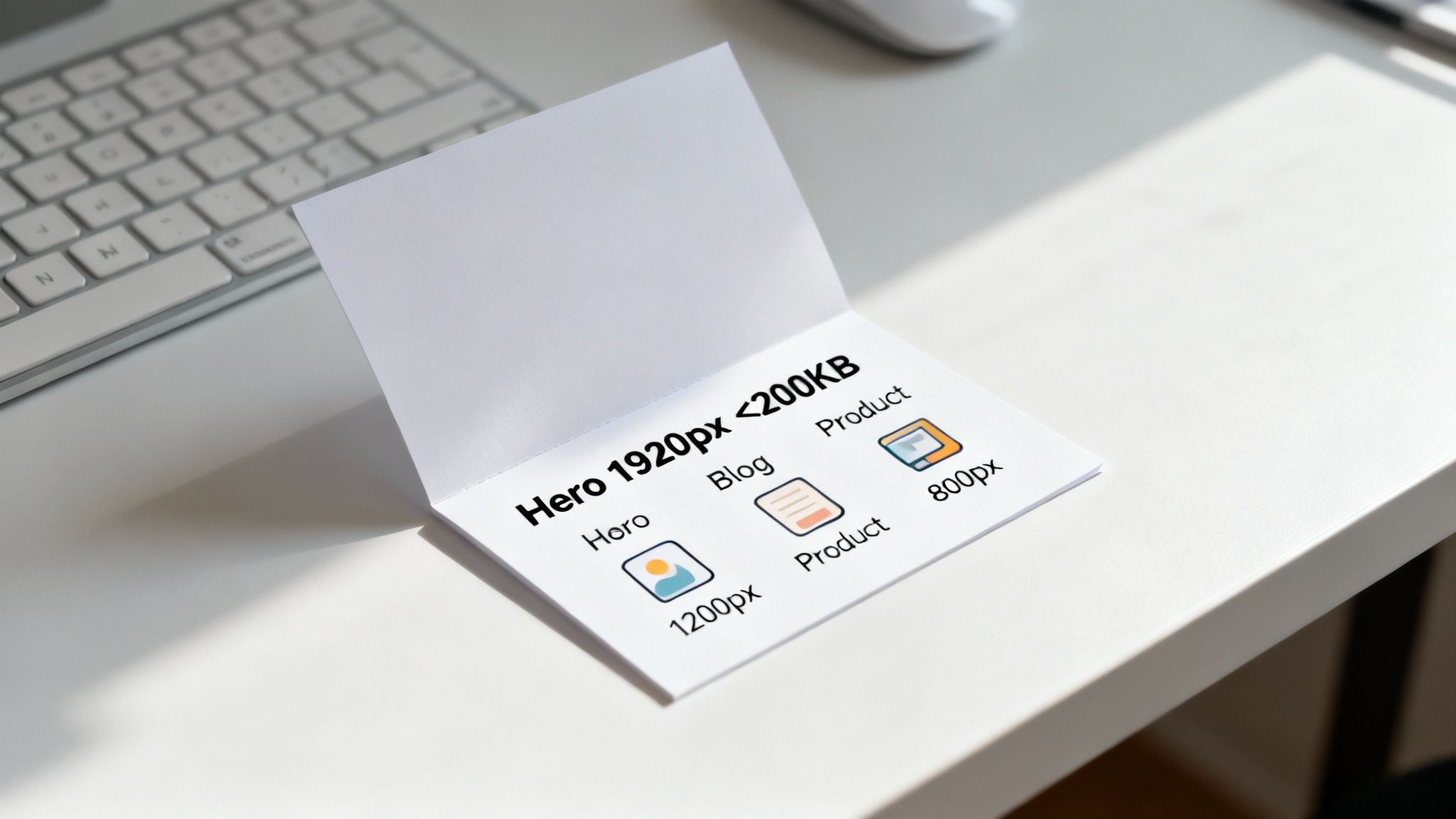
When building a website, "size" is a balancing act. You need visuals that are crisp and clear, but they also must load in a flash. The sweet spot? For most web images, aim for a maximum width of 1920 pixels and keep the file size under 200 KB. It's an actionable guideline that can save your site from the visitor-repelling curse of slow page loads.
Why Image Size Is a Big Deal for Your Website
Nailing your image sizes is one of the fastest, most effective ways to boost your website’s performance and keep visitors happy. Oversized images are page-speed killers. They slow everything down, leading to frustrated users clicking away and search engines like Google taking notice.
On the flip side, a zippy, fast-loading site feels professional, keeps people engaged, and sends all the right quality signals to search engines. It's a win-win.

The Two Sides of "Size"
To get this right, you have to understand that "size" means two different things. Both are critical.
- Image Dimensions: This is the width and height of the image, measured in pixels (px). Actionable Tip: Resize your image's dimensions to match the maximum size it will be displayed on your website. For example, if an image will only ever be shown in a 800px wide column, don't upload a 3000px wide version.
- File Size: This is the image's "weight," measured in kilobytes (KB) or megabytes (MB). This directly impacts how quickly the image downloads and appears on the screen. Actionable Tip: Always aim to get your final file size under 200 KB after resizing and compressing it.
Sticking to a max width of 1920 pixels is a solid starting point for large, full-screen images, as it covers most modern screen resolutions without going overboard. But it's the file size that often does the most damage.
Google has found that a delay of just three seconds can cause 53% of mobile visitors to abandon a page. That's why keeping file sizes low is so important for speed and keeping users on your site. For a complete guide on improving your site's performance, you can learn more about how to optimize website speed.
Quick Reference for Common Web Image Sizes
To make things easier, here's a handy chart with common recommendations. Think of these as a starting point—you can always adjust based on your specific design needs.
| Image Type | Recommended Width (Pixels) | Ideal File Size (KB) |
|---|---|---|
| Full-Width Hero Image | 1920px | Under 200 KB |
| Blog Post Image | 1200px | Under 150 KB |
| Inline Content Image | 800px | Under 100 KB |
| Product Image (e-commerce) | 1000px | Under 120 KB |
| Thumbnail | 300px | Under 50 KB |
Remember, these aren't rigid rules, but they provide a fantastic baseline. The goal is always to find that perfect balance between sharp visuals and fast loading.
Understanding Dimensions vs. File Size
To get your website’s images just right, you need to understand two core concepts: image dimensions and file size. They might sound similar, but they control different aspects of how your images look and how your site performs.
Image dimensions are simply the width and height of an image, measured in pixels (px). For example, a hero image might be 1920px wide by 1080px tall. This determines how much space the image physically takes up on a screen.
File size, on the other hand, is the image's digital "weight," measured in kilobytes (KB) or megabytes (MB). This dictates how long it takes for a visitor's browser to download and display it.
Why Both Matter
Here’s where it gets tricky: you can't just focus on one and ignore the other. It’s all about a balance.
An image with huge dimensions but a tiny file size might load fast, but it will probably look blurry and pixelated. This happens when you over-compress an image—you sacrifice visual quality for speed.
Conversely, a beautiful, crystal-clear image with a massive file size will slow your website to a crawl. And we know that slow load times are a major turn-off for visitors and can even hurt your SEO rankings. After all, site speed is a known ranking factor for search engines like Google.
Mastering the balance between dimensions and file size is the first step toward a faster, more professional-looking website. A visitor won't appreciate a crystal-clear image they never see because the page took too long to load.
Fortunately, you don’t have to be a design expert to get this right. Modern tools, including the Solo AI Website Creator, are built to handle a lot of this optimization for you, ensuring your site looks great and loads quickly. But understanding the basics gives you more control and a better eye for what works.
Picking the Right Image Format for Your Website
Choosing the right image format is just as important as getting the dimensions right. Think of formats like different types of boxes, each built for a specific kind of item. Getting this right is one of the easiest, non-technical wins for a fast-loading website.
Each format handles visual data in its own way, which impacts both file size and image quality. For example, saving a photograph as a PNG will result in a huge file for no good reason. On the other hand, saving a logo as a JPEG will make its sharp edges look blurry and remove any transparency.
The Go-To Image Formats for the Web
Let's break down the four main formats you’ll be working with. Once you understand their strengths, you can make the right choice every time.
- JPEG (or JPG): Your workhorse for photographs and any image with lots of colors and smooth gradients. It uses "lossy" compression, which cleverly removes tiny bits of visual information our eyes can't easily detect to make the file size much smaller.
- PNG: Use PNG anytime you need a transparent background. It’s perfect for logos, icons, and graphics with hard, crisp lines because it uses "lossless" compression—it keeps every single pixel exactly as it was. This pixel-perfect quality comes at a cost, as PNGs are usually larger than JPEGs.
- WebP: This is the modern, high-performance option. Developed by Google, WebP gives you the best of both worlds. It supports transparency like a PNG but offers far better compression—often creating files that are 25-34% smaller than an equivalent JPEG. For most images on the web today, WebP is an excellent default choice.
- SVG (Scalable Vector Graphic): This format is different. SVGs aren't made of pixels; they're built from mathematical code. This makes them ideal for logos and simple icons because you can scale them to any size—from a tiny icon to a massive banner—and they will never lose quality or look pixelated.
A Quick Guide to Image Sizes for the Web
Getting the right dimensions and file sizes for different parts of your website is a small detail that makes a huge difference. Let's be honest, nobody wants to wait for a massive photo to load. A good image size for web pages really comes down to its job—a huge background photo has different needs than a tiny product thumbnail.
This section is your quick-lookup guide. Here are the specific, no-fluff numbers to keep sites looking sharp and running fast. By following these, you can stop uploading oversized images that kill your page speed and frustrate visitors.
Hero and Full-Width Images
For those big, beautiful hero images that stretch across the top of a page, you want clarity, but you need speed.
Actionable Tip: Resize the image to a maximum width of 1920 pixels.
But the real secret is the file size. You have to keep it under 200 KB. Seriously. Serving up a massive image file is a surefire way to alienate anyone on a spotty mobile connection. If you want to dive deeper into performance-focused sizing, the folks at ShortPixel have some great insights.
Blog and In-Content Images
When you're dropping images into a blog post or an article, they don't need to be nearly as wide as a banner.
Actionable Tip: A width of 1200 pixels is a perfect sweet spot. These visuals almost never take up the full screen, so anything more is just overkill.
For these in-content graphics, aim to keep the file size under 150 KB. This ensures they appear instantly as someone scrolls down the page, keeping the reading experience smooth.
Pro Tip: Don't forget to save your images in the right format before you upload them. This simple infographic breaks down the best use cases for common formats like JPEG, PNG, and the super-efficient WebP.

As you can see, JPEGs are your go-to for photos, PNGs are perfect for logos that need a transparent background, and WebP is the modern, high-performance choice for just about everything else.
E-commerce Product Photos
Product photos are a different beast entirely. You need them to be crystal clear and detailed, so shoppers can see exactly what they're getting.
Actionable Tip: Start with a high-quality source image around 1000 pixels square, which gives you enough resolution for a good zoom feature.
The key here is aggressive compression. Even with that high-res source file, you have to get the final image size on the page under 120 KB. This gives customers all the detail they need without slowing down your product pages—something that can absolutely kill conversions. If you're using a tool like the Solo AI Website Creator, these kinds of optimizations are often handled for you, striking that perfect balance.
Compressing Images Without Sacrificing Quality
Once you’ve resized your image dimensions, the final and most critical step is compression. This is where you shrink your image's file size to make it load lightning-fast. Compression works by intelligently removing or reorganizing the data in the file, often in ways the human eye can't even notice.
There are two main types of compression: lossy and lossless. The terms sound technical, but picking the right one is easy once you know what they're for.
Lossy vs. Lossless Compression
Think of lossy compression as a smart editor that permanently removes bits of data that are nearly invisible to us. This can slash the file size dramatically. Actionable Tip: Use lossy compression for photographs (JPEGs and WebP files) where a tiny, imperceptible loss in detail is a great trade-off for a much smaller file.
On the flip side, lossless compression is more like a meticulous organizer. Instead of deleting data, it just repacks it more efficiently without discarding a single pixel. Actionable Tip: Use lossless compression for graphics with sharp lines, text, and flat colors—like logos or icons saved as PNGs—where every single detail needs to stay crisp and perfect.
The goal isn't just making files smaller. It's about hitting that sweet spot where the file size is as low as possible without anyone noticing a drop in visual quality. A perfectly compressed image looks just as sharp to your visitors but loads way faster.
Easy Tools for Powerful Compression
You don't need to be a Photoshop expert to get this right. There are fantastic—and free—online tools that can shrink your image files by up to 80% without any obvious loss in quality.
Here are a couple of my favorites:
- TinyPNG: Don't let the name fool you; this is my go-to for both PNG and JPEG files. You just drag and drop your images, and it does a fantastic job of compressing them automatically.
- Squoosh: This is a powerful, browser-based tool from Google that gives you a ton of control. The best part is the live preview slider, which lets you see exactly how the quality changes as you tweak the compression settings.
Using these tools is simple: upload your already-resized image, let the tool work its magic, and then download the newly optimized version. This final step is what truly delivers a good image size for web performance.
For a deeper dive into the whole process, check out our complete guide on how to optimize website images.
Optimizing Images For Mobile And Retina Displays
Delivering crisp, beautiful images to every device is a modern web challenge. Your website will be viewed on everything from a small smartphone to a giant, high-resolution desktop monitor. This is where responsive images come into play, making sure every visitor gets the best possible experience.

This process is managed with a bit of code called the srcset attribute. Think of srcset as giving the browser a menu of different image sizes to choose from. A phone on a poor connection might get a small, fast-loading version, while a desktop on Wi-Fi gets the larger, more detailed one. It’s an automatic process that delivers the right image for the right user.
Serving High-Resolution Retina Displays
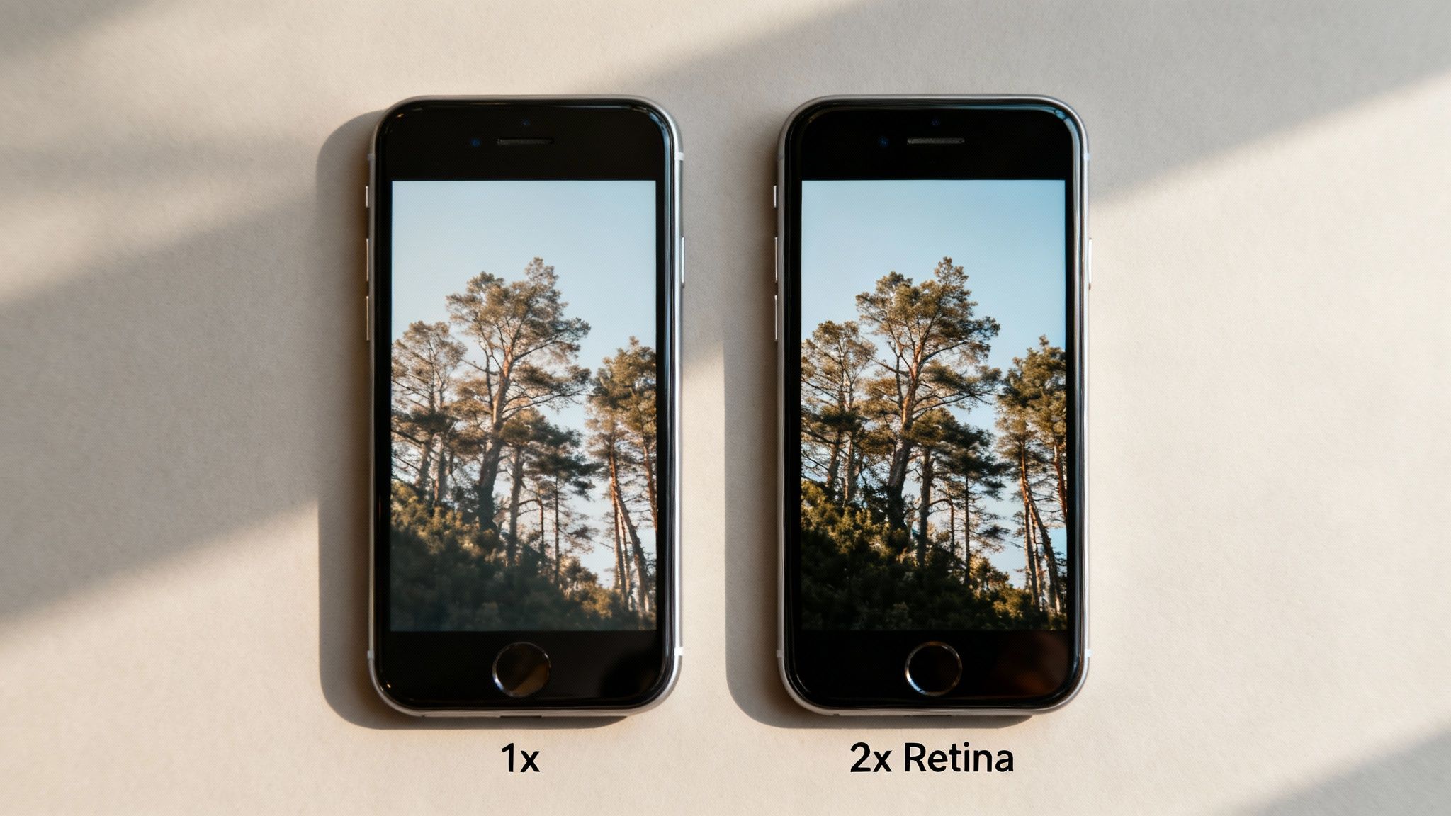
High-resolution screens, often called "Retina" displays, pack twice as many pixels into the same space as standard screens. To make your images look sharp on these devices, the rule of thumb is simple.
Actionable Tip: Save your image at twice the intended display dimensions.
For example, if your image will be displayed in a 600-pixel wide container on your site, you should actually upload a 1200-pixel wide version.
The catch? A bigger image means a bigger file. You must use aggressive compression on these "2x" images. This is the secret to making your site look stunning on premium devices without forcing your mobile users to download unnecessarily huge files.
Luckily, platforms like the Solo AI Website Creator often handle these responsive adjustments automatically, ensuring your site looks professional no matter where it's viewed.
Common Questions About Web Image Sizing
Even after you've got the basics down, a few practical questions always seem to pop up. Getting straight answers to these can help you troubleshoot common image sizing headaches.
First up, a big one: what's the best size for a full-screen background image?
Actionable Tip: A solid starting point is 1920 pixels wide by 1080 pixels tall. This lines up perfectly with the standard 16:9 HD screen ratio. But the real secret isn't the dimensions—it's aggressive compression. You absolutely must get that file size under 300 KB to keep it from slowing down your page's initial load time.
Another question I hear all the time is whether to worry more about pixel dimensions or the file size in kilobytes. The truth is, you must focus on both. They're two sides of the same coin. Pixel dimensions dictate how the image fits visually on the page, while file size determines how fast it gets there. A truly optimized web image nails both.
How Image Size Affects Your SEO
It’s impossible to talk about image sizing without bringing up SEO. Why? Because large, unoptimized images are one of the biggest reasons for slow-loading websites, and Google is obsessed with speed. Site speed is a massive ranking factor.
Think about it from a user's perspective. When a page takes forever to load, people don't wait around—they leave. This spikes your bounce rate, which tells search engines that your page is delivering a poor user experience.
By properly sizing and compressing your images, you improve your site speed. This enhances the user experience and can directly contribute to a boost in your search rankings over time.
This is exactly why keeping an eye on your site's speed is non-negotiable. If you're looking for the right tools for the job, you can find a complete overview of the best website performance monitoring tools to keep your site running fast.
Ready to stop worrying about image optimization and launch a fast, professional website? The Solo AI Website Creator handles the technical details for you, ensuring your site looks great and loads quickly on every device. Create your free website in minutes at https://soloist.ai.
