10 Homepage Design Best Practices for 2025
This article was assisted with AI. We may include links to partners.
Your homepage is often a visitor's first interaction with your brand. It’s not just a page; it’s your virtual storefront, your digital handshake, and your 24/7 salesperson. Getting it right is non-negotiable for capturing attention, building trust, and turning visitors into customers. In a world where first impressions are made in milliseconds, applying proven homepage design best practices is the key to standing out. A well-designed homepage acts as a central hub, and to maximize its impact, you should also consider broader strategies for building a robust online presence to drive qualified traffic to your site.
This guide breaks down 10 essential, no-fluff strategies into actionable steps. We'll ditch the complex jargon and focus on practical tips that any small business owner or entrepreneur can implement, whether you're building from scratch or revamping an existing site. You will learn how to write a clear value proposition, optimize for mobile users, and strategically place calls-to-action that guide visitors toward your goals. We’ll cover everything from loading speed and social proof to creating a compelling hero section that hooks visitors immediately, ensuring your digital welcome mat effectively converts interest into action.
1. Clear Value Proposition
A clear value proposition is a short, powerful statement that instantly tells visitors what you do, who you help, and why you’re the best choice. It must be the first thing a user sees and must immediately answer their question: “What’s in it for me?” This isn't just a catchy tagline; it's a foundational element that can dramatically reduce the number of visitors who leave immediately by clarifying your purpose within seconds.
This statement should be prominently displayed "above the fold" (the part of the page visible without scrolling). For example, a simple yet powerful proposition could be: "Everything you and your team need to keep work moving." It clearly defines the product's function (collaboration) and its core benefit (productivity).
Actionable Tips for a Strong Value Proposition
Creating a compelling value proposition requires focusing on what your customer gets, not just what your product does. A visitor doesn't care about your "proprietary algorithm"; they care about how it saves them time or money.
Here are some actionable tips:
- Keep It Short and Punchy: Aim for one or two sentences at most. Your main headline should grab attention, and a sub-headline can add a little more detail.
- Focus on Benefits: Instead of saying "We sell organic dog food," try "Healthy, organic meals that give your dog a longer, happier life." The benefit is the dog's well-being.
- Be Specific: Vague claims like "We're the best" are meaningless. A more powerful statement is "The #1 email marketing and automations brand," which provides a specific and confident market position.
- Test Your Message: Use A/B testing (comparing two versions of your page) to try different headlines. See which one leads to more sign-ups or longer visit times. This data-driven approach removes guesswork.
2. Intuitive Navigation Structure
An intuitive navigation structure acts as a clear roadmap for your website, guiding visitors effortlessly to the information they need. If a user can't find what they're looking for quickly, they'll leave. The goal is to create a logical, predictable, and easy-to-use menu system that helps the user on their journey.
A disorganized navigation menu is like a store with unlabeled aisles; customers will get frustrated and walk out. The goal is to make finding information feel natural and frictionless, which builds user confidence and encourages them to stay longer.
Actionable Tips for Intuitive Navigation
Building a user-friendly navigation system requires thinking from your visitor's perspective. Your internal company jargon means nothing to them; use terms they understand and expect.
Here are some actionable tips:
- Limit Menu Items: Stick to 5-7 main options in your primary navigation menu. Too many choices can be overwhelming.
- Use Familiar Language: Instead of "Synergistic Solutions," use clear terms like "Services" or "Features." Use words your target audience would search for.
- Group Logically: Place related pages under a single, relevant parent category. For example, "About Us," "Our Team," and "Careers" can all be placed under a main "About" tab.
- Ensure Mobile Accessibility: Your navigation menu must be easy to find and use on mobile devices. The "hamburger" icon (three horizontal lines) is a universally recognized symbol for the mobile menu.
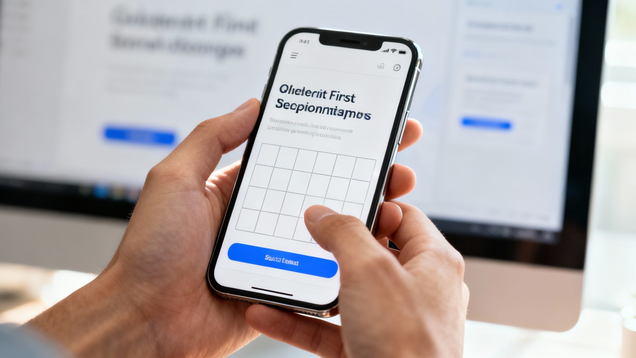
3. Mobile-First Responsive Design
With most internet traffic now coming from mobile devices, designing for the smallest screen first is a necessity. A mobile-first approach means you design the user experience for a mobile phone and then adapt it for larger screens like tablets and desktops. This strategy ensures your site is accessible and functional for the majority of users.
This method forces you to prioritize essential content and features, leading to a cleaner, more focused design on all devices. For a deeper understanding of how websites adapt to different screen sizes, you can explore this article where responsive web design explained.
Actionable Tips for a Mobile-First Design
Adopting a mobile-first strategy involves reversing the traditional design process. Instead of shrinking a desktop design down, you build it up from a mobile foundation. This ensures that critical elements work perfectly on the most limited devices.
Here are some actionable tips:
- Prioritize Content: Start by identifying the most crucial information and actions a mobile user needs. Remove anything that isn't essential for the main goal of the page.
- Use Large Touch Targets: Ensure buttons and links are big enough for a thumb to tap easily (at least 44×44 pixels). This prevents users from accidentally tapping the wrong thing.
- Optimize for Speed: Make images smaller and use "lazy loading" (where images only load as you scroll to them) to ensure your homepage loads quickly on mobile networks.
- Test on Real Devices: While computer simulations are helpful, nothing beats testing your design on actual smartphones and tablets to find real-world usability issues. You can learn how to make your website mobile-friendly with further hands-on techniques.
4. Strategic Call-to-Action (CTA) Placement
A Call-to-Action (CTA) is a prompt, usually a button or link, that tells visitors what to do next. Strategic CTA placement is critical because it turns your homepage from a simple brochure into a tool that drives action. Without clear CTAs, even interested visitors won't know the next step, leading to lost opportunities.
Your main CTA should be visible without scrolling ("above the fold"), while secondary CTAs can be placed further down the page for users who need more information before committing. For example, a prominent "Get Started" button at the top of the page immediately guides new users toward the main goal.
Actionable Tips for Strategic CTAs
Effective CTAs combine compelling words, eye-catching design, and smart placement. The goal is to make the desired action feel like the natural next step for the visitor.
Here are some actionable tips:
- Use Action-Oriented Language: Start with strong verbs. Instead of "Submit," try "Get Your Free Quote" or "Start My Trial."
- Create Visual Contrast: Your CTA button should stand out. Use a bright, contrasting color that draws the eye and surround it with empty space.
- Offer Different Levels of Commitment: Not everyone is ready to buy. Provide a main CTA for users ready to act ("Buy Now") and a secondary, lower-commitment CTA for others ("Learn More" or "Download Free Guide").
- Ensure Mobile-Friendliness: CTAs must be large enough and positioned for easy tapping on mobile devices. A button that’s too small will frustrate users.
- Test and Refine: Use A/B testing to experiment with different button text, colors, and placements. Small changes can significantly impact how many people click.
5. Fast Loading Speed and Performance Optimization
A fast-loading homepage is non-negotiable. Page speed directly impacts user experience, how many visitors convert, and your search engine ranking. If your homepage takes more than a few seconds to load, visitors will likely leave before they even see what you offer. This makes speed a top priority.
A slow site feels unprofessional and untrustworthy, whereas a fast one immediately builds confidence and encourages visitors to explore. Prioritizing speed ensures your carefully crafted design and message actually get seen.
Actionable Tips to Optimize Homepage Speed
Improving your site's performance involves a few key adjustments. The goal is to reduce the amount of data the browser has to download and process to show your page.
Here are some actionable tips:
- Compress Images: Large image files are the biggest cause of slow pages. Use online tools to compress your images into smaller files (like WebP format) without losing noticeable quality.
- Use a Content Delivery Network (CDN): A CDN is a network of servers that stores copies of your site around the world, so it loads quickly for visitors no matter where they are.
- Load Important Things First: Load the content visitors see first. Scripts for things like chatbots or analytics can be loaded after the main page content is visible.
- Monitor Your Speed: Use Google's PageSpeed Insights to check your site's performance. It will give you a score and suggest specific areas for improvement.
6. Social Proof and Trust Signals
Social proof is the idea that people are more likely to do something if they see others are doing it. On your homepage, this means showing visitors that other people trust and value your brand. This is a critical practice because it reassures potential customers and reduces their skepticism.
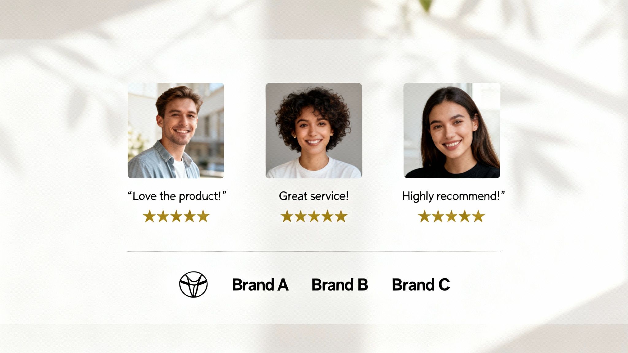
When a new visitor sees testimonials, user reviews, or logos of companies you've worked with, it immediately validates your business. For instance, displaying logos of major companies along with a powerful statistic like, “Trusted by millions,” instantly communicates authority and reliability.
Actionable Tips to Implement Social Proof
Effectively using social proof is about strategically placing authentic validation where it matters most, often near your call-to-action buttons.
Here are some actionable tips:
- Showcase Real People: Use testimonials that include a customer’s full name, company, and photo. This makes the praise far more believable than an anonymous quote.
- Use Specific Numbers: Don't just say "many users." Instead, use precise figures like "Trusted by over 150,000 businesses." Specificity builds more trust.
- Display Trust Badges: If you handle payments, prominently display security badges like SSL certificates or payment logos (e.g., Stripe, PayPal). This reassures users their information is safe.
- Leverage Video Testimonials: A short video of a happy customer sharing their experience can be significantly more impactful than text. It adds a human element that is hard to fake.
7. High-Quality Visuals and Consistent Branding
High-quality visuals are the difference between a homepage that looks amateur and one that builds immediate trust. This means using professional photography, clean graphics, and a consistent brand identity (colors, fonts, logo) to create a polished, memorable experience. Your visuals communicate your brand's quality before a visitor reads a single word.
Our brains process images much faster than text, making visuals a powerful communication tool. Consistent visuals reinforce your brand identity at every turn.
Actionable Tips for High-Quality Visuals
Achieving a professional look doesn’t always require a massive budget. The key is consistency and a focus on quality over quantity.
Here are some actionable tips:
- Invest in Original Photography: If possible, hire a professional photographer. Authentic photos of your team, product, or location build much more trust than generic stock images.
- Optimize All Images: Use free online tools like TinyPNG or Squoosh to compress images before uploading them. This reduces page load time without sacrificing visual quality.
- Establish Brand Guidelines: Create a simple document that defines your brand's color palette, fonts, and logo usage. This ensures everyone on your team uses them consistently.
- Use Whitespace Strategically: Don't crowd your page. Whitespace (or empty space) helps guide the user's eye, reduces clutter, and makes your content easier to read.
8. Clear Content Hierarchy and Scannable Layout
A clear content hierarchy organizes your homepage information logically, guiding the user’s eye to the most important elements first. Most visitors don't read every word; they scan for keywords and phrases. An effective hierarchy uses visual cues like bigger text for headlines and empty space to create a scannable layout that makes this process effortless.
This structure ensures that your main message, like your value proposition, stands out, followed by secondary information like benefits or testimonials. This is done using bold headlines, subheadings, and bullet points to break down information into digestible sections.
Actionable Tips for a Clear Content Hierarchy
Building a strong hierarchy is about strategic communication. By controlling what users see first, you can direct their journey through your homepage and toward your main call-to-action.
Here are some actionable tips:
- Use Headings Correctly: Use only one main heading (H1) for your page's title. Use H2s for major sections and H3s for subsections to create a logical and search engine-friendly structure.
- Keep Paragraphs Short: Limit paragraphs to 2-4 sentences to avoid big blocks of text. Short paragraphs are easier to scan on any device.
- Embrace White Space: Use plenty of empty space around text and images. This "breathing room" reduces distraction and helps users focus.
- Leverage Bullet Points: For lists of features or benefits, use bullet points or numbered lists. This format is easy to scan and draws immediate attention.
- Ensure High Contrast: Text must be easy to read. Make sure there is a strong contrast between your text color and its background to ensure readability for everyone.
9. Accessible Design and WCAG Compliance
An accessible website ensures that all users, including those with disabilities, can navigate, understand, and interact with your content. This isn't just a technical requirement; it's a fundamental part of inclusive design that broadens your audience. Adhering to Web Content Accessibility Guidelines (WCAG) is a critical practice that shows your commitment to serving every potential customer.
Implementing accessibility means designing for people who use screen readers (which read web content aloud), keyboard-only navigation, or other assistive technologies. For a business, this practice builds trust and can protect you from potential legal issues.
Actionable Tips to Implement Accessible Design
Building an accessible homepage involves thoughtful structure and attention to detail. It’s about ensuring your design doesn't create barriers for users. For a deeper dive, learn more about website accessibility best practices.
Here are some actionable tips:
- Use Proper HTML Structure: Structure your page with the correct code tags, like
<nav>for navigation and<h1>for the main heading. This provides context for screen readers. - Provide Alt Text for Images: Every meaningful image needs descriptive "alt text." This text is read aloud to visually impaired users, explaining the image's content.
- Ensure High Contrast: Text should have strong color contrast against its background to be easily readable. Use free online tools to check if your color combinations pass accessibility standards.
- Enable Keyboard Navigation: Test your entire homepage using only the Tab key on your keyboard. Users should be able to get to every link, button, and form field in a logical order.
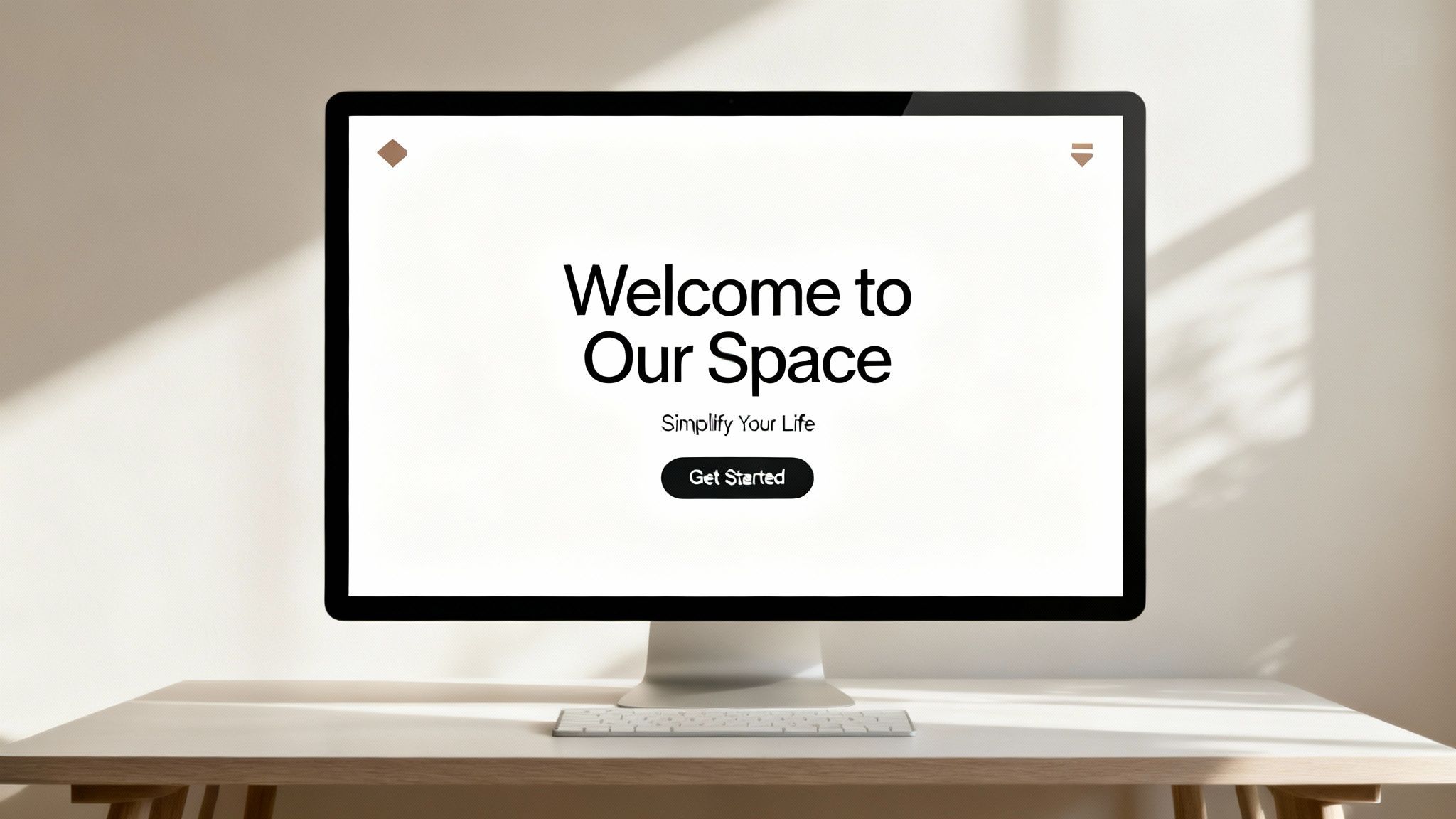
10. Above-the-Fold Optimization and Compelling Hero Section
The "above the fold" area is what a visitor sees on your homepage without scrolling. Optimizing this space with a compelling "hero section" is one of the most critical practices because it determines whether a user stays or leaves. This prime real estate must instantly convey your value, grab attention, and guide visitors toward an action.

A strong hero section combines a powerful headline, a relevant image or video, and a clear call-to-action (CTA) button. For example, a benefit-driven headline like "Great teamwork starts with a digital HQ" paired with a simple "Try for Free" button immediately tells you the benefit and what to do next.
Actionable Tips for an Optimized Hero Section
The goal is to eliminate confusion and create an immediate, positive impression. Every element in this section should have a purpose.
Here are some actionable tips:
- Write Benefit-Focused Headlines: Instead of "AI-Powered Software," try "Create Your Website in 60 Seconds." Focus on the outcome for the user.
- Use High-Quality Visuals: A relevant, high-resolution image or a short, engaging video can communicate your brand's purpose much faster than text alone.
- Ensure a Prominent CTA: Your main call-to-action should be impossible to miss. Use a contrasting color and clear, action-oriented text like "Get Started" or "View Demo."
- Design for Mobile First: What appears above the fold on a desktop is very different from a mobile screen. Prioritize the most crucial elements to ensure they are visible on small devices without scrolling.
Top 10 Homepage Design Best Practices Comparison
| Element | Implementation complexity | Resource requirements | Expected outcomes | Ideal use cases | Key advantages |
|---|---|---|---|---|---|
| Clear Value Proposition | Low–Medium (copycraft + testing) | Copywriter, designer, A/B testing | Reduced bounce; clearer relevance; higher conversions | Homepage hero, landing pages, product intros | Immediate clarity; faster user decisions; SEO support |
| Intuitive Navigation Structure | Medium–High (IA design) | UX research, information architecture, dev work | Faster findability; lower bounce; improved retention | Large sites, e-commerce, content-heavy sites | Better UX; improved accessibility; easier discovery |
| Mobile-First Responsive Design | Medium–High (front-end focus) | Front-end dev, device testing, performance tuning | Better mobile UX; SEO boost; higher cross-device conversions | Mobile-dominant audiences, retail, media sites | Consistent experience; improved performance on mobile |
| Strategic Call-to-Action (CTA) Placement | Low–Medium (design+copy + testing) | Copywriter, designer, analytics, A/B testing | Increased conversion rates; clearer user paths | Signups, trials, purchases, lead-gen pages | Guides user behavior; easy to iterate and optimize |
| Fast Loading Speed & Performance Optimization | High (technical optimization) | Dev engineers, CDNs, monitoring tools, audits | Improved SEO; higher conversions; lower bounce; cost savings | High-traffic, global e-commerce, SaaS platforms | Faster pages; better rankings; improved user satisfaction |
| Social Proof & Trust Signals | Low–Medium (content curation) | Customer outreach, design, legal/verification | Increased trust; higher conversion and retention | New customers, high-consideration purchases, B2B/SaaS | Builds credibility; reduces purchase anxiety |
| High-Quality Visuals & Consistent Branding | Medium (creative production) | Photography/video, designers, brand guidelines | Stronger brand perception; higher engagement | Premium brands, storytelling, product showcases | Professional first impression; differentiation |
| Clear Content Hierarchy & Scannable Layout | Medium (content + design) | Content strategist, copy editor, designer | Improved readability; better SEO; increased engagement | Blogs, docs, marketing pages, long-form content | Faster scanning; improved comprehension and access |
| Accessible Design & WCAG Compliance | High (standards + testing) | Accessibility experts, testing tools, dev fixes | Inclusive audience reach; legal compliance; better UX | Public sector, regulated industries, large userbases | Wider accessibility; reduced legal risk; improved usability |
| Above-the-Fold Optimization & Compelling Hero | Medium (design + copy + media) | Copywriter, designer, media optimization, A/B tests | Lower immediate bounce; stronger first impression; more CTAs | Landing pages, product launches, promotional campaigns | Immediate attention capture; clear CTA visibility |
Putting It All Together: Your Blueprint for a High-Performing Homepage
Your homepage is more than just a digital landing spot; it's your virtual storefront, your lead brand ambassador, and often, the first handshake with a potential customer. Throughout this guide, we've broken down the essential components that transform a good homepage into a great one. We’ve moved beyond abstract theories to provide a concrete framework built on proven homepage design best practices.
The journey from a passive visitor to an engaged customer is paved with intentional design choices. It starts with a powerful, crystal-clear value proposition in your hero section, immediately answering the crucial question: "What's in it for me?" From there, it's about creating a frictionless experience through intuitive navigation and a mobile-first approach, ensuring your site is accessible and effective on any device.
Your Actionable Roadmap to a Better Homepage
Mastering these concepts doesn't require a complete teardown of your existing site. Instead, view it as an iterative process of improvement. The most successful websites are never truly "finished"; they are constantly evolving based on user feedback and performance data.
Here’s a simple plan to get started:
- Start with a Quick Audit: Re-read this list and honestly assess your current homepage against each point. Where are the most significant gaps? A slow loading speed or a confusing navigation menu are often high-impact areas to tackle first.
- Focus on High-Impact Changes: You don't need to fix everything at once. Prioritize the "above-the-fold" experience. Is your headline compelling? Is your primary CTA impossible to miss? Optimizing this small but critical section can yield immediate results.
- Gather Feedback: Ask a friend, a colleague, or a loyal customer to complete a simple task on your homepage, like finding your contact information or understanding what service you offer. Their fresh perspective will reveal usability issues you've become blind to.
Ultimately, a high-performing homepage is an exercise in empathy. It’s about anticipating your user’s needs and guiding them effortlessly toward a solution. By implementing these homepage design best practices, you are not just decorating a webpage; you are building a strategic asset. You are fostering trust with social proof, communicating value through a clear content hierarchy, and creating an inclusive environment with accessible design. This deliberate approach turns your homepage into a reliable engine for growth, consistently converting visitors into loyal customers and advocates for your brand.
Ready to build a stunning homepage that incorporates these best practices from the start? The Solo AI Website Creator empowers you to launch a professional, high-performing website without writing a single line of code. It intelligently designs your site with clear CTAs, mobile-responsive layouts, and optimized structures, so you can focus on your business. Try the Solo AI Website Creator today and bring your vision to life.