How to Improve Website Conversion Rates: A Practical Guide
This article was assisted with AI. We may include links to partners.
To improve your website's conversion rate, you need to find out where your visitors are getting stuck and leaving, then fix those specific issues. It's a straightforward idea: find the problem before you start trying to solve it.
This guide gives you actionable tips to set realistic goals, check your key pages with free tools like Google Analytics, and focus on the pages that are losing visitors.
Diagnosing Your Website Conversion Health
Before making any changes, you need a clear picture of how your website is performing right now. Optimizing without data is like driving in a new city without a map—you're moving, but you don't know if you're getting closer to your destination.
This first phase isn't about becoming a data expert overnight. It's about learning to read the vital signs of your website. The goal is to stop guessing and build a strategy backed by real information. By understanding your current performance and pinpointing where you're losing potential customers, you'll build a solid foundation for growth.
Set Your Performance Benchmarks
First, you need a realistic benchmark. It’s easy to get discouraged by the high conversion rates some companies share online, but performance varies widely by industry and location.
Globally, the average e-commerce conversion rate is between 1.9% and 2.9%. But even that number is tricky. The United States averages 2.3%, while the United Kingdom is at 4.1%, and Italy sits at just 0.99%. You can check these conversion rate benchmarks to get a feel for your specific industry.
Actionable Tip: Your most important benchmark is your own past performance. If you're currently converting at 1.5%, aiming for 1.8% is a fantastic, achievable goal. Small, consistent wins create massive growth over time.
This infographic breaks down the diagnostic process into three simple, actionable steps.
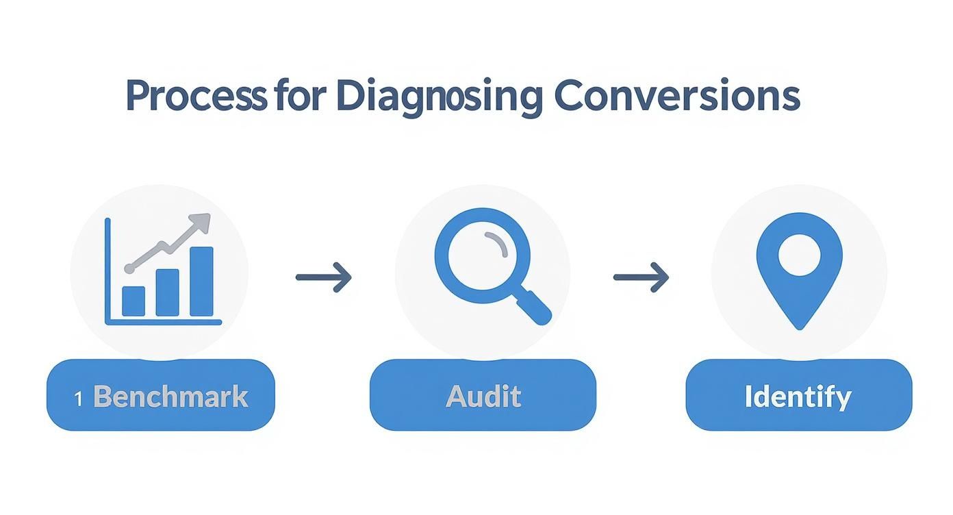
As the visual shows, the path to better conversions starts with setting a benchmark, moves into auditing your site, and finishes by identifying specific problem spots.
Conduct a Simple Website Audit
Your next move is to do a quick audit using powerful, free tools. Google Analytics is your best friend here, giving you the raw data you need to understand user behavior without getting overwhelmed.
If you don't have it set up yet, that's your top priority. Our guide on how to add a site on Google Analytics will get you up and running quickly.
Once it's connected, focus on two key reports that tell a very clear story:
- Behavior > Site Content > Landing Pages: This report shows you the first page a visitor sees. Look for pages with high traffic but also a high bounce rate (people who leave after seeing only that page). A high bounce rate is a huge red flag that there's a disconnect between what the visitor expected and what they found.
- Behavior > Site Content > Exit Pages: This is the opposite—it reveals the last page someone saw before they left. If your checkout page or contact form is high on this list, you've found a critical problem that needs to be fixed immediately.
Identify Where Users Abandon Their Journey
With this audit data, you can start connecting the dots. Are visitors leaving your product pages in large numbers? Maybe the product descriptions are confusing, or the "Add to Cart" button is hard to find.
For example, if your "Pricing" page has a very high exit rate, that's a clue. It could mean your pricing is unclear, seems too high, or isn't presented with enough value to justify the cost.
The data itself won't give you the solution, but it tells you exactly where to start looking. This focused approach ensures you’re not wasting time on changes that don’t matter. Instead, you're directly addressing user friction, which is the key to improving your website's conversion rates.
Your Conversion Rate Optimization Priority Matrix
To help you figure out where to start, use a simple priority matrix. This helps you weigh which optimizations will give you the biggest impact for the least amount of work. Focus on the high-impact, low-effort tasks first—these are your quick wins.
| Optimization Area | Potential Impact | Effort Level | First Steps |
|---|---|---|---|
| Homepage CTA | High | Low | Rewrite the headline and button text to be more specific and compelling. |
| Checkout Process | High | High | Map the user journey, identify drop-off points in Analytics, and simplify the form fields. |
| Product Pages | High | Medium | Add higher-quality images, write more detailed descriptions, and feature customer reviews prominently. |
| Landing Page Copy | Medium | Low | A/B test a new headline that directly addresses a major customer pain point. |
| Site Speed | Medium | Medium | Run a PageSpeed Insights report and compress your largest images first. |
| Navigation Menu | Low | Low | Simplify the menu options to only include the most critical pages. |
Use this framework to turn your audit findings into an actionable to-do list. It brings clarity to the process and makes sure your effort is always focused where it will make the biggest difference.
How Site Speed Directly Boosts Conversions

Think of your website like a physical store. A fast site is like having no lines at the checkout. In our impatient world, every extra second a visitor has to wait for your page to load dramatically increases the chances they'll leave and never come back.
This isn't a small issue; it's a direct leak in your revenue.
When someone lands on your site, their interest is at its peak. A slow page immediately creates friction and doubt, making your business feel less professional and trustworthy. Faster sites, on the other hand, feel more reliable, keeping people engaged long enough for you to show your value and make the sale.
The Financial Impact of a Single Second
The link between speed and conversions is backed by clear data. For instance, websites that load in just one second see conversion rates 2.5 times higher than sites that take five seconds to load. That gap only gets wider the slower a site gets.
This means that cutting even a single second off your load time can have a massive, positive impact on your bottom line. It's one of the most effective things you can do to improve conversions without changing your copy or design.
Making Sense of Speed Metrics
Technical terms around site speed can feel overwhelming, but you only need to understand a few key concepts. Don't get bogged down in complex jargon; just focus on what they mean for your visitors.
First Contentful Paint (FCP) is a good example. It simply means "how long it takes for the very first piece of content to show up on the screen." That could be text or an image. A fast FCP is crucial because it reassures visitors that the page is working, which stops them from leaving.
It's like walking into a restaurant. FCP is the moment a host makes eye contact and says, "Be right with you!" If you stand at the door for 30 seconds with no one in sight, you’re probably leaving. The same thing happens on your website.
Identifying Your Speed Bottlenecks
So, where do you start? Free tools like Google's PageSpeed Insights are perfect for this. Just enter your website's address, and it will give you a performance score along with a checklist of specific recommendations.
You don’t need to be a developer to understand the report. It often flags common issues that are surprisingly easy to fix.
Here are the usual problems:
- Unoptimized Images: Large, high-resolution photos are the #1 cause of slow websites. Actionable Tip: Always use a compression tool to reduce image file sizes before you upload them.
- Too Many Plugins or Scripts: Every add-on can slow down your site. Actionable Tip: Go through your plugins and deactivate any you aren't actively using.
- Clunky Code: This is where a platform like the Solo AI Website Creator really helps. It generates clean, optimized code automatically, so you don't have to worry about inefficient scripts dragging you down.
Fixing these core issues is a fundamental step. If you want to learn more, check out our complete guide on how to optimize website speed for more advanced techniques. Prioritizing speed means prioritizing your user's experience—and that’s the real secret to unlocking higher conversions.
Mastering a User Experience That Guides Action
Great design is more than just how your site looks; it's a silent guide that makes it easy for visitors to do what you want them to do. A powerful user experience (UX) isn't about flashy animations. It’s about understanding how people see, process, and act on the information you present.
The moment someone lands on your site, they quickly ask three questions: "Where am I?", "What can I do here?", and "Why should I do it?". Your design must answer these instantly. A confusing layout creates friction, and friction kills conversions. Every element, from your headline to your footer, must work together to create a clear, intuitive path to action.
Create a Clear Visual Hierarchy
Visual hierarchy is about controlling where your visitors look first, second, and third. You intentionally make certain elements stand out to guide their attention straight to your most important goal, like a "Get Started" button. Think of it like a spotlight on a stage, directing the audience's gaze.
People don't read web pages word-for-word; our eyes are naturally drawn to larger text, brighter colors, and images of faces. You can use these tendencies to your advantage.
- Size and Scale: Your main message—your value proposition—should be in the largest font. Supporting details get progressively smaller.
- Color and Contrast: A call-to-action (CTA) button in a color that stands out from the page background will instantly draw the eye. An orange button on a mostly blue page is impossible to ignore.
- Strategic White Space: Don't cram your page full of content. Giving elements room to breathe makes the important ones stand out more. White space reduces the mental effort needed to scan the page, making it feel clean and easy to navigate.
By setting up a clear hierarchy, you remove the guesswork for your visitors. They don't have to search for what to do next because you've already shown them the way.
Prioritize Intuitive Navigation
If a visitor can't find what they're looking for within a few seconds, they're gone. Your navigation menu should be simple, logical, and predictable. This isn't the place to get creative; stick to standard terms everyone understands, like "Services," "About," and "Contact."
Imagine walking into a grocery store where the aisles aren't labeled. You'd get frustrated and leave. Your website's navigation is no different. It’s the main tool visitors use to look around, and if it's confusing, they won't stick around long enough to become a customer.
A study found that 38% of people will stop engaging with a website if the content or layout is unattractive. This shows how critical a clean, simple user experience is for keeping potential customers on your site.
Actionable Tip: A local bakery's website needs clear navigation links like "Our Cakes," "Order Online," and "Visit Us." A vague menu with artsy terms like "Creations" would just create confusion and increase their bounce rate. Stick to what people know.
Design for Mobile First
Thinking "mobile-first" is no longer an option; it's essential. More than half of all web traffic now comes from mobile devices. A mobile-first approach means you design the experience for the smallest screen first, then adapt it for larger screens like desktops.
This forces you to prioritize what truly matters. On a small screen, there's no room for clutter. You have to focus on the core message and the primary call-to-action.
- Make buttons large and tappable. Ensure there's enough space around them to prevent accidental clicks.
- Use a simple, single-column layout. This makes your content easy to scroll through on a narrow screen.
- Keep forms short. Typing on a phone is difficult, so only ask for the information you absolutely need.
Tools like the Solo AI Website Creator handle this for you automatically, ensuring your design is responsive and looks great on any device without you having to do anything. This built-in feature removes a huge technical headache and guarantees a seamless experience for every visitor, which is a massive step toward improving your website's conversion rates.
Crafting Copy and CTAs That Actually Convert
If your website's design is its body, then your copy—the actual words on the page—is its voice. A beautiful site with flat, uninspired copy is like a salesperson who looks sharp but has nothing compelling to say. The words you use have one job: to persuade visitors that you understand their problem and have the exact solution they need.
This isn't about becoming a professional writer. It's about empathy. You know your customers better than anyone, so your copy just needs to reflect that. When you speak directly to their needs and goals, visitors feel understood. That's the foundation of trust, and trust drives conversions.
Write Headlines That Solve Problems
You have about three seconds to convince a visitor to stay on your page. Your headline shouldn't just describe what you do; it needs to communicate the value you provide from the moment the page loads. A great headline instantly answers the visitor's unspoken question: "What's in it for me?"
Actionable Tip: Instead of a generic headline like "Professional Landscaping Services," use one that sells the outcome, such as, "Get a Greener, Healthier Lawn Without Lifting a Finger." The second one sells a benefit—a beautiful lawn with zero effort—not just a service.
Your headline’s job is to make a powerful promise. The rest of your copy’s job is to prove you can deliver on it. This simple shift in mindset can completely change how you approach writing for your website.
Focus on the biggest pain point your customer is facing. Are they wasting time? Losing money? Feeling overwhelmed? Frame your headline around solving that specific problem. This approach grabs the attention of your ideal customer immediately because you’re talking about their world, not just yours.
Create Calls to Action That Inspire Movement
Your Call to Action (CTA) is the most important piece of copy on any page. It's the final instruction that tells a visitor what to do next. Vague CTAs like "Submit" or "Click Here" are conversion killers because they create no excitement or clarity.
Effective CTAs use strong, action-oriented words and clearly state what the user gets by clicking.
- Instead of "Sign Up," try "Get Your Free Marketing Plan." This tells them exactly what they're getting.
- Instead of "Buy Now," try "Start My 30-Day Free Trial." This removes the risk and highlights a key benefit.
- Instead of "Contact Us," try "Request a Free Quote Today." It's specific and implies a tangible outcome.
Make your CTA buttons stand out with a contrasting color, but let the words do the heavy lifting. The language should feel like the logical, exciting next step in the visitor's journey.
Leverage the Power of Social Proof
People trust other people far more than they trust marketing messages. Social proof is the idea that we look to the actions of others to guide our own behavior. On a website, this means using testimonials, reviews, and case studies to build instant credibility.
Placing a glowing testimonial right next to a CTA can have a massive impact because it provides last-second reassurance. In fact, studies show that displaying customer reviews can increase conversions by as much as 270% by building trust.
- Get Specific: Don't settle for "Great service!" A testimonial that says, "This service saved our team 10 hours a week," is much more powerful.
- Use Real Names and Photos: Attributing quotes to real people with a photo adds a layer of authenticity.
- Place it Strategically: Put social proof on your homepage, product pages, and especially near your checkout or sign-up forms.
When you integrate these elements, you show visitors that real people just like them have already found success with you. That proof is often the final nudge someone needs to become a customer.
Putting all these conversion strategies into practice can feel overwhelming. You have to analyze data, tweak designs, and rewrite copy all at once. This is where modern tools can help, and the Solo AI Website Creator is a perfect example of how to make optimization simpler.
This isn't about learning complex software. Think of it as a smart assistant that handles the technical work for you. That frees you up to focus on your overall strategy.
Let’s break down how its features directly solve the conversion challenges we’ve been talking about.
Effortless A/B Testing Without Touching Code
A/B testing is one of the most powerful ways to boost your conversion rates, but it has historically been a technical and time-consuming process. You would usually need a developer just to set up different versions of a page.
The Solo AI Website Creator removes that barrier. You can duplicate any page with a single click and then start editing the new version right away.
Imagine you want to test two different headlines on your homepage. The process is simple:
- Duplicate Your Page: Create a copy of your homepage within the platform.
- Change One Thing: On that new version, swap out only the headline for your alternative.
- Watch What Happens: Use the built-in analytics to see which version brings in more leads or sales.
This straightforward workflow means you can start testing button colors, calls to action, or images without writing any code. It makes data-driven decision-making a practical reality for any business owner.
Built-in Speed and Mobile Optimization
We've already established that site speed and mobile experience are critical. A slow, clunky site on a smartphone is a surefire way to lose a sale. Manually optimizing for these things can be a huge technical headache.
The Solo AI Website Creator handles this for you automatically.
- Automatic Image Compression: When you upload images, the platform optimizes them for the web automatically, giving you faster load times without sacrificing quality.
- Mobile-First by Default: Every template and design is built to be responsive. Your site will look and work perfectly on any device, from a small phone to a large desktop monitor.
The real benefit is that you're starting with a fast, user-friendly foundation. You don't have to fix performance issues later—they’re prevented from the start, giving every visitor a smooth experience.
If you’re just getting started, you can get a full rundown on this powerful tool in our introduction to the Solo AI Website Creator.
Making Sense of Analytics and User Behavior
Changing your website is only half the battle. You have to know if those changes are actually working. Digging into analytics can be intimidating, but it's the only way to understand how people are interacting with your site.
Solo AI Website Creator integrates with Google Analytics and makes it easier to see the impact of your work. Once you publish an update—like new CTA copy—you can easily monitor its effect.
You can track key metrics like page views, how long people stay on a page, and most importantly, goal completions. This tells you if your changes are actually improving your results. It's this direct feedback loop that turns guesswork into a repeatable system for growth. You make a change, measure the result, learn from it, and then apply that knowledge to the next improvement.
To bring it all together, here's a quick look at how the tool's features map directly to common optimization tasks.
Solo AI Website Creator Features for CRO Tasks
| CRO Task | Relevant Solo AI Website Creator Feature | How It Helps |
|---|---|---|
| Testing headlines and CTAs | One-click page duplication | Lets you create variants for A/B testing in seconds without any coding. |
| Improving page load speed | Automatic image optimization | Compresses images on upload to ensure fast performance without manual effort. |
| Reducing mobile bounce rates | Built-in responsive design | Guarantees your site looks great and is easy to use on all devices, right out of the box. |
| Measuring the impact of changes | Seamless analytics integration | Connects to Google Analytics so you can track metrics and see if your optimizations are working. |
| Updating on-page content | Intuitive drag-and-drop editor | Allows you to quickly change text, images, and layouts to test new ideas instantly. |
This table shows how you're not just getting a website creation tool, but a toolkit designed to help you actively improve your site's performance over time.
Common Conversion Rate Questions Answered

As you dive into optimizing your website, you're bound to run into some questions. Let's tackle some of the most common ones so you can move forward with confidence.
What Is a Good Conversion Rate to Aim For?
This is a common question, but there's no single magic number. You'll see global averages around 2-3%, but a "good" rate is completely tied to your industry, how people find you, and what you're selling.
For instance, a niche e-commerce store might have a conversion rate over 4%, while a high-end B2B software company might celebrate a 1.7% rate from their demo requests. Context is everything.
Actionable Tip: Instead of focusing on a universal benchmark, your real goal should be to consistently improve your own numbers. If your site converts at 1% today, aiming for 1.2% next month is a huge win. That's how you build real, sustainable momentum.
Progress over perfection is the key to building a website that grows your business.
How Long Until I See Results from These Changes?
It depends. Some tweaks can deliver an immediate impact, while others take longer to show results.
You could see a lift in just a few days from simple, high-impact fixes, like improving your site speed or rewriting a confusing call-to-action on your most popular page.
On the other hand, A/B tests need time to collect enough data to be meaningful. Depending on your traffic, that could take anywhere from a week to a month. The key is to be patient and keep tracking your results—foundational changes often yield the most significant long-term growth.
What Is the Single Most Important Factor for Improving Conversions?
If I had to choose one thing, it's clarity.
The second a visitor lands on your site, they need to effortlessly understand three things:
- What do you offer?
- How does it make my life better?
- What should I do next?
This principle applies to every part of your site, from the main headline and your value proposition to the navigation and CTA buttons. Before you start A/B testing button colors, make absolutely sure your core message is crystal clear. Cutting through confusion is the foundation of all successful conversion optimization.
Do I Need a Lot of Traffic to Start Optimizing?
Not at all. You can and should start optimizing right now, no matter how many visitors you have.
High traffic lets you run A/B tests much faster. But websites with lower traffic can use something just as powerful: qualitative data. This helps you uncover the why behind what people are doing on your site.
Here are a few methods that work for a site of any size:
- User Session Recordings: Watch real people navigate your site. You'll quickly see where they get confused or stuck.
- Heatmaps: These visual guides show you where users are clicking and scrolling. It's a great way to see what's grabbing their attention and what's being ignored.
- Direct Customer Feedback: Just ask! Send a quick email to recent customers and ask them about their experience on your site. You'll be amazed at the insights you get.
This kind of feedback gives you deep insights that raw analytics can't. Making changes based on what you learn is a powerful strategy at any traffic level.
Ready to put these ideas into action without getting bogged down in code? The Solo AI Website Creator gives you the tools to easily test ideas, optimize for speed, and build a user experience that gets results.
Start building your high-converting website for free at soloist.ai