How to Make Website Mobile Friendly: Quick UX Guide
This article was assisted with AI. We may include links to partners.
Making a website mobile-friendly means ensuring it works perfectly on any screen, from a desktop monitor to a smartphone. This is called responsive design, and it's no longer optional—it's essential for keeping visitors on your site and ranking well on Google.
Why Your Website Must Be Mobile Friendly Today

A website that isn't built for mobile phones is a direct problem for your business. When a visitor has to pinch and zoom just to read a sentence, they won't stay. They'll leave and go to a competitor with a better website.
Think of a clunky mobile site as a physical store with a door too small for most customers to enter. You'd fix that door immediately. Your website is no different.
The Real Cost of a Poor Mobile Experience
The internet is now primarily mobile. Back in 2015, mobile devices accounted for just under 35% of website visits. Today, that number has jumped to 64.35% of global web traffic.
This means that for every ten visitors, six or seven are likely using a phone. You can learn more about these mobile traffic statistics to see the full picture.
This shift has changed how search engines like Google rank websites.
Google now uses "mobile-first indexing," which means it primarily evaluates the mobile version of your site to determine its search ranking. If your mobile site is difficult to use or has missing content, your search rankings will drop across all devices, not just phones.
A poor mobile experience directly impacts your revenue. It's about accessibility, user trust, and sales. Here’s what happens when your site isn't mobile-friendly:
- Actionable Tip: Frustrated users leave within seconds, increasing your bounce rate. This signals to Google that your site isn't helpful, which hurts your search ranking.
- Actionable Tip: Trying to buy something or fill out a form on a clunky mobile site is a nightmare. This leads directly to abandoned carts and lost leads. Fix this by ensuring forms and buttons are large and easy to tap.
- Actionable Tip: A website that looks broken on a phone makes your business seem unprofessional and outdated. This erodes trust before you can even make a first impression.
Making your site work well on mobile is a core business strategy for survival and growth.
Understanding Responsive Web Design

Responsive design isn't about building separate sites for desktop and mobile. It's about creating a single, flexible website that automatically adjusts its layout to fit any screen size. This means one site provides a seamless experience for every visitor.
The Core Techniques of a Responsive Layout
Here’s a simple breakdown of the technology that makes responsive design work.
- The Viewport Meta Tag: This is a small piece of code in your site's header that tells the mobile browser how to control the page's dimensions and scaling. Without it, the browser shrinks your entire desktop page, forcing users to pinch and zoom. This tag tells the browser, "Set the viewing area to match the device's screen width."
- Fluid Grids: Instead of using fixed sizes like pixels, fluid grids use relative units like percentages for widths. This allows columns and page sections to stretch or shrink to fit whatever screen space is available, like a rubber band instead of a rigid ruler.
- Flexible Media: This applies the same stretchy concept to your images and videos. They automatically resize to fit within their containers, preventing them from breaking the layout or spilling off the screen on smaller devices.
Mobile-First vs. Desktop-First: Which Is Better?
There are two main approaches to building a responsive site. The older "desktop-first" method involved designing for a large screen and then removing elements to make it fit smaller ones.
Today, the "mobile-first" strategy is the standard. You begin by designing for the smallest screen, which forces you to focus on the most essential content and features. As you design for larger screens, you can add more elements. This results in a cleaner, faster, and more focused experience for all users.
Of course, a great website also needs to incorporate the key elements of modern website design.
By starting with mobile, you build a stronger, more efficient foundation that scales up effectively, rather than a cluttered desktop site that has to be stripped down.
If this sounds too technical, don't worry. Modern tools handle these details for you. For instance, the Solo AI Website Creator builds these principles into every site automatically. You can also explore other options in our guide to the best responsive website builders.
Key Responsive Design Techniques at a Glance
Here’s a quick summary of the essential techniques for a mobile-friendly layout.
| Technique | What It Does | Actionable Tip |
|---|---|---|
| Viewport Meta Tag | Tells the browser to set the page width to the device's screen width. | Add <meta name="viewport" content="width=device-width, initial-scale=1.0"> to the <head> of your HTML to prevent the "pinch-and-zoom" issue. |
| Fluid Grids | Uses relative units (like %) instead of fixed units (like px) for layout widths. | Use percentage-based widths in your CSS (e.g., width: 100%;) so your layout adapts smoothly to any screen. |
| Flexible Media | Ensures images and videos scale down proportionally within their containers. | Apply max-width: 100%; and height: auto; to your images and videos in CSS to stop them from breaking the layout. |
| Media Queries | Applies different CSS styles based on the screen's size or orientation. | Use media queries to fine-tune your design, like increasing font size (@media (max-width: 600px) { body { font-size: 16px; } }) on smaller screens for readability. |
These four pillars work together to ensure every visitor has a great experience, no matter the device.
How to Boost Your Website Speed for Mobile Users

A beautiful mobile site that loads slowly is useless. Mobile users are impatient; a few seconds of delay will cause them to leave. Research confirms that 53% of mobile visitors will leave if a page takes longer than three seconds to load. You can find more data on how load times impact mobile website design best practices.
Shrink Your Images Without Losing Quality
Large images are a primary cause of slow load times. The goal is to reduce the file size (in kilobytes or megabytes) without making your photos look blurry. This is done through image compression.
- Actionable Tip: Choose the right file format. Use JPEG for photos and PNG for graphics with transparency. Modern formats like WebP offer even better compression and quality.
- Actionable Tip: Use free online tools like TinyPNG or Squoosh to compress your images before uploading them. If you use a modern platform like the Solo AI Website Creator, this optimization is often done for you automatically.
Clean Up Your Code and Use Caching
Your site's code can also slow things down. "Minifying" your code means removing unnecessary characters like spaces and comments from your HTML, CSS, and JavaScript files. This makes the files smaller and faster to download.
Browser caching is another powerful speed-boosting technique. It allows a visitor's web browser to save parts of your website (like your logo and fonts) on their device.
Actionable Tip: When a user revisits your site, their browser can load these saved files from its local "cache" instead of re-downloading them. This makes repeat visits feel almost instant. You can enable caching through your website's hosting control panel or by using a plugin if you're on a platform like WordPress.
These are not minor tweaks; they create a measurable improvement in performance, leading to lower bounce rates and higher conversions. For more tips, see our guide on how to optimize website speed.
Going Beyond Responsive: Nailing the Mobile Experience
Making your site fit a small screen is just the first step. The real goal is to create a mobile experience that feels natural and easy. A great mobile site is designed around how people actually use their phones.
This is where "thumb-friendly" design is key. People scroll and tap with their thumbs, so your most important buttons and links should be within easy reach. A "Buy Now" button in the top-left corner might work on a desktop, but it's a frustrating stretch for a mobile user.
Make Navigation a Breeze, Not a Chore
A frustrating navigation experience will make mobile visitors leave. One of the biggest issues is trying to tap a tiny link or button.
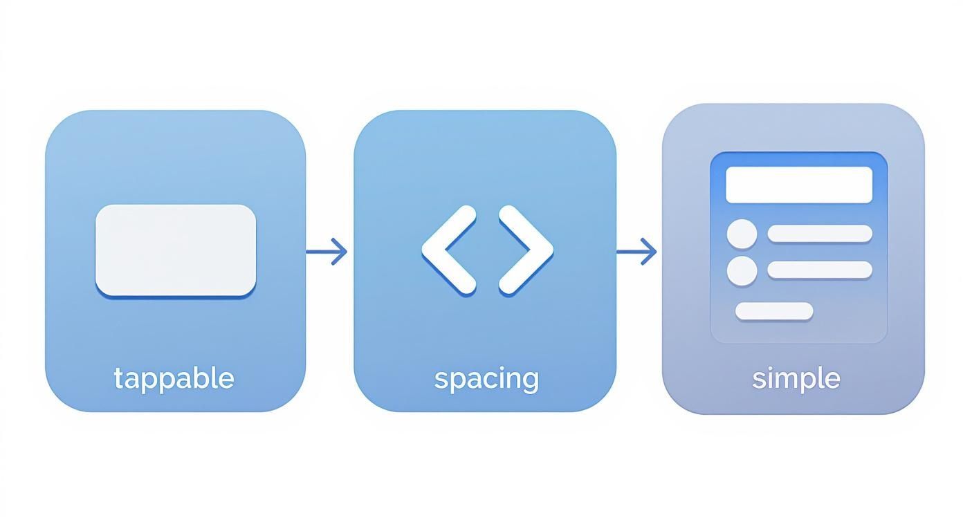
- Actionable Tip: Make buttons and tap targets large, at least 44×44 pixels. This gives thumbs a clear target and prevents accidental clicks.
- Actionable Tip: Use plenty of white space around links and buttons. This visual cushion is the easiest way to prevent users from tapping the wrong thing.
- Actionable Tip: Simplify your forms. Typing on a phone is difficult, so only ask for essential information. For number fields, ensure the numeric keypad automatically appears. Every tap you save for the user improves their experience.
A website that works on a phone is functional. A website that is a pleasure to use on a phone turns visitors into customers.
These thoughtful details are what separate a merely responsive site from a truly mobile-friendly one. Tools like the Solo AI Website Creator are built with these principles in mind, giving you a head start.
If you don't want to deal with code, modern tools can handle all the technical work. Platforms like the Solo AI Website Creator are designed to automatically create responsive layouts. The AI intelligently structures your content and handles performance tweaks like image compression, ensuring your site is fast and looks professional on any device.

The key takeaway is that an excellent mobile experience is about making interactions effortless for people who are likely on the go and in a hurry.
When you use a tool specifically designed for this, you get a site built with mobile-first best practices from the start. It’s a shortcut to getting it right the first time.
How to Test Your Mobile-Friendly Website
After building your site, you must test it. You can check your site’s mobile performance with a couple of powerful, free tools.
Your first stop should be Google’s Mobile-Friendly Test. Enter your website’s URL, and you'll get a clear pass-or-fail result in under a minute. This is an essential check from the world's biggest search engine.
See Your Site Through Your Users' Eyes
While Google's test gives a quick verdict, you also need to see how your site actually looks and feels on different screens. You can do this right from your computer's web browser.
If you use Google Chrome, use the device emulator in Chrome DevTools.
- Actionable Tip: Open your website in Chrome. Right-click anywhere on the page and select "Inspect". Then, click the small phone-and-tablet icon in the top-left of the panel that opens.
Your website view will instantly switch to a mobile screen size. You can then use the dropdown menu to see how your site appears on various devices, like an iPhone 14 Pro or a Google Pixel 7.
This hands-on testing helps you spot real-world problems: a button too close to another link, text that wraps awkwardly, or an image that doesn't scale correctly. It's much better for you to find these issues than for a potential customer to discover them.
Regular testing is a key part of maintaining your site. To ensure your efforts are effective, consider performing a comprehensive website audit to find other areas for improvement.
If you're using a platform like the Solo AI Website Creator, responsive checks are part of the design process. However, it’s always a good idea to do your own final review.
Got Questions? We’ve Got Answers
How Do I Know if My Website Is Already Mobile-Friendly?
The fastest way to check is with Google's Mobile-Friendly Test tool. It's free and easy to use. Just enter your website's URL, and Google will give you a clear "yes" or "no" and report any issues it finds.
What’s the Real Difference Between Responsive and Adaptive Design?
Responsive design uses one flexible layout that flows to fit any screen size, like water. Adaptive design uses a few fixed layouts for specific screen sizes (e.g., one for phones, one for tablets, one for desktops). Responsive design is the modern standard because its fluid approach works better across the vast range of screen sizes available today.
Can I Make My Existing Website Mobile-Friendly Without a Full Redo?
Sometimes, yes. If your site isn't too old, you may be able to add responsive code and optimize your media. However, for older websites, trying to retrofit responsive features can be more difficult and time-consuming than starting over. In such cases, rebuilding with a modern, mobile-first platform is often faster, more cost-effective, and produces a better result.
Ready to stop worrying about mobile performance for good? Let the Solo AI Website Creator build you a stunning, automatically responsive site in minutes. Launch your mobile-friendly website today!
