Optimizing your website's images is a simple formula: pick the right format, use the right dimensions, and shrink the file size without ruining the quality. Getting this process right is one of the most powerful things you can do to speed up your site, improve visitor experience, and boost your SEO.
Why Image Optimization Is a Game Changer for Your Website

Before we jump into the how, let’s quickly cover the why. Huge, unoptimized images are the number one cause of slow websites. When a visitor lands on your page, their browser has to download every single element, and large images act like anchors, dragging down your load time.
This delay isn't just a minor annoyance; it directly impacts your success. People have no patience for slow pages. A few seconds can be the difference between gaining a customer and losing them to a competitor.
The Real-World Cost of Slow Images
Slow-loading images don't just affect your site's speed—they impact your revenue and search engine rankings. Google uses page speed as a major ranking factor, focusing on metrics like Largest Contentful Paint (LCP). LCP measures how quickly the largest, most important content on the page loads. Often, the largest element is that big hero image at the top.
The financial impact is just as significant. E-commerce studies have shown that a one-second improvement in load time can lead to a noticeable increase in conversions. This isn't just a technical task; it's a core business strategy.
Actionable Tip: A delay of just one second in page load time can lead to a 7% reduction in conversions. For an e-commerce site making $100,000 per day, that one-second delay could cost over $2.5 million in lost sales every year.
Tangible Benefits of Optimizing Your Images
When you optimize your images, you unlock direct benefits that fuel your website's growth. The payoff goes far beyond just a faster page.
Here’s what you stand to gain:
- Improved User Experience: A fast, experience keeps people on your site longer and encourages them to explore, which can significantly lower your bounce rate.
- Higher SEO Rankings: Search engines reward fast websites with better visibility in search results, leading to more organic traffic.
- Increased Conversions: There's a direct link between faster load times and better conversion rates, whether you're selling products, collecting sign-ups, or generating leads.
To fully understand why this is so critical, it's worth reading about the importance of website speed performance. And if you're ready to optimize beyond images, our guide on how to optimize website speed covers the complete picture.
Choosing the Right Image Format
Not all image files are the same. Picking the right format is the first and most important step in optimizing your website's images. Using the wrong format is like using a moving truck to carry a single bag of groceries—it leads to bloated files that slow your site down.
You'll mainly work with four key formats: JPEG, PNG, WebP, and AVIF. Each has a specific purpose. A vibrant photograph has different technical needs than a simple logo requiring a transparent background. Getting this choice right puts you ahead from the start.
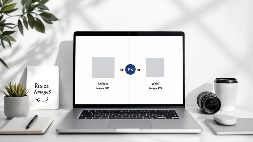
Just look at the difference proper optimization can make.

As you can see, a simple compression can shrink an image file by over 68%. That's a massive win for your page load time.
Traditional vs Modern Formats
For years, JPEG and PNG were the standard for web images. They are still reliable and universally supported, but they aren't always the most efficient options available today.
- JPEG (or JPG): Your go-to for photographs and complex images with millions of colors. It uses "lossy" compression, which means it intelligently removes small bits of data you won't notice to shrink the file size.
- PNG: Use PNG for graphics that need a transparent background, like logos, icons, or illustrations with sharp lines. It uses "lossless" compression, preserving every pixel of the original, but this results in a larger file size.
Actionable Tip: Modern "next-gen" formats like WebP and AVIF offer the best of both worlds: incredible quality and tiny file sizes. They can often reduce files by an additional 25-50% compared to JPEG and PNG.
Luckily, you don't always have to manage this manually. Modern tools like the Solo AI Website Creator can automatically convert and serve the best format for each visitor's browser, ensuring your site is as fast as possible with no extra work from you.
To help you decide, here's a quick rundown of the most common formats.
Comparing Common Image Formats
| Format | Best For | Key Feature | Typical File Size |
|---|---|---|---|
| JPEG | Photographs, complex images with gradients. | Lossy compression, great for quality vs. size balance. | Small to Medium |
| PNG | Logos, icons, graphics needing transparency. | Lossless compression, preserves exact detail. | Medium to Large |
| WebP | All-around replacement for JPEG and PNG. | Superior lossy and lossless compression. | Very Small |
| AVIF | The absolute smallest file sizes possible. | Cutting-edge compression, even smaller than WebP. | Smallest |
WebP is the best choice for most websites today, offering huge file size savings with excellent quality.
Embracing WebP and AVIF
WebP and AVIF are formats designed for the modern web. Their superior compression means your images look just as sharp but load much faster. While browser support was once a concern, it's no longer an issue.
A quick check on a resource like Can I Use shows that WebP support is nearly universal across all major browsers.
Actionable Tip: For the rare visitor on an old browser, you can set up "fallbacks." This tells the browser to load a JPEG or PNG if it can't handle the modern format. This way, most of your visitors get a lightning-fast experience, and no one sees a broken image.
Mastering Image Resizing and Compression
This is where you’ll achieve the biggest improvements in your site speed. Correctly resizing and compressing your images has a massive impact, and you don't need to be a designer to do it well.
First, let's clarify two common terms: image dimensions and file size are not the same thing.
Dimensions are the image's width and height in pixels (e.g., 1920px by 1080px). File size is the amount of storage space it occupies, measured in kilobytes (KB) or megabytes (MB). Your goal is to reduce both as much as possible without making your images look pixelated.
With high-resolution screens and mobile devices, average image file sizes have increased. This makes optimization more crucial than ever.
Actionable Tip: A good rule of thumb is to resize images to a maximum width between 1280px and 1920px. The most important target is the file size: aim to keep every image under 200KB. Lean and fast always wins, especially on mobile connections.
Resizing to the Perfect Dimensions
Before you compress an image, you must resize it. Uploading a massive 4000px photo directly from a camera will destroy your page speed. An image only needs to be as large as the container it will fill on the screen.
Consider where the image will be used on your site:
- Full-Width Hero Image: This banner needs to be around 1920px wide to look sharp on a standard desktop monitor.
- Blog Post Thumbnail: A smaller image, around 800px wide, is usually sufficient.
- Team Member Headshot: These are typically small, perhaps 250px by 250px.
Resizing first is a mandatory step. It removes unnecessary pixel data, which dramatically reduces the initial file size.
Choosing Your Compression Method
Once your image has the right dimensions, it's time to compress it. This process removes more data to make the file smaller. There are two main types of compression.
Lossy vs. Lossless Compression
- Lossy: This is the standard for most web images. It makes files much smaller by permanently removing some data. For most photos, you won’t notice any quality difference.
- Lossless: This method reduces the file size without discarding any data, so the quality remains perfect. The file sizes are larger, making it best for logos or simple graphics where every pixel matters.
For almost every photo on your website, lossy compression offers the best balance of small file size and great visual quality.
Online tools like Squoosh make this process simple. Drag your image into the tool, adjust the compression slider, and you’ll see a real-time preview of the quality and final file size.

The side-by-side view allows you to see the original next to the compressed version, giving you full control over the final result before you download it.
If you handle hundreds of images regularly, you might consider how image automation can simplify your workflow. For most users, creating a simple, repeatable process is enough to turn bulky photos into lean, web-ready assets that load instantly.
Optimizing Images for SEO
Making your images load quickly is a huge win, but it's only half the battle. Images are also powerful assets for improving your search engine rankings. By providing search engines like Google with the right context, you can turn a simple picture into a tool that helps new customers find you.
It starts with something simple that most people ignore: the file name. Search engine crawlers can’t “see” an image, but they can read its name. A filename like IMG_7890.jpg tells them nothing.
Actionable Tip: Instead of a generic filename, use a descriptive one like blue-suede-running-shoes.jpg. This gives crawlers clear information about the image's content, helping your images appear in Google Images search and strengthening your page's relevance for that keyword.
Writing Alt Text That Actually Works
Alt text (alternative text) is a short, written description of an image that you add to your website's code. It serves two critical functions. First, it makes your site accessible to visually impaired users who use screen readers. Second, it gives search engines a clear, text-based description of the image.
Good alt text is about being descriptive and helpful, not stuffing keywords. The best approach is to describe the image as if you were explaining it to someone over the phone.
- Bad Alt Text: "shoes"
- Okay Alt Text: "blue running shoes"
- Great Alt Text: "A pair of royal blue suede running shoes with white laces on a wooden floor."
The "great" example provides specific details that are useful for both accessibility and helping Google understand the image in context. For a refresher on the bigger picture, our guide on SEO basics for the Solo AI Website Creator is a great starting point.
Alt text is your best opportunity to tell search engines what an image is about. A well-written description improves accessibility—which Google values—and directly contributes to your on-page SEO, helping your content rank for more specific search queries.
Beyond the Basics with Image Sitemaps
If your website is visually intensive, like a photography portfolio or an e-commerce store, an image sitemap is a valuable tool. It's a special file you can submit to Google that lists all the images on your site, ensuring that crawlers discover and index every one. This is especially useful for images loaded with JavaScript, which crawlers can sometimes miss.
This level of technical detail will only become more important. As search engines rely more on AI to interpret visual content, descriptive alt text and structured data from sitemaps will be crucial for being discovered. You can read more about these trends in these technical SEO statistics that you must know in 2025.
Use Lazy Loading and a CDN for the Finishing Touches
You've done the heavy lifting: your images are resized, compressed, and properly named. Now, there are two more powerful techniques that work behind the scenes to deliver those images to your visitors at top speed: lazy loading and using a Content Delivery Network (CDN).
These methods optimize how your images are delivered, not just the images themselves.

Think of it this way: resizing and compression are like preparing ingredients to cook faster. Lazy loading and CDNs are your efficient delivery service, ensuring the meal arrives hot and fresh.
What Is Lazy Loading?
Lazy loading is a simple but effective technique. Instead of forcing a browser to download every image on a page upon initial load, lazy loading tells the browser to wait and only download an image just before it’s about to scroll into view.
Imagine a long blog post with 20 photos. Without lazy loading, the browser tries to download all 20 at once, slowing down the initial page load. With lazy loading, it only loads the first few images at the top, making the page feel almost instant. The rest load smoothly as the user scrolls.
This is especially beneficial for mobile users on slower connections, as it improves the perceived load time by displaying the most important content first.
How to Implement Lazy Loading
Implementing lazy loading is easier than ever. Here are your options:
- Native Browser Support: Most modern browsers support lazy loading natively. Simply add
loading="lazy"to your image tag in the HTML. - Built-in Platform Features: Many modern website platforms, like the Solo AI Website Creator, include performance features like lazy loading automatically.
- Plugins: If you use a CMS like WordPress, numerous plugins can enable lazy loading across your entire site with just a few clicks.
Actionable Tip: Lazy loading is one of the most effective ways to improve your Largest Contentful Paint (LCP) score. By deferring offscreen images, you allow the main, above-the-fold content to render much faster.
What Is a Content Delivery Network (CDN)?
A Content Delivery Network (CDN) is a global network of servers that store a copy of your website's files, including your images. When a user visits your site, the CDN serves the files from the server that is physically closest to them.
If your main server is in New York and someone from Tokyo visits, a CDN will deliver your images from a server in Asia. This reduces the physical distance the data has to travel, resulting in a much faster load time. A good CDN can improve load times by 50% or more.
Like lazy loading, many modern platforms integrate a CDN automatically. The Solo AI Website Creator, for instance, distributes your content globally for top performance without any complex setup. You can track these improvements using website performance monitoring tools to see the real-world impact.
Your Image Optimization Questions, Answered
Here are practical answers to the most common questions that come up when you start optimizing images for your website.
What’s the Best Free Tool for Image Compression?
For quick, one-off compression tasks, online tools are a great choice. TinyPNG is a popular option because it's simple and effectively compresses both PNG and JPEG files.
Another excellent tool is Squoosh. It offers more control, providing a live side-by-side preview so you can see how changes affect the image quality. It also includes advanced settings for compression levels, all within your browser.
If you prefer desktop software, GIMP is a powerful, free alternative to Photoshop that includes reliable image export and compression features.
How Do I Fix Images Already on My Site?
Manually re-optimizing a large library of existing images is daunting. Instead, use automation. If you're on a CMS like WordPress, plugins can handle this for you.
- Bulk Optimization Plugins: Tools like EWWW Image Optimizer or Smush can scan your entire media library and compress all existing images in one batch.
- Set It and Forget It: Most of these plugins also offer an option to automatically optimize any new images you upload. Enable this feature to keep your site fast and efficient over time without any extra effort.
Actionable Tip: Don't let a large backlog of unoptimized images deter you. A bulk optimization plugin can process thousands of photos in the background, providing a significant performance boost with minimal effort.
Does Optimizing Images Always Ruin the Quality?
No. The key is understanding the difference between lossless and lossy compression.
Lossless compression reduces file size with zero impact on visual quality. Lossy compression is more aggressive; it strategically removes small amounts of data that are generally unnoticeable to the human eye, resulting in much smaller file sizes.
For most web images, a well-executed lossy compression is the best choice. It provides the biggest speed improvements. The goal is to find the right balance where the file size is small, but the image still looks sharp.
Can I Use High-Res Images Without Killing My Site Speed?
Absolutely. If you have a portfolio or photography site where visual quality is critical, you shouldn't avoid high-resolution images. The solution is to be smart about how you deliver them.
First, resize the image to the largest dimensions it will be displayed at on a screen—don't upload the original, full-size file from your camera.
Next, save it in a modern format like WebP, which provides excellent quality at a smaller file size than a traditional JPEG. Finally, ensure lazy loading is enabled. This will make sure those high-quality images only load when a visitor scrolls down to them, keeping your initial page load time fast.
Ready to build a website where top-tier image optimization is baked in from the start? The Solo AI Website Creator handles all these performance best practices for you automatically. You can just focus on your content, not the configuration. Create your free website with Solo AI today!
Which image format should you use on a website?
Use WebP for most website images because it delivers strong compression with excellent quality. Use AVIF when you want even smaller files, JPEG for photographs when needed, and PNG for logos or graphics that require transparency.
How large should website images be before uploading them?
Resize images to match the space they will actually fill on the page instead of uploading oversized originals. A full-width hero image may need about 1920px width, a blog thumbnail around 800px, and smaller profile images much less; a practical target is keeping each image under 200KB.
What is the difference between resizing and compressing an image?
Resizing changes the image dimensions in pixels, such as width and height, while compression reduces the file size in KB or MB. Resize first to remove unnecessary pixels, then compress to shrink the file further without causing obvious visual damage.
How do images help SEO?
Images support SEO when search engines can understand what they show and when pages load quickly. Use descriptive, hyphenated filenames, write clear alt text that explains the image naturally, and consider an image sitemap if your site depends heavily on visual content.
What is good alt text for image SEO and accessibility?
Good alt text describes the image clearly and specifically, as if you were explaining it to someone who cannot see it. It should be helpful and natural rather than stuffed with keywords, because that improves both accessibility and search relevance.
Should you use lazy loading and a CDN for images?
Yes, both improve image delivery. Lazy loading delays offscreen images until they are needed, and a CDN serves files from servers closer to the visitor, helping pages load faster and more consistently.