You’ve got a new offer to promote. Maybe it’s a free consultation, a seasonal package, a workshop, or a service you want people to book this week. You send traffic from Instagram, email, or ads to your homepage, and then people wander off. They click your About page, your blog, your menu, your footer links, and the original goal gets lost.
That’s where a focused landing page Squarespace setup helps. Instead of giving visitors ten options, you give them one clear next step. The page does one job. It explains the offer, builds trust, and asks for the action you want.
If this is your first time building one, don’t worry. Squarespace is approachable, and once you understand the logic behind a good landing page, the actual build becomes much easier.
Why Your Business Needs a Focused Landing Page
A homepage is built for browsing. A landing page is built for action.
That difference matters more than most small business owners realize. If you’re promoting one offer, one event, or one service, sending people to your homepage usually creates friction. Your visitor has to figure out where to click, what matters most, and how to take the next step. Many won’t bother.
A landing page removes that confusion. It keeps the message tight and the path simple. One page. One audience. One goal.
If you’re still fuzzy on the distinction, this quick explanation of what a landing page is helps clarify why it works so differently from a normal website page.
One page one goal
A strong landing page asks for one main action. That might be:
- Book a call
- Join a waitlist
- Download a guide
- Register for an event
- Buy one featured product
When you try to ask for several actions at once, people hesitate. Should they read more? Browse services? Contact you later? Follow on social? That split attention weakens the page.
Practical rule: If a visitor lands on the page and you can’t answer “What should they do next?” in one short sentence, the page isn’t focused enough.
Squarespace is a solid place to build this kind of page because it’s already widely used by businesses that need professional design without a custom development process. According to Site Builder Report’s Squarespace statistics, Squarespace reached 4.6 million unique subscriptions by the end of 2023, operated across more than 200 countries and territories, and generated $1.01 billion in revenue in 2023. That doesn’t guarantee your page will convert, but it does tell you the platform is established and trusted.
When a landing page makes the most sense
A landing page is usually the right choice when you need a page that should feel separate from the rest of your site.
Common examples include:
- A paid ad campaign where every click should lead to one offer
- A service launch such as a new coaching package
- A local promotion tied to one city or one event
- A lead magnet where the only job is collecting email signups
The simpler the goal, the stronger the page tends to feel. That’s why focused pages often outperform more general ones. Visitors don’t need to think as much. They just need enough confidence to act.
Laying the Foundation Before You Build
Most landing page problems start before the design stage. People open Squarespace, choose a template, drag in a few sections, and hope the page somehow comes together. That usually leads to clutter.
Planning first saves time because it forces clarity.

Decide the one action first
Before you pick colors or images, finish this sentence:
“When someone lands on this page, I want them to…”
Keep the answer concrete. Good examples include “book a discovery call” or “submit the form for a quote.” Weaker answers sound like “learn about my business” or “explore my services.” Those are browsing goals, not landing page goals.
A clear action helps you make every other decision. It shapes the headline, the button text, the page length, and even whether you need a form or a booking tool.
Try this simple check:
| Question | Strong answer | Weak answer |
|---|---|---|
| What’s the page for | Book a free consultation | Tell people about my business |
| Who is it for | Busy parents needing piano lessons | Anyone who might be interested |
| What should they do | Schedule a time | Look around and contact me later |
Choose a practical starting point
In Squarespace, you don’t need to overthink the first setup. A Blank Page is often the easiest choice for a dedicated landing page because it gives you control and avoids extra layout elements you may not want.
If your site already has lots of navigation, place the page in Not Linked so it doesn’t appear in your main menu. That makes the page easier to use for campaigns, email promotions, and direct links.
A good pre-build checklist looks like this:
Pick the page goal
One offer only. If you’re promoting two services, make two pages.Write the button text early
“Book Now,” “Get the Guide,” or “Apply Today” is clearer than “Submit.”Gather the assets
Pull together your logo, a few brand photos, the offer details, and any supporting proof you want to include.Sketch the page flow
You don’t need wireframing software. A note on paper works fine.
A landing page gets easier to build when you know the order before you open the editor.
Outline the page before design starts
Use a rough structure, not a perfect draft. For example:
- Top section with headline, short explanation, and button
- Support section explaining what the offer includes
- Trust section with testimonials, credentials, or reassuring details
- Action section with form or booking
- Simple footer with only essential links
This step also helps you spot missing pieces. If you don’t yet have a clear offer statement or image for the top section, that’s better to discover before you start building.
Assembling Your Page Block by Block
Once the plan is clear, Squarespace becomes much less intimidating. You’re no longer decorating a page. You’re arranging information in the order a visitor needs it.

Start with a blank page and keep it out of navigation
A reliable setup on Squarespace 7.1 is to open the Pages panel, click +, create a Blank Page, and move it into Not Linked. That gives you a standalone page people can visit from emails, ads, QR codes, or social links without making it part of your main site navigation.
Landing pages are most effective when self-contained, ensuring your visitor remains on the designated path.
According to the methodology shared in Rising Tide Creatives’ Squarespace landing page guide, the highest-converting pages are often limited to 7 key parts, and multiple CTAs can drop conversions by 30-50%. That’s a useful reminder to keep the structure simple.
Build the page in a logical reading order
Think of your page as a conversation.
Your visitor arrives with questions in this order:
- Am I in the right place
- What are you offering
- Why should I trust you
- What happens next
That usually turns into sections like these:
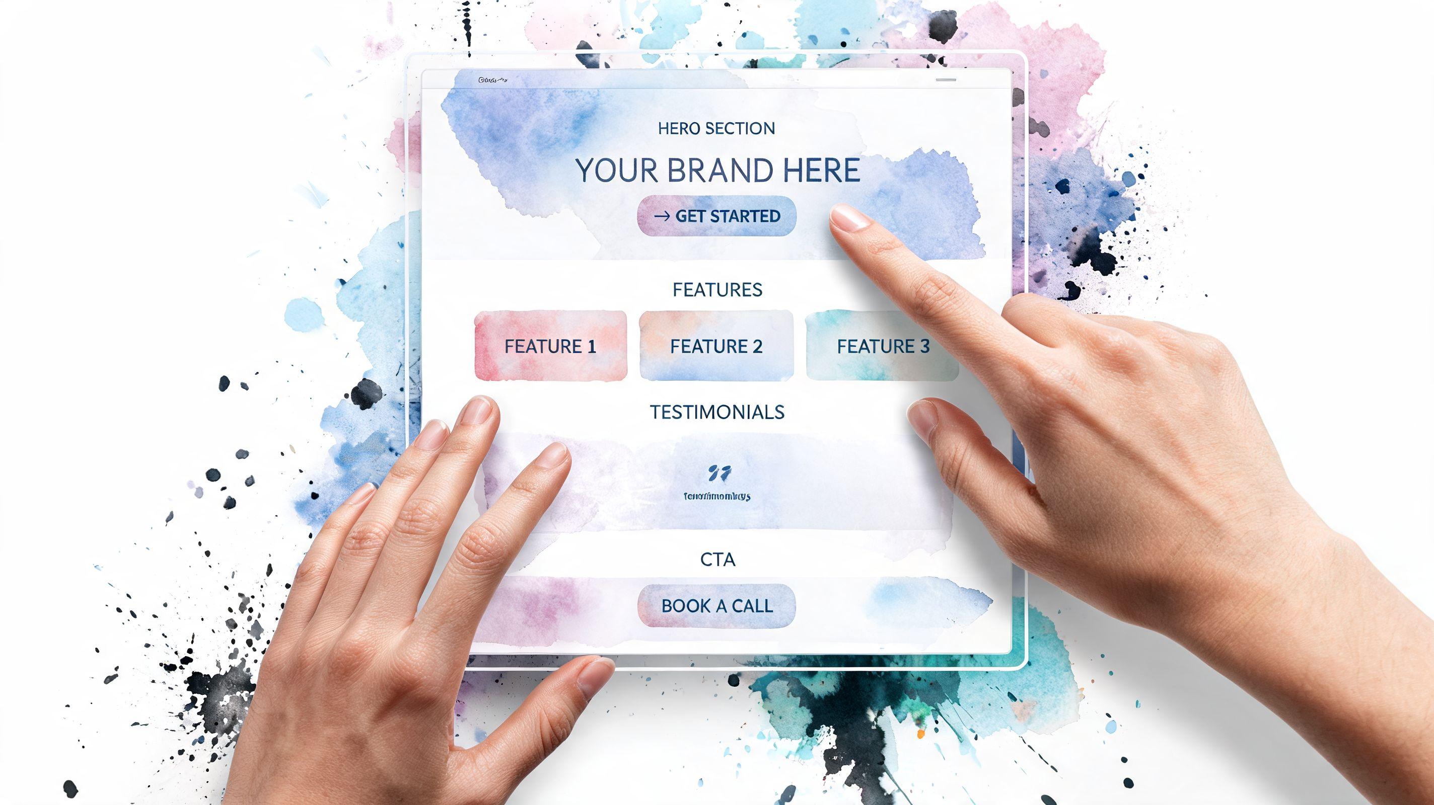
Hero section
Add a strong headline, a short supporting line, and one button.About the offer
Explain what the person gets. Keep it concrete.Why choose you
Add proof, credentials, simple testimonials, or process details.Action area
Place your form or booking tool here, and repeat your CTA.
A lot of first-time builders write too much in the hero section. Don’t. Your top area should answer the main question quickly.
Good headline: Get a custom meal plan for your family
Less effective headline: Holistic nutrition support for the modern lifestyle journey
The second one sounds polished, but it’s vague. Clear beats clever on landing pages.
Use the right blocks for each job
Squarespace blocks are easier to use when you assign each one a purpose.
- Text Block for the main promise and short supporting copy
- Image Block for one strong visual that supports the offer
- Button Block for your main CTA
- Form Block when you want inquiries or lead capture
- Video Block if a short explanation would build trust faster than text
Here’s a helpful walkthrough if you want to see the editing style in action:
Hide the normal header and footer
One of the best landing page squarespace tricks is removing the usual site header and footer. That strips away distractions like menu links, social icons, and extra calls to action.
If your plan allows page-level code injection, use this CSS:
.Header--top, .Footer {display: none !important;}
Add it in the page settings under advanced code injection. If you’re new to CSS, don’t let the word “code” scare you. In this case, you’re pasting a tiny rule that tells Squarespace not to show those elements on that page.
Fewer exits usually create a stronger path to the action you want.
Keep your CTA consistent
Your page should have one primary CTA phrase and repeat it. If the first button says Book Now, don’t switch later to Get Started, Contact Us, and Learn More. That creates hesitation.
Use one phrase throughout. Keep it short. If possible, keep it to three words.
A simple page flow might look like this:
| Section | What it should do |
|---|---|
| Hero | State the offer and invite the click |
| Benefits | Show what the visitor gets |
| Trust | Reduce doubt |
| Form or booking | Capture the lead |
| Footer | Include only essentials |
That’s enough for many service businesses. You don’t need every block Squarespace offers. You need the few that move the visitor forward.
Driving Action with Forms and Booking
The page only works if the action step feels easy.
A lot of business owners spend most of their time polishing the design and almost no time improving the form or booking experience. That’s backwards. Your form, scheduler, or checkout area is where the conversion happens.
Make the form easy to finish
Squarespace’s Form Block is flexible, but simple forms usually perform better than long ones. Ask only for what you need to respond properly.
For most service businesses, these fields are enough:
- Name
- One short message field
- Optional phone number, only if you need it
Clear labels matter. “Tell me about your project” is better than “Additional details.” Your button text matters too. “Request a Quote” or “Book My Call” gives more confidence than “Submit.”
If you need help with the setup itself, this walkthrough on how to create a contact form is a useful companion.
Match the form to the visitor’s intent
Not every page should use the same form.
If someone is asking for a quote, a short inquiry form makes sense. If they’re ready to choose a time, booking is better. If they only want a free resource, ask for the smallest commitment possible.
That’s why it helps to think of your CTA as a promise:
Low commitment
Download, join, get the checklistMedium commitment
Ask a question, request pricing, get a callbackHigh commitment
Book now, apply today, schedule consultation
A page converts better when the action matches the readiness of the visitor.
If the offer is simple, keep the form simple too. Friction often hides in unnecessary fields.
Add booking for service businesses
If you run a service business, embedding scheduling can remove the back-and-forth that slows down inquiries. Squarespace supports Acuity scheduling, which is especially useful for coaches, consultants, stylists, therapists, and other appointment-based businesses.
The key is context. Don’t drop a calendar onto the page without explanation. Add a short line above it such as:
Choose a time that works for you. I’ll confirm the next steps by email.
That reassurance helps people feel like they know what happens after the click.
If you want a good outside example of how small changes can improve lead capture language and inquiry flow, this guide to improving golf club conversions is worth reading even if you’re not in golf. The same lesson applies across industries. Reduce friction, clarify the next step, and make the ask feel easy.
Launch Prep SEO and Mobile Optimization
A page can look great on your laptop and still underperform once real visitors arrive. That usually happens for two reasons. The page isn’t set up well for search, or it’s awkward on mobile.
Mobile deserves special attention here. Many Squarespace tutorials focus on desktop design first, but that misses how many people will see your page.

According to the mobile-focused guidance referenced in this Squarespace mobile optimization discussion, mobile represents over 60% of web traffic, and touch-friendly CTAs plus mobile form usability are critical. That’s the gap many landing page guides leave open.
Set the SEO basics before publishing
Inside Squarespace page settings, handle these items before launch:
URL slug
Make it short and descriptive, such as/book-consultationor/wedding-florist-inquiry.SEO title
Write a title that clearly names the offer and the business.Meta description
Use a plain-language summary that gives people a reason to click.Headings
Use one clear H1 on the page. Use H2s to break up the rest.Image alt text
Describe the image accurately, especially if it supports the offer.
If you want to strengthen the search side further, this guide on how to improve Google search ranking gives a helpful overview without getting too technical.
Check the mobile version on a real phone
Squarespace’s preview is useful, but don’t stop there. Open the page on your own phone and go through it like a visitor would.
Test these items one by one:
Can you read the headline immediately
If the first screen feels cramped or vague, simplify it.Is the CTA easy to tap
Buttons should feel obvious and comfortable under your thumb.Does the form feel annoying
If typing into fields feels fiddly, shorten the form.Does the page scroll well
Big image stacks and long text blocks can make mobile feel endless.Does anything look off-center or cropped
Mobile layout issues often hide in spacing, not just content.
Make mobile-specific adjustments
Mobile users behave differently. They’re often distracted, moving quickly, and less patient with friction.
That means your page should favor:
- Shorter paragraphs so text doesn’t feel dense
- Stronger spacing between sections for easier scanning
- One clear button style repeated throughout the page
- Compact forms with fewer required fields
- Visible trust signals near the action area, not buried lower down
A common mistake is using a beautiful desktop image that pushes the mobile headline too far down. If your visitor has to scroll before they understand the offer, the hero section needs work.
On mobile, clarity matters more than decoration.
Run a final launch check
Use this quick checklist before publishing:
| Item | What to confirm |
|---|---|
| URL slug | Short and readable |
| Meta title and description | Clear and relevant |
| Main CTA | Same wording across the page |
| Phone test | Buttons and forms feel easy |
| Images | Load cleanly and support the message |
That final review often catches the small issues that hurt conversions.
Measuring Success and A/B Testing
A landing page is a bit like a storefront window. Once it is live, you can finally see whether people stop, understand the offer, and walk in, or pass by without taking action.
That is why measurement matters. You are not looking for every possible metric in Squarespace. You are checking whether the page is doing its one job.
Start with one success goal
Pick the action that counts as a win before you review any numbers.
For example, your main goal might be:
- Form submissions
- Booked calls
- Button clicks to a checkout page
- Email signups
If you try to track everything at once, it gets muddy fast. A first landing page works better with one target and a short list of supporting signals.
Watch the numbers that explain behavior
A few metrics can tell a clear story:
- Visits tell you whether people are reaching the page
- Conversions show whether they complete the main action
- Bounce rate or quick exits can hint that the message does not match what visitors expected
- Traffic source shows which channel brings people who are more likely to act
Here is a simple way to read those numbers. If visits are healthy but conversions are low, the offer, headline, or call to action may need work. If people leave quickly, the first screen may be confusing or weak.
For mobile-first pages, look even closer at what happens on phones. A page can look fine on desktop and still lose mobile visitors because the button sits too low, the copy feels long on a small screen, or the form asks for too much typing. If most of your traffic is mobile, mobile conversion rate deserves its own attention.
Make testing small and clear
A/B testing means comparing two versions of a page with one meaningful difference.
That sounds technical, but the process is simple. Change one thing, send traffic to each version, and compare results. One change at a time gives you a clean lesson. Five changes at once create guesswork.
Good first tests for a Squarespace landing page include:
- Headline A vs. headline B
- Button text like "Book Now" vs. "Request a Call"
- Shorter form vs. longer form
- Different hero image
- CTA button placed higher on mobile vs. lower on the page
That last one matters more than many business owners expect. On a phone, placement can change results because visitors decide quickly and scroll with less patience. A button that appears early, feels thumb-friendly, and repeats at the right moment often performs better than one that hides behind a long intro.
Keep a simple test log
You do not need fancy reporting to learn from early tests.
Write down:
- what you changed
- when you changed it
- which audience or traffic source saw it
- what happened to conversions
This keeps you from relying on memory. It also helps you spot patterns. You may find that mobile visitors respond to a shorter headline, while desktop visitors are fine with more detail.
Small, focused tests usually teach more than a full redesign.
If a version wins, keep it. Then test the next thing. Over time, your landing page gets stronger because each change solves a specific problem instead of chasing a vague idea of what "looks better."
Frequently Asked Questions
A first Squarespace landing page often raises the same practical questions. The good news is that the confusing parts are usually simpler than they sound once you separate site-wide decisions from page-level decisions.
Is a homepage the same as a landing page
A homepage works like a front desk. It introduces your business, points people to different areas, and serves several types of visitors at once.
A landing page has a narrower job. It is built for one offer, one audience, and one next step. If you are promoting a consultation, download, event, or service package, that focus usually makes the page easier to understand and easier to act on.
Do I need a special Squarespace plan
Your plan matters if you want features beyond the standard page setup.
For example, some custom layout changes depend on code injection or other settings that are not available on every plan. If your goal is a clean, simple landing page with strong copy, a form, and good mobile layout, you may not need anything advanced. If you want to hide global elements or add custom behavior, check plan limits before you build so you do not design a page you cannot fully set up.
Should I use Squarespace for only one landing page
That depends on what role the page plays in your business.
Squarespace makes more sense if the landing page connects to a broader site, such as your services, blog, scheduling tools, or brand pages. If you need only a single page for a short-term campaign, another tool might feel lighter. Many small business owners choose Squarespace because they want the landing page to grow into part of a complete website later.
What if I need appointments, forms, and SEO in one place
Squarespace can be a good fit for that setup. You can collect leads, connect scheduling tools, and edit core SEO settings without stitching together several separate platforms.
That convenience matters even more on mobile. A visitor on a phone is less patient with extra steps, pop-ups, or clunky booking flows. If your form loads quickly, your booking option is easy to tap, and your page title and description are clear, you create a smoother path from visit to action.
Can I create a landing page without showing it in my main menu
Yes. Putting the page in Not Linked is a common way to do it.
That means the page still exists and can be shared by direct URL, email, ad, or social post, but it does not appear in your main navigation. For campaign pages, that extra control is often helpful because it keeps casual browsers from wandering onto a page meant for a specific audience.
What should I do if my page isn’t converting
Start with the parts a visitor feels first, especially on a phone.
Message match
The headline should match the ad, email, or post that brought the visitor there.Clarity
A new visitor should understand the offer within a few seconds, without scrolling too far.Friction
Shorter forms, clearer buttons, and fewer decisions usually make action easier.Mobile experience
Check button size, text length, image cropping, and how quickly the main call to action appears on screen.
A useful rule is this: if the page feels easy to use with one thumb, you are usually heading in the right direction.
FAQ Quick Answers
| Question | Answer |
|---|---|
| Is a homepage a landing page | A homepage serves several goals. A landing page focuses on one offer |
| Can I hide it from navigation | Yes, use Not Linked |
| Do I need code | Not always. Many pages work well without it, though custom layouts sometimes need it |
| Should I use one CTA | One main action keeps the page clearer |
| Is Squarespace always the best option | It depends on whether you need a full website or only a single campaign page |
If you want a faster way to launch a polished website or simple lead-generation page without wrestling with setup details, Solo AI Website Creator is worth a look. It’s designed for people who want to get online quickly, with built-in tools for booking, contact forms, SEO setup, and analytics, without the usual website complexity.