8 Nonprofit Website Best Practices for 2025
This article was assisted with AI. We may include links to partners.
Your website is your nonprofit’s most powerful tool for attracting donors, recruiting volunteers, and sharing your mission. But simply having a website isn't enough; it must be a strategic, high-performing hub designed to inspire action and drive support. Generic advice won't cut it when your resources are on the line.
This guide moves past the fluff to deliver a comprehensive roundup of essential, actionable nonprofit website best practices you can implement immediately. We will break down everything from crafting compelling storytelling and simplifying donation forms to the technical SEO that helps supporters find you online, all explained in easy-to-understand language. Whether you're building a new site from the ground up or refining an existing one, these strategies are designed to help you create a digital presence that truly advances your cause.
You will learn how to:
- Create clear calls-to-action that drive donations and sign-ups.
- Optimize your site for mobile users, where most of your audience is.
- Showcase your impact transparently to build trust and credibility.
- Improve site speed and performance for a better user experience.
Each point is structured to be practical and straightforward, enabling you to make meaningful improvements that convert visitors into dedicated advocates for your mission.
1. Clear and Compelling Calls-to-Action (CTAs)
A visitor lands on your website, reads about your mission, and feels inspired. What happens next? A clear and compelling call-to-action (CTA) is the crucial next step, transforming passive interest into active support. CTAs are the buttons and links that tell users exactly what to do, like "Donate Now" or "Sign Up to Volunteer." Without them, even the most passionate visitor may leave without taking action.
This is a fundamental aspect of nonprofit website best practices because it directly connects your mission to measurable outcomes. Effective CTAs answer the user's unspoken question: "How can I help?"
Actionable Tips for Effective CTAs
To maximize engagement, your CTAs must be visible, persuasive, and strategically placed. Use contrasting colors to make buttons stand out from the background, and use urgent, action-focused words. For instance, instead of a generic "Submit," try powerful phrases like "Give Clean Water" or "Protect a Tiger Today."
Think about the user's journey. A first-time visitor might not be ready to donate but could be persuaded to sign up for a newsletter. Offer these smaller actions to keep them engaged. Place donation CTAs directly next to impactful statistics (e.g., "Every $10 provides a meal") to create an immediate emotional connection and prompt for action.
A few more actionable tips include:
- Use First-Person Language: Phrasing like "Count Me In!" or "I'll Volunteer" can increase click-through rates by creating a personal connection.
- Strategic Placement: Place your main CTA (e.g., "Donate") in the top-right corner of your homepage, as this is where people naturally look first.
- Mobile-First Design: Ensure buttons are large enough to be easily tapped on a phone—at least 44×44 pixels.
The visual below summarizes the key performance indicators you should track to measure the success of your CTAs.
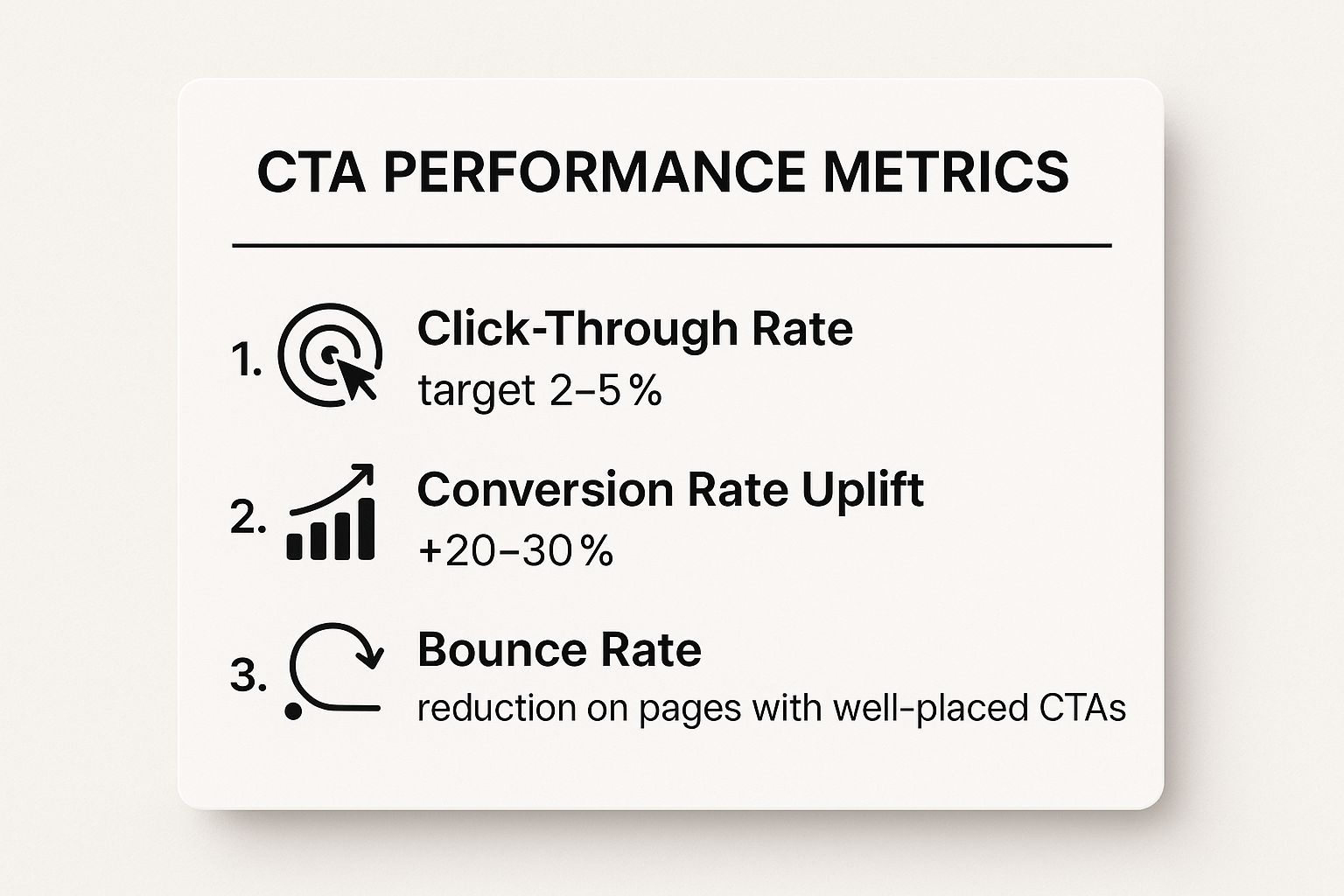
These metrics demonstrate that well-designed CTAs do more than just guide users; they significantly boost conversions and improve overall site engagement. For further insights into optimizing your digital pathways, consider exploring resources on how to design a high-conversion landing page to ensure your CTAs lead to effective destinations. For more inspiration, you can find a variety of call-to-action examples on soloist.ai.
2. Impactful Storytelling and Visual Content
Data and statistics can inform your audience, but stories are what move them to act. Impactful storytelling combines authentic narratives with high-quality visuals to transform abstract mission statements into human experiences. This practice is essential for connecting donors emotionally to your cause, making the impact of their support tangible and memorable.
This is a cornerstone of nonprofit website best practices because it builds a deep, lasting connection with supporters. By showing the real-world effects of your work through compelling stories, photos, and videos, you move beyond just soliciting donations; you invite people to become part of a meaningful journey.

Actionable Tips for Impactful Storytelling
To tell stories that resonate, focus on individual journeys rather than broad overviews. Show the "before, during, and after" of your work from the perspective of a single person, family, or community. This creates a powerful story that holds attention and inspires empathy. Organizations like charity: water excel at this by providing GPS tracking and photos of completed well projects, directly linking donor funds to a specific, visible outcome.
Balance the emotional weight of your stories with a message of hope. While it's important to convey the need, your story should ultimately focus on the positive change that supporter contributions make possible.
A few more actionable tips include:
- Follow the 'Hero's Journey': Structure your stories with a clear hero (the person you help), a challenge they face, and how your organization (with the donor's help) empowers them to succeed.
- Keep Videos Concise: Aim for videos under three minutes to keep viewers engaged on your website and social media.
- Prioritize Consent: Always get permission before sharing photos, videos, or personal stories to protect the dignity and privacy of the people you serve.
- Balance Emotion with Hope: Your story should inspire action by showing that a solution is possible, not leave viewers feeling helpless.
The video below offers a powerful example of how a compelling story can convey a complex issue in an emotionally resonant way.
By weaving these authentic narratives throughout your site, you transform passive visitors into passionate advocates. For more inspiration, explore the work of Pencils of Promise, which masterfully uses student success stories and video updates to demonstrate impact. You can also learn from the visual storytelling techniques outlined in resources on creating compelling nonprofit videos.
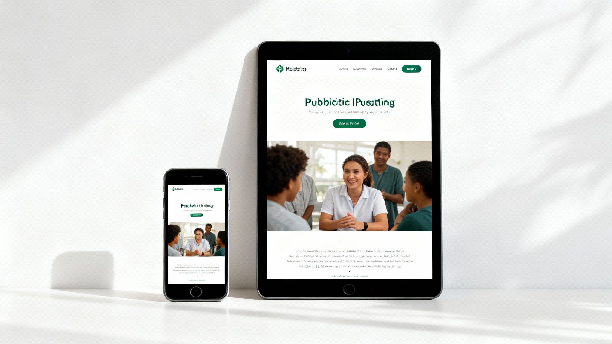
3. Mobile-First Responsive Design
Today, your supporters are more likely to engage with your mission on a smartphone than a desktop computer. With over half of nonprofit website traffic coming from mobile devices, a mobile-first responsive design is no longer a luxury; it's a necessity. This approach means designing your website for a small phone screen first, then adapting it for larger screens. This ensures a great experience for every user, no matter their device.
This is a cornerstone of modern nonprofit website best practices because it directly impacts engagement and donations. A clunky, hard-to-navigate mobile site frustrates potential donors and volunteers, causing them to leave. A mobile-first approach prioritizes speed, readability, and touch-friendly navigation, capturing the attention of on-the-go supporters when they are most inspired to act.
Actionable Tips for Mobile-First Design
To effectively adopt a mobile-first strategy, you must prioritize what a mobile user needs to see and do. This means simplifying navigation menus, ensuring forms are easy to fill out with a thumb, and making donation buttons large and prominent. Organizations like UNICEF excel at this, offering a streamlined mobile site that makes it effortless for users to connect and contribute.
Think about the user experience from a mobile perspective. A good mobile website features a simplified donation process that reduces extra steps and encourages completion. This focus on mobile usability is critical for capturing support at a moment's notice.
A few more actionable tips include:
- Prioritize Content Hierarchy: On a small screen, you must display the most critical information first. Place your main call-to-action and mission statement where users can see them without scrolling.
- Implement a Sticky Header: A sticky header is a menu that stays at the top of the screen as users scroll. Keep your main navigation and primary "Donate" button visible there.
- Optimize for Touch: Ensure all buttons and links are large enough (at least 44×44 pixels) to be easily tapped without accidental clicks.
- Streamline Forms: Use mobile-friendly keyboard inputs (like a number pad for phone numbers) and enable autofill to minimize typing. A one-page donation form is highly effective on mobile.
By building for your mobile audience first, you ensure that every supporter has a positive, engaging experience. To see how these principles are applied in practice, you can explore the design resources on the Awwwards blog for inspiration from award-winning responsive websites. For tools that simplify this process, consider a platform like the Solo AI Website Creator, which automatically optimizes sites for mobile performance.
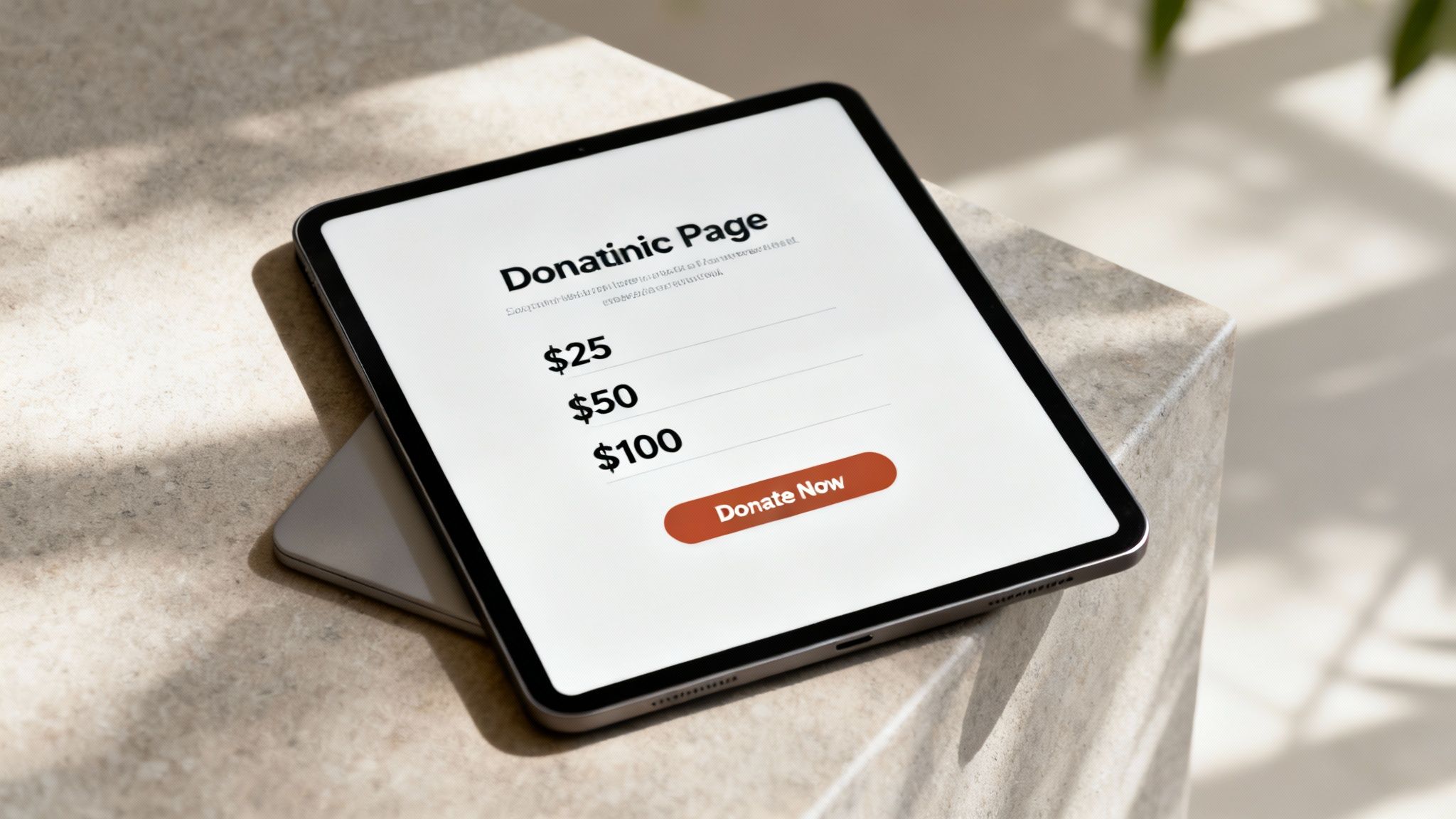
4. Simplified and Optimized Donation Process
A potential donor has decided to support your cause, clicks the "Donate" button, and is met with a long, complicated form. This friction is often enough to cause them to abandon the process. A simplified donation process is crucial; it removes unnecessary barriers, making it as easy as possible for supporters to give. Studies show that every field you remove from a form can significantly boost completion rates.
This is a cornerstone of nonprofit website best practices because the donation page is where good intentions become financial support. A cumbersome experience disrespects the donor's time and generosity, directly impacting your organization's revenue. By streamlining this process, you ensure more supporters complete their contributions successfully.
Actionable Tips for a Streamlined Donation Process
The goal is to create a frictionless path from intention to confirmation. Start by minimizing the number of form fields to only the absolute essentials: name, email, and payment information. Every extra question increases the chance of abandonment. Organizations like charity: water excel at this with clean, single-page forms that feature pre-selected, impact-tied amounts.
Consider the psychology of giving. Making recurring giving the default (opt-out) choice can substantially increase lifetime donor value. Similarly, remove all extra navigation links from the donation page to keep the user focused only on completing their gift. This "distraction-free" environment is a key strategy used by major platforms like Wikipedia during fundraising drives.
A few more actionable tips include:
- Show Direct Impact: Connect donation amounts to tangible outcomes. For example, "Your $25 gift can provide clean water for one person."
- Offer Flexible Giving: Include pre-set donation amounts but always provide an "Other Amount" field to empower donors to give what they are comfortable with.
- Emphasize Security: Display trust symbols (like SSL certificates or payment processor logos) prominently near the payment section to reassure donors their information is safe.
- Enable One-Click Options: Integrate digital wallets like Apple Pay, Google Pay, and PayPal to allow for swift, secure payments, especially on mobile devices.
- Send Instant Confirmation: An immediate thank-you email and receipt confirms the donation was successful and makes the donor feel appreciated right away.
5. Transparent Impact and Financial Accountability
In an era of skepticism, donors increasingly demand to see exactly how their contributions make a difference. Transparency involves openly sharing program outcomes, financial data, and success metrics to build unwavering trust. By showing you are a responsible steward of funds, you prove that every dollar is being used effectively to advance your mission.
This practice is a cornerstone of modern nonprofit website best practices because it directly addresses the donor's primary concern: "Is my money making a real impact?" Demonstrating this transparency proactively can transform a one-time gift into a long-term partnership built on confidence and shared purpose.
Actionable Tips to Showcase Transparency
Your website should be a central hub for all accountability-related information. Create a dedicated "Our Impact" or "Financials" section in your main navigation that is easy to find. Use clear visuals like infographics, charts, and videos to make complex data easy to understand for everyone.
Organizations like charity: water excel at this by showing how 100% of public donations fund water projects. They provide detailed reports and GPS coordinates for every well. Similarly, GiveWell offers exhaustive analyses of its programs, allowing donors to make evidence-based giving decisions. These examples prove transparency is a powerful tool for donor acquisition and retention.
A few more actionable tips include:
- Create an Impact Hub: Dedicate a page to your annual reports, financial statements (like the IRS Form 990), and ratings from sites like Charity Navigator.
- Visualize Financials: Use simple pie charts to break down where your money comes from and how it's spent. Clearly explain your overhead costs.
- Show Tangible Outcomes: Translate donations into concrete results. For example, state that "$50 provides literacy materials for one child for a year."
- Publish Regular Updates: Keep your impact statistics current, updating them at least quarterly to show ongoing progress and maintain donor engagement.
6. Fast Page Load Speed and Performance Optimization
In the digital world, every second counts. A visitor inspired by your mission won’t wait long for a page to load; in fact, research shows over half of mobile users will abandon a site that takes longer than three seconds to load. A fast website is a critical component of nonprofit website best practices, directly impacting user engagement, donor conversions, and even how high you appear in Google search results.
A slow website can inadvertently signal that your organization is inefficient or outdated, undermining the trust you work so hard to build. By optimizing your site’s performance, you ensure that potential supporters can access information, donate, or sign up to volunteer without frustrating delays. This is an essential technical foundation for retaining visitors.
Actionable Tips for Performance Optimization
Optimizing your website’s speed involves a series of technical improvements to reduce how long it takes for your pages to become usable. This includes shrinking image file sizes, simplifying your site's code, and using modern web technologies. For example, the Wikimedia Foundation aggressively optimizes its performance to ensure its vast knowledge base is accessible to users globally, even on slow connections.
The goal is to deliver a seamless experience that keeps users engaged. A fast-loading site reduces the number of people who leave right away. To further ensure visitors remain engaged, explore proven strategies to lower your website's bounce rate.
A few more actionable tips include:
- Compress Images: Use free online tools like TinyPNG to reduce image file sizes to under 100KB without sacrificing visual quality. This is one of the quickest ways to improve load times.
- Enable Caching: Website caching stores a temporary copy of your site for visitors. This allows it to be delivered much faster to people who have visited before. Many website platforms have this built-in or available as an add-on.
- Minimize Third-Party Scripts: Each social media widget or analytics tool can slow your site down. Limit them to only what is absolutely essential for your mission.
The visual below summarizes the key performance indicators you should track to measure the success of your performance optimizations.
These metrics highlight how technical performance directly translates into better user experiences and improved organizational outcomes. For a comprehensive guide on making your site faster, you can learn how to optimize website speed on soloist.ai. For more inspiration, check out the performance-focused design of DoSomething.org's website, which is optimized for its young, mobile-first audience.
7. Strategic Search Engine Optimization (SEO)
Your mission is vital, but it won’t make an impact if people can't find you. Strategic Search Engine Optimization (SEO) is the process of improving your website so it appears higher in search engine results (like Google) when people look for related causes or services. It ensures that when someone searches for "animal shelter near me" or "disaster relief organizations," your nonprofit is visible.
This is a critical component of nonprofit website best practices because it connects your organization to an audience that is actively looking to help. Good SEO drives free, relevant traffic to your site, increasing donations and volunteer sign-ups without a constant ad spend. It’s about being the answer when your community asks for help.
Actionable Tips for Strategic SEO
To improve your search visibility, focus on both the words your audience uses and how your website is built. Start by researching the specific phrases people search for, such as "food bank in [Your City]" or "how to support clean water initiatives." Include these keywords naturally in your page titles, headings, and main content.
Local SEO is particularly powerful for community-based nonprofits. For example, a local food bank's website should be optimized to appear for searches like "food pantry near me." This helps connect you with the people in your service area who need you most.
A few more actionable tips include:
- Claim Your Google Business Profile: This is a free tool that displays your location, hours, and services in local search results and on Google Maps. It's essential for any organization with a physical location.
- Create Cause-Focused Content: Write blog posts and resource pages that answer common questions related to your mission. This establishes your organization as a trusted expert and attracts visitors.
- Optimize Page Elements: For each page, write a clear and compelling meta description (the short summary that appears in search results) to encourage clicks. Use simple, descriptive URLs and add descriptive alt text to all images for accessibility and SEO.
By implementing these SEO tactics, you can significantly increase your online visibility and attract a continuous stream of relevant visitors. SEO is an ongoing effort that builds sustainable, long-term growth for your organization's digital presence.
To gain a deeper understanding of these techniques, explore additional resources on how to boost your website’s Google ranking and start driving more organic traffic to your cause.
8. Integrated Social Proof and Community Engagement
A potential supporter visits your site, curious but hesitant. They see that thousands of others have already donated, read a powerful story from a volunteer, and notice a live feed of recent contributions. This is the power of social proof—the idea that people are more likely to act when they see others doing the same. By integrating social proof, you transform your website from a simple brochure into a vibrant, trustworthy community hub.
This is a critical component of nonprofit website best practices because it builds instant credibility and creates a sense of belonging. Social proof answers a visitor's subconscious question: "Can I trust this organization?" When they see tangible evidence of a thriving community, their confidence grows, making them far more likely to join your cause.
Actionable Tips for Social Proof
To effectively leverage social proof, strategically display it throughout your website. It’s not just about adding a single testimonial; it’s about weaving a story of community support into every page. Showcase donor counts, volunteer stories, and project updates to create an environment of transparency and collective achievement.
For example, Kiva masterfully builds trust by displaying lender testimonials and real-time loan repayment rates. Similarly, charity: water features comments from donors alongside updates on completed water projects, directly linking contributions to impact. These examples show visitors that their support is part of a larger, successful movement.
A few more actionable tips include:
- Use Specific Numbers: Instead of "thousands of supporters," state "15,487 active supporters" to build concrete credibility.
- Feature Video Testimonials: A short video from someone you've helped or a volunteer can create a much stronger emotional connection than text alone.
- Showcase Recognizable Partners: Display the logos of corporate sponsors or media outlets that have featured you near your donation forms to borrow their authority.
- Create Urgency: Use dynamic counters like "127 people donated this week" to encourage immediate action.
By showcasing the actions of others, you provide the validation many visitors need to take that final step from observer to active supporter. For more information on building trust, you can explore Robert Cialdini’s foundational book, Influence: The Psychology of Persuasion, which details the science behind social proof. To see tools that can help automate this on your site, platforms like Fomo offer real-time social proof notifications.
Best Practices Comparison of Top 8 Nonprofit Website Features
| Item | Implementation Complexity | Resource Requirements | Expected Outcomes | Ideal Use Cases | Key Advantages |
|---|---|---|---|---|---|
| Clear and Compelling Calls-to-Action (CTAs) | Moderate (design & continuous testing) | Design expertise, analytics tools | 20-30% increase in conversion rates | Driving donations, signups, event registrations | Increases conversions; clarifies user actions |
| Impactful Storytelling and Visual Content | High (content creation & production) | Budget for videos/photos, creative team | Up to 40% increase in emotional connection and retention | Building donor relationships, social media sharing | Enhances emotional appeal; builds trust and engagement |
| Mobile-First Responsive Design | High (complex development & testing) | Skilled developers, device testing resources | 20-50% higher mobile conversions; better SEO | Capturing mobile users; improving user experience | Future-proofs site; captures majority mobile traffic |
| Simplified and Optimized Donation Process | Moderate (form design and payment integration) | Payment processor integration, UX expertise | 30-50% increase in donation completion | Reducing donor friction; impulse giving | Increases completion rates; improves donor satisfaction |
| Transparent Impact and Financial Accountability | Moderate to High (data compilation & updates) | Data tracking, design, copywriting, legal | 15-25% improved donor retention; builds credibility | Major donors, trust-building, compliance | Enhances trust; attracts larger gifts and funders |
| Fast Page Load Speed and Performance Optimization | High (technical expertise required) | Technical team, monitoring tools | Reduces bounce rate by 20-40%; improves SEO & conversions | All nonprofits focusing on user experience | Faster site; better rankings; improved accessibility |
| Strategic Search Engine Optimization (SEO) | High (ongoing content & technical work) | SEO specialists, content creators | 50-200% organic traffic growth over months | Increasing discovery and long-term traffic | Sustainable, cost-effective traffic; attracts high-intent users |
| Integrated Social Proof and Community Engagement | Moderate (content management & permissions) | Content curation, moderation, social integrations | 15-30% increase in donation conversion | Credibility building; community engagement | Builds trust quickly; creates sense of belonging |
Turn Your Website Into Your Best Fundraiser
Your nonprofit's website is far more than a digital brochure; it is your 24/7 advocate, storyteller, and fundraiser. Throughout this guide, we've explored the essential pillars that transform a static online presence into a dynamic engine for your mission. From crafting compelling calls-to-action that inspire immediate support to showcasing transparent impact reports that build unshakable trust, each strategy is a crucial component of a successful digital ecosystem. We’ve seen how impactful storytelling and mobile-first design create an emotional connection and ensure accessibility for every visitor, no matter their device.
The journey to an optimized website is not about implementing every single change overnight. Instead, it's about continuous, intentional improvement. The core theme connecting all these nonprofit website best practices is a relentless focus on the user experience. Whether it's simplifying your donation process to reduce friction or leveraging SEO to connect with new supporters, every action should be designed to make it easier for people to understand, trust, and contribute to your cause. By prioritizing clarity, speed, and engagement, you remove barriers and build a welcoming digital home for your community.
Your Actionable Path Forward
To avoid feeling overwhelmed, select one or two high-impact areas to begin with. Your next steps could look like this:
- Conduct a "One-Click" Audit: Ask three people unfamiliar with your site to try and donate. Watch them navigate the process. Where do they hesitate? Where do they get confused? This will immediately reveal friction points in your most critical conversion path.
- Identify Your Hero Story: Find one powerful, emotionally resonant story of impact. Dedicate a prominent space on your homepage to tell it using compelling visuals and a clear narrative, connecting it directly to a "Donate Now" button.
- Test Your Mobile Experience: Don’t just resize your browser window. Pull out your phone and navigate your entire site. Are buttons easy to tap? Is text legible without zooming? Is the donation form mobile-friendly?
Mastering these nonprofit website best practices is not just a technical exercise; it's a strategic imperative. A well-executed website builds credibility, fosters a loyal community, and ultimately, drives the resources needed to fuel your work. By thoughtfully applying these principles, you empower your organization to connect more deeply with supporters and amplify your impact far beyond what you thought possible. Your mission deserves a digital presence that works as hard as you do.
Ready to build a powerful online presence without the technical headache? The Solo AI Website Creator can help you launch a professional, mobile-responsive website that incorporates these nonprofit website best practices from the start. Get started today and create a site that truly serves your mission at Solo AI Website Creator.