Tag: responsive design
-
How to Optimize Website for Mobile: Boost Speed, UX, and Conversions
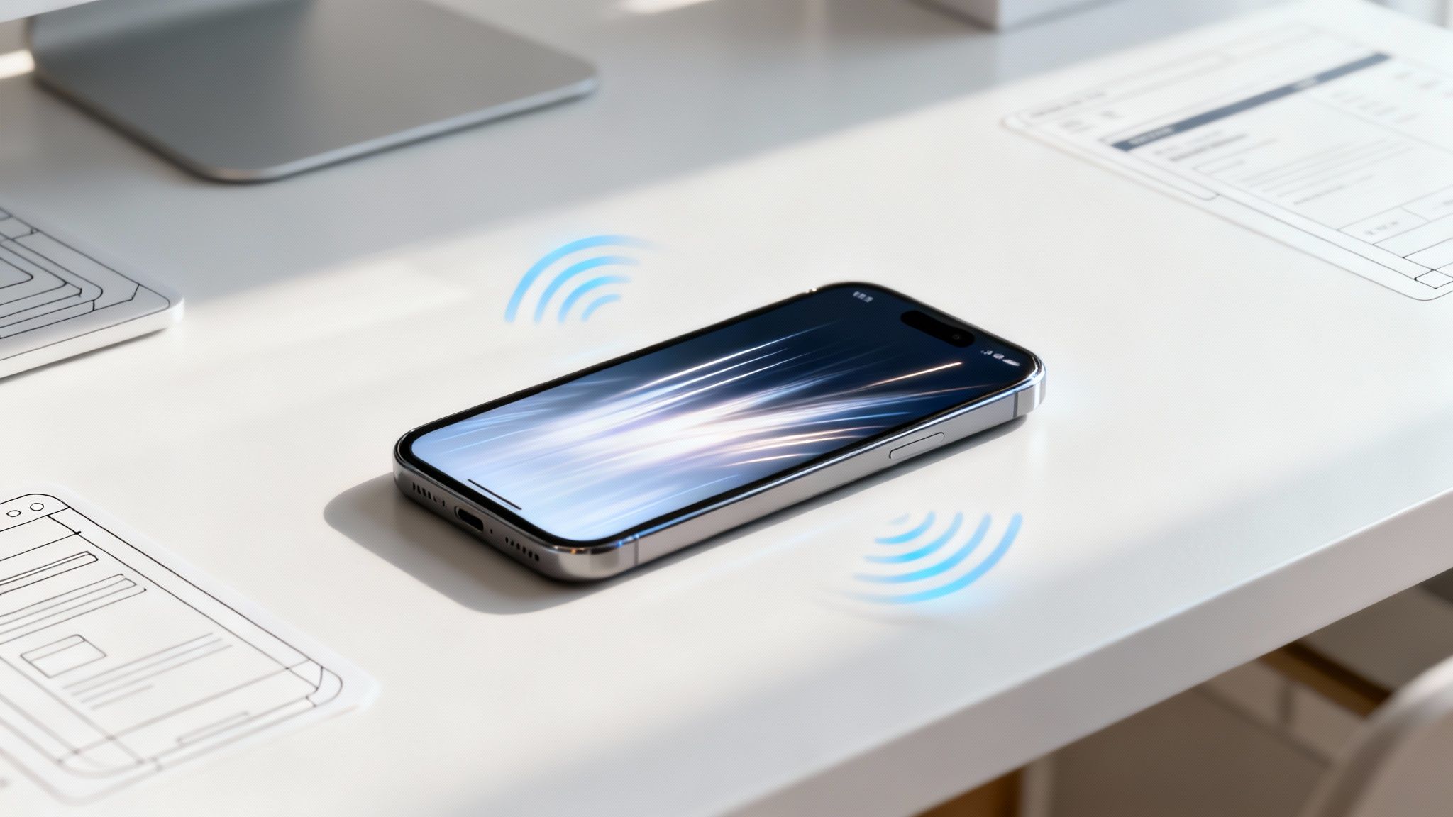
Optimizing your website for mobile is about ensuring your site is fast, easy to use, and looks great on any screen, especially smartphones. The key is responsive design—a method that allows a website to automatically adapt its layout to fit different screen sizes. This isn't just a technical tweak; it's a critical business move that…
-
What Is Mobile First Design With Actionable Tips
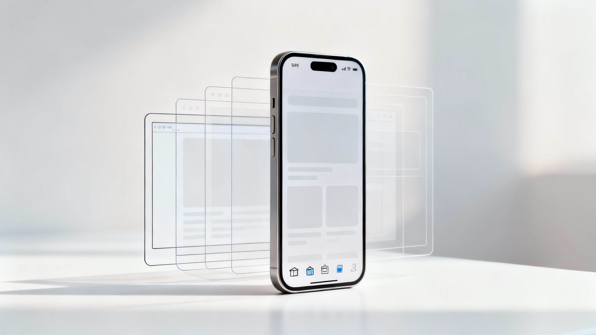
Mobile-first design means you design for the smallest screen first—smartphones—then scale up to tablets and desktops. It ensures your content is clear, navigation is touch-friendly, and pages load fast.Actionable Tip: Sketch a simple mobile wireframe before any desktop mockup to lock in your priorities. Key Features Of Mobile First Design Content Prioritization ensures users see…
-

How to Make Website Mobile Friendly: Quick UX Guide
Making a website mobile-friendly means ensuring it works perfectly on any screen, from a desktop monitor to a smartphone. This is called responsive design, and it's no longer optional—it's essential for keeping visitors on your site and ranking well on Google. Why Your Website Must Be Mobile Friendly Today A website that isn't built for…