How to Create a Professional Website Quickly & Easily
This article was assisted with AI. We may include links to partners.
Before picking a color scheme or font, the most important step in building a professional website happens on paper, not on a screen. You must first lay the strategic groundwork by defining your website's purpose and getting crystal clear on who your target audience is.
This isn't the most exciting part, but skipping it is like building a house without a blueprint. A clear plan ensures every page has a specific job, turning your site from an online brochure into your hardest-working employee.
Defining Your Website's Strategic Foundation

The best websites are built on a solid strategy, not just code. This initial planning phase separates a site that just exists from one that actively works for you 24/7. It’s all about intention.
Your first task is to determine your website's primary goal. What is the one action you need a visitor to take? This must be a specific, measurable objective.
Pinpoint Your Primary Website Goal
Think of your website as a new hire. What specific job did you hire it for? Answering this will guide every decision you make, from page layout to the words you use.
Actionable Tip: Most website goals fall into one of these categories. Pick the one that fits your business best:
- Generate Leads: Your main goal is collecting contact info—emails, phone numbers—from potential clients through forms. This is the top priority for consultants, coaches, and service providers.
- Sell Products or Services: You need to drive sales directly through an e-commerce shop or an online booking system.
- Build a Community: You want to create a hub where people can connect and share ideas, common for creators, niche forums, and membership sites.
- Establish Authority: The goal is to become the go-to expert in your field by publishing high-value content like blog posts, case studies, and free resources.
Once you know your core purpose, the path becomes clearer. A lead-generation site will feature contact forms prominently, while an authority site will be built around an easy-to-search blog.
Identify Your Ideal Visitor
With your goal set, the next question is: who are you building this for? A professional website must speak directly to the problems and desires of its intended audience. Trying to talk to everyone connects with no one.
Actionable Tip: Create a simple "audience persona" by answering these questions:
- What are their biggest challenges related to what I offer?
- What phrases are they typing into Google to find solutions?
- What information would genuinely make their life or job easier?
- Are they tech-savvy, or do they need things explained simply?
Knowing this helps you write copy that resonates, choose relatable images, and design a navigation menu that feels intuitive to them. This prevents you from building a site that only you understand how to use. For more on these foundational steps, our guide to domain and website builders for solopreneurs is a great resource.
Your website is not for you—it's for your customer. The moment you shift your perspective to serve their needs first, you begin the process of creating a truly professional and effective online presence.
Map the User Journey
Last, visualize the path a first-time visitor takes on your site. This "user journey" is the step-by-step experience from the moment they land on a page to when they complete your primary goal.
For example, a common journey might be: Visitor lands on the homepage from Google > Clicks to the "Services" page > Reads about your packages > Navigates to the "Contact" page to fill out your form.
Actionable Tip: Sketching this path helps you spot potential roadblocks. Is the main call-to-action button easy to find? Is the menu confusing? By putting yourself in their shoes, you can smooth out the path and guide them where you want them to go.
This strategic thinking powers a professional website. A tool like the Solo AI Website Creator is specifically designed to turn your strategic blueprint into a beautiful, working site without you getting bogged down in technical details. You bring the vision; the AI helps make it real.
With a solid plan, it's time to focus on what visitors see first: your brand's visual identity. This is about creating an experience that builds trust and feels professional.
Think of your website's design as its silent salesperson. It’s working 24/7 to communicate who you are.

A memorable brand experience is built on consistency. Every element, from the logo to the color of your buttons, should work together. This visual harmony makes your site look professional and reassures visitors they’re in the right place.
The great news? You don't need a design degree. The global website creator market is expected to hit $2.32 billion by 2025, a sign that powerful, user-friendly tools are in high demand. Platforms like the Solo AI Website Creator let you build a polished online presence without touching code.
Your Logo Is Your Digital Handshake
Your logo is the most concentrated version of your brand and often the first thing a potential customer associates with your business. It's a visual shortcut to who you are.
An effective logo should be:
- Simple: The most iconic logos are clean, uncluttered, and recognizable even when small.
- Relevant: The style should make sense for your industry and audience. A law firm’s logo will feel very different from a toy store's.
- Memorable: It should have a unique quality that sticks in someone's mind. Avoid generic clipart that blends in.
Actionable Tip: The Solo AI Website Creator helps you place your logo consistently across your site, from the header to the footer, which is key for building brand recognition.
Choosing Colors That Communicate
Color is a powerful communication tool that influences how people feel. The right color palette can instantly set a mood—calm, energetic, or trustworthy.
A professional approach involves picking a primary color, a secondary accent color, and a neutral for text and backgrounds.
- Primary Color: This is your main brand color. It will appear in headings, key buttons, and other prominent spots.
- Secondary Color: Use this sparingly to create contrast and draw attention to important actions, like a "Sign Up" button.
- Neutral Colors: These are your workhorses—shades of gray, black, or white used for most text and backgrounds to ensure readability.
By sticking to a limited, defined color palette, you create a sense of order and professionalism. It stops your site from looking chaotic and helps guide the user's eye exactly where you want it to go.
Select Fonts That Are Clear and Consistent
Typography is about making written language easy to read on a screen. Your font choices have a massive impact on your site's professionalism and usability.
Actionable Tip: Use no more than two or three fonts. A classic combo is one font for headings and a different one for your main body text.
- Headings Font: This can have more personality to grab attention and break up the page.
- Body Font: This must be exceptionally readable. A clean sans-serif font like Open Sans or a classic serif like Georgia works well for long blocks of text.
Consistency is key. Use the same font style and size for all H1s, H2s, etc. The Solo AI Website Creator simplifies this by letting you set your brand fonts once, which are then applied automatically across every page. For more guidance, check out our article on the 15 best fonts for websites.
You have your strategy and brand look. Now it's time to build the essential pages of your site. This is where the Solo AI Website Creator excels, helping you create the pages that form the foundation of any professional site.
We'll focus on the four must-have pages: a compelling Homepage, a genuine About Us page, a clear Services or Products page, and a simple Contact page. Each has a specific job to guide visitors from browsing to taking action.
Crafting a Homepage That Captivates
Think of your homepage as your digital storefront. You have seconds to convince someone they're in the right place. Its main job is to give a quick, powerful overview and point people in the right direction.
To make an instant connection, your homepage must immediately answer three questions:
- Who are you? Your logo and brand name should be front and center.
- What do you offer? A strong headline and supporting text should make this obvious.
- What should I do next? A large, bold call-to-action (CTA) button is essential.
Actionable Tip: The Solo AI Website Creator generates layout options based on your business type. It arranges elements like images, headlines, and CTAs effectively, giving you a solid foundation to customize.
This image shows a basic wireframe—it’s the architectural blueprint for your site, mapping out where everything will go.
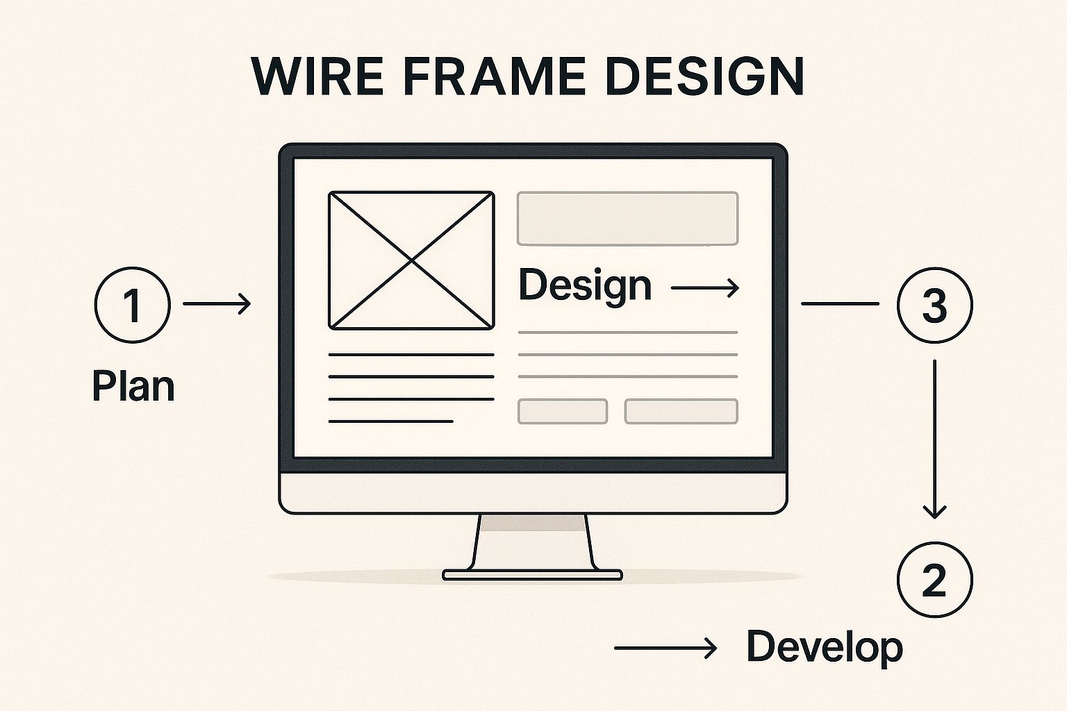
Starting with a clean, logical structure ensures your most important messages are seen without clutter, guiding your visitor’s eye exactly where you want it to go.
Building Trust with an Authentic About Page
Many businesses treat their About Us page as a chore, but it's often one of the most-visited pages. This is your chance to share why you do what you do. The goal is to make a human connection and build trust.
A great About page tells a story, not just a dry company history.
Actionable Tip: Talk about your mission, show friendly photos of your team, and explain what makes you different. Let the personality behind the brand shine through.
Your About page is where you turn a transaction into a relationship. People buy from people they know, like, and trust. This is where that process really begins.
Showcasing Your Value on a Services or Products Page
This is the heart of what you offer. The goal here is clarity. Anyone on this page should immediately understand what you sell, who it's for, and how it will improve their life. Avoid jargon and focus on results.
Actionable Tip: A good structure is your best friend. Follow these steps:
- Use clear headings for each offering.
- Write benefit-focused descriptions. Don't list features; explain how you solve your customer's problems.
- Show, don't just tell. Use high-quality images or videos of your products or work.
- Include a clear CTA for each item, like "Book a Consultation" or "Add to Cart."
Solo AI Website Creator offers pre-built sections for services and product galleries. This helps you display everything in a clean, professional way that is easy for customers to browse.
Before we move on, here’s a quick-glance table outlining the core pages every professional website needs.
Essential Pages for a Professional Website
| Page Type | Primary Goal | Must-Have Elements |
|---|---|---|
| Homepage | Capture attention and direct traffic | Strong headline, clear call-to-action (CTA), overview of services. |
| About Us | Build trust and human connection | Company story/mission, team photos, unique value proposition. |
| Services/Products | Showcase offerings with clarity | Detailed descriptions, high-quality images, pricing, benefit-focused copy. |
| Contact | Make it easy to get in touch | Contact form, email, phone number, physical address (if applicable). |
Think of these pages as the four pillars of your online presence. Get them right, and you've built a solid foundation for growth.
Making Connections with a Simple Contact Page
Finally, your Contact page must be incredibly easy to find and use. If someone has made it this far, they are highly interested. Remove every barrier to getting in touch.
At a minimum, offer a few ways for people to reach out: a physical address (if you have one), a phone number, and a professional email. The real workhorse, however, is a simple contact form.
Knowing how to add a contact form is a game-changer for capturing leads. The Solo AI Website Creator has a built-in form element you can drag onto your page.
Actionable Tip: Keep the form short. Only ask for the information you absolutely need to start the conversation, such as a name, email, and a message box.
Optimizing for Search and User Engagement

You’ve built a beautiful site with a clear purpose. But how will anyone find it?
This is where Search Engine Optimization (SEO) and User Experience (UX) come in. They sound technical, but the concept is simple. SEO helps search engines like Google find your site. UX is what makes people want to stay once they arrive. A professional website needs both.
The good news is you don’t need to be a technical wizard. The Solo AI Website Creator handles much of the heavy lifting, but understanding the basics will put you miles ahead.
Foundational SEO Inside Solo AI Website Creator
SEO is about making your content easy for both people and search engines to understand. A huge part of this is learning how to optimize content for SEO, which helps your pages rank higher in search results.
Actionable Tip: Here are a few core practices you can manage directly within the platform:
- Craft Search-Friendly Page Titles: Every page has a "title tag," the headline that appears in Google search results. Make each one descriptive and include the main keyword for that page (e.g., "Handmade Leather Wallets | Your Brand Name").
- Use Headings to Structure Content: Use headings (H1, H2, H3) to break up your text. Put your main topic in an H1 and subtopics in H2s and H3s. This tells search engines what your page is about and makes it easier for people to read.
- Optimize Your Images: Large images slow down your website, which hurts your search ranking. Solo AI automatically compresses images, but you should also name your files descriptively (e.g., "brown-leather-wallet.jpg" instead of "IMG_1234.jpg").
To boost your site's visibility further, explore the best AI SEO tools. They can give you a major advantage by automating tasks like keyword research.
Understanding Your Audience's Search Behavior
Optimizing your site also means knowing where your audience lives online. For instance, the United States has over 144.68 million registered domains, but search engine dominance varies globally.
Google might have 171 million unique monthly visitors in Canada, but in China, Baidu leads with 195.7 million monthly visits. Knowing which platforms your audience uses is key to reaching them.
Designing a User Experience That Converts
Once SEO gets people to your site, your job is to keep them there. This is User Experience (UX)—making your site intuitive and easy to use. Good UX turns visitors into customers.
A visitor should never have to think about how to use your website. Great UX design is invisible; it feels so natural that the user doesn't even notice the structure, they just find what they need effortlessly.
Focus on these three simple UX principles to improve how people engage with your site.
Create Intuitive Navigation
Your main menu is the roadmap for your website. If it’s confusing, people will leave.
Actionable Tip:
- Keep it Simple: Limit your main navigation to 5-7 essential items. Use clear language like "Services," "About," and "Contact."
- Be Consistent: Your navigation menu must be in the exact same place on every page.
- Mobile-First Thinking: Most visitors will be on their phones. Solo AI creates a mobile-friendly "hamburger" menu (the three-line icon), but always check that it’s easy to tap and read on a small screen.
Make Your Calls-to-Action Unmistakable
A call-to-action (CTA) is a button or link that tells a user what to do next, like "Buy Now" or "Schedule a Call."
For a CTA to work, it needs to be:
- Visually Obvious: Use a contrasting color that makes the button stand out.
- Action-Oriented: Start the button text with a verb. "Get Your Free Quote" is stronger than "Quote."
- Logically Placed: Put CTAs where someone would naturally look after reading your content.
Combining solid SEO with thoughtful UX creates a powerful system. SEO brings the right audience, and a great user experience convinces them you are the right solution.
Your Pre-Launch Final Checklist
Right before you hit "publish" is a huge milestone. But a rushed launch can lead to simple mistakes that make your site feel unprofessional. This final checklist is your safety net.
Running through these checks will give you the confidence that you’re ready to make a killer first impression.
Technical and Functional Checks
First, make sure everything works. Broken elements look unprofessional and frustrate users.
Actionable Tip: Click every single link on your site—navigation, footer links, buttons, and in-text links. Hunt for any dead ends or "404 Not Found" errors.
Next, test your forms. They are your direct lines to customers.
- Test every contact form. Fill it out yourself to ensure the submission arrives in your inbox.
- Check booking or scheduling forms. Make a test appointment to confirm the process is smooth.
- Verify newsletter sign-ups. Subscribe to your own list to confirm the system works correctly.
Taking a few minutes now can prevent losing valuable leads later.
Content and Visual Polish
Now, review your content with a fine-tooth comb to catch small mistakes that can damage your credibility.
Actionable Tip: Proofread every word. A grammar checker is a good start, but reading your text out loud helps catch awkward phrasing. Better yet, have a friend give it a once-over.
Then, do a quick visual audit:
- Ensure all images load correctly and aren't blurry.
- Click play on any videos to confirm they work.
- Check that your logo looks crisp and clear everywhere it appears.
These details create a professional, trustworthy experience.
A professional website doesn't just look good; it functions flawlessly. Every broken link, typo, or slow-loading image is a small crack in the trust you're trying to build with a new visitor.
Cross-Browser and Device Testing
Your site might look perfect on your computer, but what about on an iPhone using Safari? You can't assume it will look great for everyone.
The Solo AI Website Creator is designed to be responsive, meaning it automatically adjusts to different screen sizes, but you should always verify it yourself.
Actionable Tip: Pull out your phone and tablet and browse every page. Are the buttons easy to tap with your thumb? Can you read the text without zooming?
For browser testing, ask friends who use different web browsers (like Chrome, Safari, or Firefox) to take a quick look. This helps you catch formatting bugs and ensure everyone has a great experience.
With an estimated 252,000 new websites created every single day, the competition is fierce. Taking this extra time to iron out the details helps your site stand out. You can explore more data on website growth statistics to understand the competitive field.
Your Top Website Creation Questions, Answered
As you build a professional website, some questions always come up. Here are straight answers to the most common ones.
How Long Does It Really Take to Build a Website with AI?
The short answer is: much faster than you think. Using a tool like the Solo AI Website Creator, you can generate a solid first draft of your entire site in just a few minutes by answering some simple questions about your business.
The rest of the time is spent personalizing it—tweaking the text, swapping in your own photos, and adjusting colors to match your brand. A focused person could easily launch a polished, professional site in a single week, compared to the months it often takes with a traditional developer.
Do I Need to Know How to Code to Use Solo AI Website Creator?
Absolutely not. Zero coding skills are required. Modern AI website creators are designed for non-technical users.
Everything is visual and intuitive. You interact with the AI in plain English and make design changes with a simple drag-and-drop editor. The AI handles all the complex code in the background, so you can focus on your message, content, and design.
What's the Single Most Important Part of a Professional Website?
While great design is crucial for a first impression, the single most important element is clarity.
A new visitor needs to understand who you are, what you offer, and what they should do next within seconds. If they're confused, even the most beautiful design won't make them stay.
You achieve clarity through:
- Simple Navigation: Your menu should be a helpful guide, not a confusing maze.
- Clear Headlines: State the benefit immediately.
- Obvious Calls-to-Action: Big, clear buttons that tell users exactly what to do next.
Your website’s primary job is to communicate, not just decorate. When you lead with clarity in every design and content choice, you build trust and get people to take action.
How Can I Make My Website Look Good on a Phone?
This is essential, as most people will find you on their phones. The best way to ensure a great mobile experience is to use a platform like the Solo AI Website Creator, which automatically uses responsive design.
Responsive design simply means your site's layout will intelligently adjust to fit any screen size, from a large desktop monitor to a smartphone. The platform does all the heavy lifting.
Actionable Tip: Always check it yourself before launching. Use the preview tool to see how your site looks on desktops, tablets, and phones. In the mobile view, ensure your navigation menu is easy to use and buttons are large enough to tap with a thumb.
Ready to build a website that works as hard as you do? With the Solo AI Website Creator, you can go from an idea to a fully functional, professional online presence in minutes, not months. Start for free and see how simple it can be. Get started with Solo AI Website Creator.