7 Essential Website Accessibility Best Practices for 2025
This article was assisted with AI. We may include links to partners.
Creating a website that everyone can use is a fundamental business requirement. Website accessibility ensures people with disabilities—including visual, auditory, and motor impairments—can navigate and interact with your content. This practice not only expands your potential audience but also improves the user experience for everyone, boosts SEO, and strengthens your brand's reputation as an inclusive organization.
Ignoring accessibility can lead to lost customers and significant legal risks. For businesses in the United States, understanding ADA compliance is critical, as a non-compliant site can open you up to lawsuits. This guide breaks down essential website accessibility best practices into simple, actionable steps without heavy technical jargon. You'll learn how to build a more inclusive online presence, whether you're a small business owner or just starting your first site.
We will cover seven key areas, providing clear instructions for each. For those looking to implement these standards from the ground up, tools like the Solo AI Website Creator can help build a strong foundation, making it easier to integrate these essential practices from day one. Let's dive into the steps you can take to make your website welcoming to all users.
1. Provide Alt Text for Images
Alt text (alternative text) is a short, written description of an image embedded in your website's code. Screen readers read this text aloud for users with visual impairments, providing context for what's on the screen. It also displays on the page if an image fails to load. Without alt text, the meaning conveyed by images is lost to a portion of your audience, creating a disconnected experience.

Why Alt Text is Crucial
Beyond helping screen reader users, alt text boosts your site's SEO. Search engines like Google use this text to understand your images, which can help your pages rank higher in search results. Good alt text allows users with visual disabilities to fully engage with your content. For example, e-commerce sites use detailed alt text to describe product colors and features, enabling informed purchasing decisions for all customers.
Actionable Tips for Implementation
Good alt text conveys the purpose of the image, not just a literal description.
- Be Descriptive and Concise: Describe what’s happening. For a photo of your team, instead of "team photo," use "The marketing team smiles during a brainstorming session."
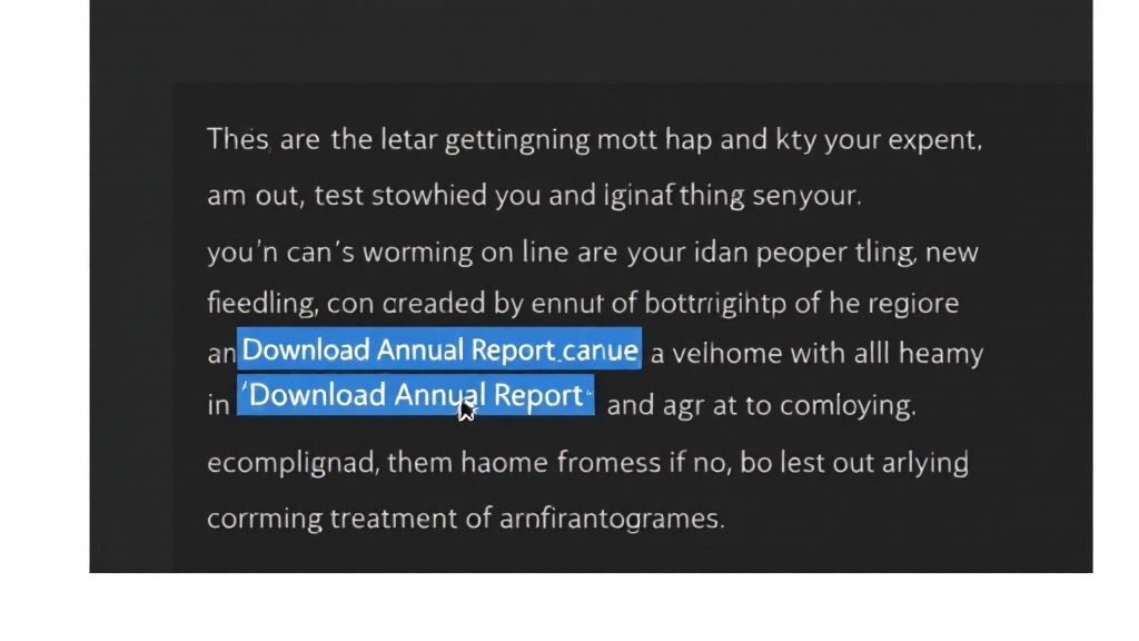
- Focus on Context: Ask yourself why the image is there. If an image of a PDF icon is a link to download a catalog, the alt text should be "Download our 2024 Service Catalog," not "PDF icon."
- Skip "Image of…": Screen readers already announce that it's an image, so starting with "picture of" is redundant.
- Handle Decorative Images Correctly: For images that are purely for decoration (like a stylistic border) and add no information, use an empty alt attribute (
alt=""). This tells screen readers to ignore it, preventing unnecessary clutter.
2. Ensure Proper Color Contrast
Color contrast is the difference in lightness between your text and its background. High contrast is essential for readability, especially for users with visual impairments like low vision or color blindness. It also helps everyone see your screen clearly in bright sunlight. Text that blends into its background can become unreadable, effectively locking some users out of your content.

Why Color Contrast is Crucial
Following color contrast standards, like those in the Web Content Accessibility Guidelines (WCAG), is a common legal requirement. Poor contrast is one of the most frequent accessibility issues, but it's also one of the easiest to fix. A site with strong contrast feels more professional and trustworthy, which can reduce bounce rates and improve engagement. Apple, for example, uses classic black text on a white background for maximum readability—a deliberate choice for clarity.
Actionable Tips for Implementation
You don't need a complete redesign to make your site's color palette accessible.
- Use a Contrast Checker: Free online tools like the WebAIM Contrast Checker instantly tell you if your color combinations pass WCAG standards. Just enter your text and background color codes.
- Don't Rely on Color Alone: Never use color as the only way to convey information. For example, if you highlight an error field in red, also add an icon or a text label like "Invalid input" so color-blind users get the message.
- Test in Grayscale: A quick way to check for issues is to view your site in grayscale. If some text or links are hard to distinguish, their contrast is likely too low.
- Prioritize Links and Buttons: Ensure interactive elements like links and buttons stand out clearly from the background. Their contrast is critical for site navigation.
3. Implement Proper Heading Structure
A proper heading structure uses HTML heading tags (<h1> to <h6>) in a logical, hierarchical order to organize page content. This creates a clear outline that assistive technologies like screen readers use to help users navigate. For a screen reader user, a well-structured page is easy to scan. They can jump from heading to heading to find the section they need instead of listening to the entire page from top to bottom.

Why Proper Heading Structure is Crucial
A logical heading structure is also a cornerstone of good SEO. Search engines use headings to understand the main topics of your content, helping them index your page more accurately. Proper structure also improves the experience for all users by breaking content into digestible chunks, making long articles easier to read. This concept is a key element of modern website design best practices.
Actionable Tips for Implementation
Implementing a correct heading hierarchy is about prioritizing structure over appearance.
- Use Headings for Structure, Not Style: Never choose a heading tag based on its default size. Use
<h1>for the main page title,<h2>for major sections,<h3>for subsections, and so on. Use CSS (your site's stylesheet) to control how they look. - Follow the Hierarchy: Do not skip heading levels. For example, never jump from an
<h2>directly to an<h4>. Maintain a sequential order (h1->h2->h3) to create a logical outline. - Be Descriptive: Ensure each heading accurately describes the content that follows it. This provides a clear and predictable user experience.
- Use Only One
<h1>Per Page: The<h1>tag is for the primary title of the page. Using more than one can confuse both screen readers and search engines.
4. Provide Keyboard Navigation Support
Keyboard navigation support ensures that all interactive elements on a website—links, buttons, forms, and menus—can be accessed and operated using only a keyboard. This is essential for users with motor disabilities who cannot use a mouse and for those who rely on screen readers. For someone unable to use a mouse, a website without keyboard support is unusable. This practice unlocks the entire experience for a much broader audience.
Why Keyboard Navigation is Crucial
A keyboard-accessible website is typically a well-structured website. The code required for good keyboard navigation also improves the site’s overall quality and SEO, making it more predictable for both users and search engines. Leading platforms like Google and GitHub are fully navigable with a keyboard, providing clear visual cues to show which element is currently active. Proper navigation support is an essential part of overall website optimization.
Actionable Tips for Implementation
Ensuring your site is keyboard-friendly involves creating a predictable path through your content.
- Test Your Website Manually: Unplug your mouse and navigate your site using only the Tab key to move forward, Shift+Tab to move backward, and Enter to activate links or buttons. Can you access everything?
- Ensure Visible Focus Indicators: When a user tabs to an element, it should have a clear visual highlight, like an outline. This "focus ring" is the keyboard equivalent of a mouse cursor and is vital for knowing where you are on the page.
- Implement "Skip to Content" Links: On pages with large menus, a "skip link" should be the first item you can tab to. This allows keyboard users to bypass the long list of links and jump directly to the main content.
- Use
tabindexSparingly: This HTML attribute can change the default navigation order but should be used with extreme caution. Incorrect use creates a confusing experience. In most cases, a well-structured page won't need it.
5. Include Descriptive Link Text
Descriptive link text uses clear, meaningful phrases for hyperlinks that describe their destination, rather than generic terms like "click here." A screen reader can generate a list of all links on a page. When links are labeled "click here," that list becomes a useless jumble of identical phrases. Descriptive links, however, offer a clear and efficient way for users to navigate the page's content.
Why Descriptive Link Text is Crucial
Clear link text improves the user experience for everyone by telling them what to expect before they click. This builds trust and improves site navigation. It also benefits SEO, as search engines use the anchor text (the clickable words) to understand the context of the linked page. Government sites like IRS.gov use precise link text such as "Download Form 1040 (PDF)" instead of just "Download," so users immediately understand the link's purpose.
Actionable Tips for Implementation
Writing effective link text is about providing clarity and context within the link itself.
- Make the Purpose Clear: The link text alone should convey where it leads. Instead of "To learn about our services, click here," rephrase it to "Learn about our professional services."
- Avoid Vague Phrases: Steer clear of generic text like "Read More," "Learn More," or "Click Here." These provide no context when read out of sequence.
- Be Unique and Specific: If multiple links on a page go to different places, they should have unique text to avoid confusion.
- Add Context for Files: If a link starts a download, let the user know. For example, use "View Our Company Brochure (PDF)" or "Download the Onboarding Guide (DOCX)."
6. Create Accessible Forms
Accessible forms ensure that all users, regardless of ability, can understand, fill out, and submit form data. This involves clear labeling, logical structure, and helpful error handling. For users relying on screen readers or keyboard navigation, an inaccessible form is an insurmountable barrier. By making your forms accessible, you ensure vital functions like lead generation and sales are open to every potential customer.
Why Accessible Forms are Crucial
Inaccessible forms lead to lost opportunities. If a potential client can't fill out your contact form, they will leave and never return. This directly impacts your conversion rates and damages your brand's reputation. Well-designed forms, like those on GOV.UK, use explicit labels and clear validation messages to create a seamless experience for everyone.
Actionable Tips for Implementation
Building accessible forms involves a few key practices that significantly improve usability.
- Use Explicit
<label>Tags: Every form input (text field, checkbox, radio button) must have a corresponding<label>tag that is programmatically linked to it. Placeholder text is not a substitute, as it disappears when a user starts typing and is often ignored by screen readers. - Group Related Fields: Use the
<fieldset>and<legend>HTML elements to group related controls, such as a set of radio buttons for a single question. This provides essential context for screen reader users. - Provide Clear Error Messages: When a user makes a mistake, clearly identify which field is incorrect and explain exactly how to fix it. The message should be helpful, not just a generic "Error."
- Ensure Keyboard Navigability: Test your forms using only the keyboard. A user should be able to move logically through all fields and buttons using the Tab key without getting stuck.
7. Implement ARIA Labels and Roles
Accessible Rich Internet Applications (ARIA) is a set of attributes you can add to your website's code to make custom interactive elements more accessible. ARIA helps explain the purpose of things like custom drop-down menus or image carousels to assistive technologies. It acts as a translator, providing essential context to screen readers when standard HTML isn't enough to describe a component's function.
Why ARIA is Crucial
ARIA is essential for making custom widgets and dynamic content updates accessible. For example, if you use a <div> tag to create a "play" button instead of the standard <button> tag, a screen reader won't recognize it as a button. By adding role="button" to the <div>, you tell the screen reader exactly what it is. Web applications like Spotify's web player use ARIA to define custom music controls, ensuring all users can navigate playlists and adjust the volume.
Actionable Tips for Implementation
Using ARIA correctly is powerful, but misuse can create more barriers. The key is to add clarity only where standard HTML falls short.
- Follow the First Rule of ARIA: Don't use ARIA if a native HTML element already does the job. For example, always use a
<button>element instead of addingrole="button"to a<div>. - Use
aria-labelfor Clarity: Anaria-labelcan provide a screen reader with a text description for an element that doesn't have visible text. This is perfect for icon-only buttons. For a button with just an "X" to close a window, addaria-label="Close notification"to provide context. - Announce Dynamic Changes: Use
aria-live="polite"on a part of your page that updates automatically, like a shopping cart total or a status message. This tells screen readers to announce the change without interrupting the user. - Test with Screen Readers: The only way to know if your ARIA implementation works is to test it. Use tools like NVDA (for Windows) or VoiceOver (for Mac) to navigate your site and ensure the experience is logical.
7 Best Practices Accessibility Comparison
| Item | Implementation Complexity | Resource Requirements | Expected Outcomes | Ideal Use Cases | Key Advantages |
|---|---|---|---|---|---|
| Provide Alt Text for Images | Moderate – requires image context knowledge | Time for writing concise, descriptive text | Improved screen reader accessibility, SEO boost | Images conveying information or function | Essential for screen readers, improves SEO |
| Ensure Proper Color Contrast | Moderate – requires design adjustments | Testing tools and multiple device checks | Enhanced readability and compliance with contrast standards | Text, icons, UI elements across sites | Improves readability, meets legal standards |
| Implement Proper Heading Structure | Moderate – needs coordinated redesign | Development and design coordination | Better navigation and content structure | Content-heavy pages, documentation | Facilitates screen reader navigation, SEO |
| Provide Keyboard Navigation Support | High – careful planning of tab order & focus | Extensive testing, potential custom code | Full keyboard operability for users with disabilities | Interactive sites and web apps | Essential for motor-impaired users, usability |
| Include Descriptive Link Text | Low to Moderate – requires clear writing | Content editing and review | Clear navigation and improved screen reader comprehension | Sites with many links | Enhances usability and SEO, reduces confusion |
| Create Accessible Forms | High – involves labeling, error handling | Development, testing with assistive tech | Increased form usability and completion rates | Forms collecting user data | Essential for screen reader users, reduces errors |
| Implement ARIA Labels and Roles | High – requires deep accessibility knowledge | Skilled development and ongoing maintenance | Accessible complex UI and dynamic content | Custom widgets, dynamic interfaces | Bridges HTML gaps, supports assistive tech |
Making Your Website Work for Everyone
Implementing website accessibility best practices is an achievable and impactful goal. It's not about a single overhaul but a commitment to a series of deliberate choices that create a universally welcoming online experience. Each step, from writing descriptive alt text to ensuring your forms are logically structured, contributes to a more robust and user-friendly digital presence.
The journey begins with recognizing that accessibility is about people. By implementing proper heading structures, you create a clear map for screen reader users. When you prioritize strong color contrast and descriptive link text, you empower users with visual impairments to interact confidently. These aren't just technical adjustments; they are acts of consideration that build trust and loyalty.
Key Takeaways for Lasting Impact
Mastering these concepts transforms your website from a simple digital brochure into a powerful tool for connection. The core principles we've covered serve as your foundation:
- Clarity is paramount: Whether it's the language in a link or the label on a form field, unambiguous communication prevents user frustration.
- Structure provides freedom: A well-structured site with keyboard navigation gives users the freedom to choose how they access your content.
- Empathy drives design: The most successful websites are built with an understanding of diverse user needs. This is the cornerstone of all effective website accessibility best practices.
Your Actionable Next Steps
Building an accessible website is a continuous process. To put these principles into practice, start with a simple audit. This week, review all your images for alt text. Next week, test your site's keyboard navigation.
For a comprehensive resource to guide your efforts, consider reviewing an ultimate website accessibility checklist to ensure you cover all critical checkpoints. Adopting this iterative approach makes the task manageable. Starting with a modern platform that prioritizes accessibility, like the Solo AI Website Creator, provides a significant advantage by handling many technical requirements automatically. Your consistent effort is what will bridge the gap between a standard website and a truly inclusive one, demonstrating that your business values every visitor.
Ready to build a beautiful website with a strong accessibility foundation from the start? The Solo AI Website Creator incorporates many of these best practices directly into its platform, giving you a head start on creating an inclusive online presence. Get started today and build a site that truly works for everyone.