10 Website Design Best Practices for 2025
This article was assisted with AI. We may include links to partners.
Your website is your most powerful tool for growth. Whether you're a freelancer, small business owner, or creative professional, a well-designed site can attract new clients, boost sales, and establish your brand authority. But with so much advice available, it's easy to get lost.
This guide cuts through the noise. We've compiled 10 essential website design best practices that are actionable, easy to understand, and proven to deliver results. We will break down each concept into simple steps, explaining not just the 'what' but the 'why,' so you can confidently apply them to your own project. Ultimately, the goal is to turn visitors into engaged customers and achieve your business objectives. Following these guidelines is one of the most effective strategies to improve website conversion rates.
Each practice is designed to enhance user experience, improve your search engine ranking, and drive meaningful action. We will even show you how tools like the Solo AI Website Creator make implementing these professional techniques easier than ever. You can build a high-performing website without needing to write a single line of code. Let's dive into the core principles that will make your website work for you.
1. Mobile-First Responsive Design
A mobile-first approach means you design your website for a smartphone screen first, then adapt it for larger screens like tablets and desktops. With the majority of users browsing on their phones, this practice ensures your most important content is prioritized and works perfectly for the largest segment of your audience. Starting small forces you to eliminate clutter, resulting in a faster, more focused experience for everyone.
The main benefit is a better user experience on all devices, which directly impacts your SEO ranking and conversion rates. When a site is easy to use on a phone, visitors stay longer and are more likely to take action. Major companies like Airbnb and Spotify master this, offering seamless experiences whether you're on your phone, tablet, or computer.
Actionable Tips for Mobile-First Design
When using a tool like the Solo AI Website Creator, many responsive elements are handled automatically. However, keeping these principles in mind during customization is key:
- Prioritize Ruthlessly: On a small screen, what is the single most important action you want a user to take? Place that content and call-to-action front and center, above the fold.
- Make Buttons Tappable: Ensure all buttons and links are large enough to be easily tapped with a thumb, ideally at least 44×44 pixels. This prevents users from accidentally hitting the wrong link.
- Use a Single-Column Layout: Start with a simple, single-column layout for your core content on mobile. As screen size increases, you can expand to more complex multi-column layouts.
- Test on Real Devices: Browser developer tools are useful, but nothing beats testing your site on an actual smartphone to understand how it feels and performs in a real-world setting.
2. Fast Loading Speed Optimization
In website design, speed is everything. Your goal should be to have your website load in under three seconds. Every second you cut from your load time reduces the chance that a visitor will get frustrated and leave before your page even appears. This is critical because a slow site not only loses customers but also gets penalized by search engines like Google.
The chart below shows how quickly visitors leave a slow-loading site.
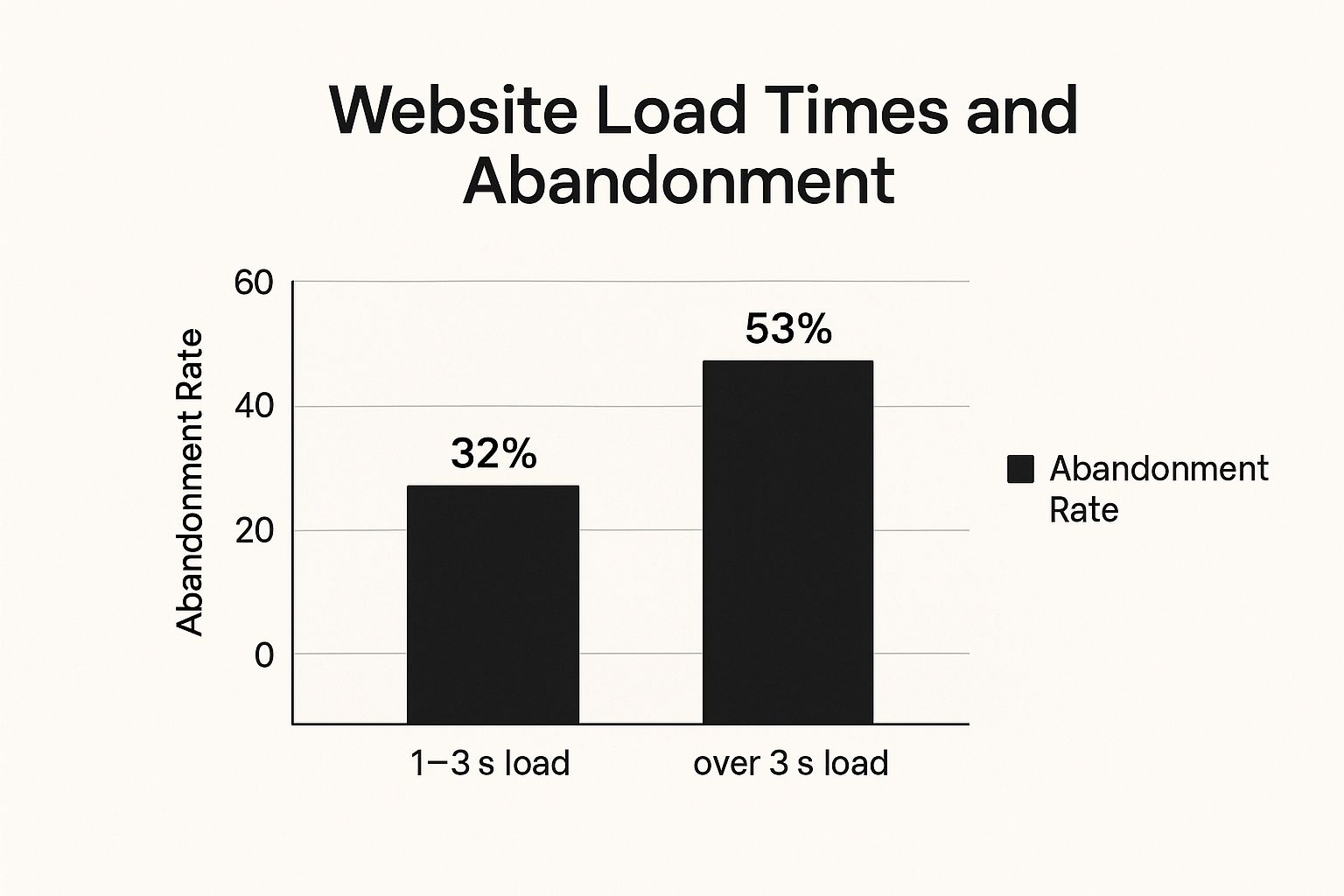
As the data shows, a site that takes more than three seconds to load loses over half of its potential visitors. A fast, snappy website feels professional, keeps users engaged, and directly boosts your bottom line. It's a non-negotiable part of a good user experience.
Actionable Tips for Fast Loading Speed
The Solo AI Website Creator automatically optimizes many performance aspects, but you can enhance speed further with these targeted actions:
- Compress Your Images: Large image files are the number one cause of slow pages. Use a free online tool to compress your images into modern formats like WebP before uploading them.
- Limit External Scripts: Every plugin or external tool (like live chat or analytics widgets) slows your site down. Be selective and only use what is absolutely essential for your business goals.
- Test Your Speed: Use Google's PageSpeed Insights to test your site's performance for free. It will give you a score and specific, actionable recommendations to improve your loading time.
- Load Visible Content First: Ensure the content at the top of your page (the "above-the-fold" area) loads almost instantly, while the rest of the page loads in the background. Learn more about website optimization and how to get started in 5 easy steps.
3. Intuitive Navigation Structure
Intuitive navigation is your website's roadmap. It should allow visitors to find what they're looking for without thinking. If users have to hunt for your services page or contact information, they will likely give up. A logical and predictable navigation menu reduces frustration, keeps people on your site longer, and guides them smoothly toward making a purchase or getting in touch.
The benefit is a better user experience that builds trust. When users can easily move through your site, they feel in control and are more likely to explore what you have to offer. This directly improves key metrics like bounce rate and time on page, which helps your SEO. Tech giants like Apple excel at this with simple menus that guide users exactly where they need to go.
Actionable Tips for Intuitive Navigation
When you use a tool like the Solo AI Website Creator, setting up your navigation menu is straightforward. Keep these usability principles in mind as you organize your pages:
- Keep Your Menu Simple: Limit your main menu to seven items or fewer. Too many choices can overwhelm visitors. Stick to the most essential pages: Home, About, Services, Blog, Contact.
- Use Obvious Labels: Avoid creative or vague names for your menu items. Use clear, common words that accurately describe the page, such as "Services" instead of "Our Solutions."
- Be Consistent: Your main navigation menu should look the same and be in the same place on every single page of your website. This predictability helps users stay oriented.
- Include a Search Bar: If your site has a lot of content, like a blog or an online store, a prominent search bar is essential. It lets users find exactly what they need instantly.
4. Clean, Readable Typography
Typography is simply the style and appearance of your text. Good typography makes your content easy to read and digest, while bad typography can make it unreadable. This is a crucial design practice because it directly affects how users engage with your message. Clear text guides attention, strengthens your brand's personality, and makes your website look professional.
The main benefit of good typography is improved readability. When text is easy to read, visitors are more likely to stay on your site, understand your message, and trust your brand. Platforms like Medium have built their success on providing a comfortable reading experience, proving that how you present your words matters just as much as the words themselves.
Actionable Tips for Clean Typography
While the Solo AI Website Creator provides a curated selection of professional fonts, you can further refine your site’s readability by applying these key principles:
- Ensure High Contrast: Your text color must stand out clearly from its background color. Use a free online contrast checker to ensure your text is easily readable for everyone, including people with visual impairments.
- Control Line Length: For the main body text, keep lines between 45 and 75 characters long. Lines that are too long or too short can cause eye strain and make reading difficult.
- Choose Legible Fonts: Stick to simple, clean fonts for your body text. Sans-serif fonts like Arial, Helvetica, or Open Sans are generally considered the easiest to read on screens. For more guidance, you can explore some of the 15 best fonts for websites.
- Create a Clear Hierarchy: Use different font sizes and weights (like bold) to distinguish between headings, subheadings, and body text. This visual structure guides the reader’s eye through your content.
5. Consistent Visual Design System
A consistent visual design system is a rulebook for your website's appearance. It ensures that your colors, fonts, buttons, and spacing look the same across every page. Instead of designing each page from scratch, this system provides a set of reusable components that create a unified and professional look, making your brand instantly recognizable and trustworthy.
This approach builds trust and improves usability. When users see a consistent design, they can navigate your site more intuitively because they know what to expect. This predictability makes them feel more comfortable and confident, which encourages them to engage with your content and convert. Big brands like Google (Material Design) use these systems to ensure a seamless experience across all their products.
Actionable Tips for a Visual Design System
The Solo AI Website Creator helps establish consistency by default, but defining your system beforehand will make customization more effective.
- Define Your Style Guide First: Before you start building, decide on 2-3 primary brand colors, one font for headings, and one for body text. Also, decide what your main buttons will look like.
- Create Reusable Sections: Think in terms of building blocks. A testimonial section, a pricing table, or a contact form should look the same no matter where it appears on your site.
- Use Consistent Spacing: Pay attention to the empty space (margins and padding) around your text and images. Using the same spacing values throughout your site creates a balanced and professional layout.
- Write Down Your Choices: Keep a simple document with your chosen colors, fonts, and button styles. This helps you maintain consistency as you add new pages or content to your site later.
6. Clear Call-to-Action (CTA) Design
A call-to-action (CTA) is a button or link that tells the user what to do next, like "Buy Now" or "Sign Up." A clear CTA is one of the most important elements on your site because it directly drives conversions. An effective CTA uses strong, action-oriented words, a color that stands out, and a prominent position on the page to make it obvious what the next step is.
The primary benefit is more conversions. By making it easy and obvious for visitors to take the next step, you remove confusion and increase the likelihood they will become a customer or lead. Famous examples like Netflix's "Get Started" and Dropbox's "Sign up for free" work because they are simple, value-driven, and impossible to miss. Learn more about how effective CTAs contribute to high-converting landing pages.
Actionable Tips for Clear CTAs
When customizing your site with the Solo AI Website Creator, you have full control over your buttons. Focus on making them both visually striking and crystal clear in their purpose:
- Use Action-Oriented Words: Start your button text with a strong verb like "Get," "Start," "Join," or "Download." This tells users exactly what will happen when they click.
- Create Visual Contrast: Your CTA button should be the most eye-catching thing on the page. Use a bold, contrasting color that draws attention but still fits your brand's color scheme.
- Place It Prominently: Put your most important CTA "above the fold" so it’s visible without scrolling. On longer pages, it’s okay to repeat the CTA at the bottom.
- One Goal Per Page: Avoid overwhelming visitors with too many different CTAs on one page. Focus on one primary action you want the user to take to avoid confusion.
7. Accessibility and Inclusive Design
Accessible design means creating a website that can be used by everyone, including people with disabilities. This involves making sure your site works with assistive technologies like screen readers, which read web pages aloud for visually impaired users. It is not just a good practice—it's essential for reaching the widest possible audience and is often a legal requirement.
The benefit is that you expand your audience and improve your SEO. Search engines favor websites that are well-structured and provide a good user experience for all. By making your site accessible, you are not only doing the right thing but also improving its technical foundation, which can boost your rankings. It ensures every potential customer can interact with your brand.
Actionable Tips for Inclusive Design
The Solo AI Website Creator builds in many accessibility features from the start, but you can enhance them by focusing on these key areas during customization:
- Add "Alt Text" to All Images: For every image you upload, write a short, descriptive "alt text." This is what screen readers will announce to visually impaired users, telling them what the image shows.
- Use Headings Correctly: Structure your page content with a logical hierarchy of headings (one H1 per page, followed by H2s, then H3s). This creates a clear outline that is easy to navigate with a screen reader.
- Check Your Color Contrast: Use a free online contrast checker to ensure your text is easily readable against its background. This is crucial for users with low vision.
- Write Descriptive Links: Instead of vague link text like "Click Here," use descriptive text that explains where the link goes, such as "View our pricing plans." This provides clear context for all users.
8. User-Centered Content Strategy
A user-centered content strategy means creating content that answers your audience's questions and solves their problems. Instead of just talking about yourself or your products, you provide valuable information that helps your target users. This approach builds trust and positions you as an expert in your field, making people more likely to do business with you.
The main benefit is attracting qualified leads and building a loyal audience. By providing genuinely helpful content, you improve engagement, increase the time visitors spend on your site, and get rewarded by search engines. Companies like HubSpot are masters of this, offering extensive free resources that attract their ideal customers by solving their problems long before they ever see a sales pitch.
Actionable Tips for User-Centered Content
When building your site with the Solo AI Website Creator, think like your customer as you add text and structure your pages. A clear content plan will make your design more effective.
- Answer Customer Questions: Brainstorm the top 10 questions your customers ask, and create a page or blog post dedicated to answering each one. This provides immediate value.
- Make Your Content Scannable: Use clear headlines, subheadings, bullet points, and short paragraphs. Most people don't read online; they scan for key information.
- Write in a Natural Tone: Use simple, clear language and avoid industry jargon. Write as if you were speaking directly to your ideal customer.
- Keep Information Up-to-Date: Regularly review your content to ensure it is still accurate and relevant. To ensure your content is also search-engine friendly, delve deeper into effective content SEO best practices.
9. Effective Use of White Space
White space (or negative space) is the empty area around elements on your page, like text, images, and buttons. It's not wasted space; it's an active design tool that gives your content room to breathe. Using white space effectively guides the user's eye, improves readability, and makes your website look clean, professional, and less cluttered.
The benefit is a more focused and elegant user experience. White space helps you draw attention to your most important elements, like a call-to-action, without needing to make them bigger or brighter. This minimalist approach, perfected by brands like Apple, makes a website feel more premium and trustworthy. A clean, uncluttered layout is easier for users to understand and navigate.
Actionable Tips for Using White Space
The Solo AI Website Creator allows for easy adjustment of margins and padding. As you build your pages, focus on creating balance and clarity with these tips:
- Group Related Items: Place related elements (like an image and its caption) close together, and increase the space between unrelated groups. This creates clear visual relationships.
- Increase Line Spacing: For paragraphs of text, slightly increasing the space between lines can dramatically improve readability and make your content feel less dense.
- Give Your CTAs Room: Surround your most important buttons with plenty of empty space. This makes them stand out naturally and encourages users to click.
- Resist Filling Every Gap: Don't feel the need to fill every pixel on the screen. A clean, uncluttered layout is always more effective than a page crammed with too much information.
10. Cross-Browser Compatibility
Cross-browser compatibility means making sure your website works and looks good on all major web browsers, like Chrome, Safari, Firefox, and Edge. Different browsers can interpret code slightly differently, which can lead to your site looking broken for some visitors. Ensuring compatibility provides a consistent, professional experience for everyone, regardless of how they access your site.
The goal isn't for your site to look identical down to the last pixel on every browser, but for it to be fully functional and usable for all visitors. A broken website on a popular browser can damage your brand's credibility and cause you to lose customers. Ensuring a reliable experience for everyone builds trust and maximizes your audience reach.
Actionable Tips for Cross-Browser Compatibility
While the Solo AI Website Creator is built on modern web standards to minimize these issues, it's always wise to test your published site. Here’s how to maintain a consistent experience:
- Test on the Big Three: After publishing your site, check it on the latest versions of Google Chrome, Apple Safari, and Microsoft Edge. These three browsers cover the vast majority of users.
- Focus on Core Functionality: Ensure your navigation menu, contact forms, and buttons work correctly on all major browsers. Minor visual differences are acceptable as long as the site is usable.
- Use Standard Features: Stick to widely supported web features and avoid experimental or browser-specific ones. This ensures the broadest possible compatibility from the start.
- Validate Your Code: For more technical users, free tools like the W3C Markup Validation Service can check your site's code for errors that might cause issues in different browsers. Clean code is more reliable.
Top 10 Website Design Best Practices Comparison
| Aspect | Mobile-First Responsive Design | Fast Loading Speed Optimization | Intuitive Navigation Structure | Clean, Readable Typography | Consistent Visual Design System | Clear Call-to-Action (CTA) Design | Accessibility and Inclusive Design | User-Centered Content Strategy | Effective Use of White Space | Cross-Browser Compatibility |
|---|---|---|---|---|---|---|---|---|---|---|
| Implementation Complexity | Moderate – requires planning and testing mobile to desktop | High – ongoing monitoring, CDN setup, and code minification | Moderate – needs research, testing, and content updates | Moderate – typography choices and testing across devices | High – upfront planning, documentation, and maintenance | Moderate – continuous A/B testing and copy/design iterations | High – requires expertise, testing, and guidelines adherence | Moderate – ongoing content creation and user research | Moderate – requires design expertise and balance | High – testing and fallbacks for multiple browsers |
| Resource Requirements | Moderate – development time and device testing | High – tools, CDN costs, performance monitoring | Moderate – user research, usability testing | Moderate – font licensing, testing, and updates | High – team coordination, style guides, component libraries | Moderate – marketing and design resources | High – specialized knowledge, testing tools | Moderate – content strategists and analytics | Moderate – design and user testing | Moderate – testing tools and compatibility libraries |
| Expected Outcomes | Optimized mobile UX, SEO benefits, future-proof design | Faster load times, improved engagement, higher conversions | Easier navigation, reduced bounce, improved SEO | Improved readability, accessibility, and engagement | Cohesive brand, faster development, better UX | Increased conversions, clear user guidance | Legal compliance, expanded access, better SEO | Better engagement, SEO rankings, higher retention | Enhanced readability, hierarchy, and user comfort | Consistent UX across browsers, wider audience reach |
| Ideal Use Cases | Sites targeting mobile users or diverse devices | Websites where speed impacts conversions and SEO | Content-rich or complex sites needing clear user paths | Content-heavy sites requiring legibility and brand consistency | Large-scale projects with multiple pages and components | Landing pages, e-commerce, goal-driven interfaces | Public websites with diverse user abilities | Content marketing, educational, and user-focused sites | Minimalist or professional designs needing clarity | Broad audience sites accessed on multiple browsers |
| Key Advantages | Single codebase, better SEO, improved mobile loading | User retention, reduced bounce, cost savings on bandwidth | Better UX, reduced confusion, improved accessibility | Better accessibility, engagement, brand trust | Brand consistency, reusable components, streamlined updates | Higher conversion, clear CTAs, measurable | Equal access, positive brand image, SEO benefits | Quality content, user satisfaction, SEO boost | Professional look, reduced cognitive load | Reliable, accessible, SEO-friendly, future-proof |
Turn Your Knowledge into Action
You now have a clear framework for building an excellent website. We've covered ten core website design best practices, from essential technicals like mobile-first design and fast loading speeds to crucial user experience elements like intuitive navigation and clean typography. Each principle works together to create a site that is easy to use, accessible, and engaging for every visitor.
The main takeaway is this: great web design isn't just about looks; it's a strategic tool for your business. It's about building trust with a consistent design, guiding users with clear navigation, and driving action with powerful CTAs. By focusing on your user's needs with helpful content and an accessible interface, you turn casual visitors into loyal customers. Mastering these concepts will transform your website from a simple online brochure into your most powerful engine for growth.
Your Actionable Roadmap to a Better Website
Instead of feeling overwhelmed, use this list as a practical checklist. Start by reviewing your current website (or your plan for a new one) against these ten principles.
- Immediate Wins: Start with speed and mobile-friendliness. Use Google's PageSpeed Insights to find quick fixes. Open your site on your phone—is it easy to navigate and read?
- Content and Clarity: Review your navigation menu and CTAs. Are the labels simple and direct? Does your homepage immediately answer a visitor's key questions?
- Design and Accessibility: Look at your visual consistency. Is your site easy to read? Does it feel cohesive and professional? Use a free online contrast checker to test your colors for accessibility.
Implementing these website design best practices ensures your digital storefront is not only beautiful but also highly effective. It creates a seamless bridge between your brand and your audience, leading to higher engagement, better search engine rankings, and more conversions. The time you invest in creating a user-focused experience will deliver a stronger, more profitable online presence.
Ready to implement these best practices without the steep learning curve? The Solo AI Website Creator is designed with these principles at its core, allowing you to generate a professional, high-performing website in minutes. Start building a site that you and your customers will love by visiting Solo AI Website Creator today.