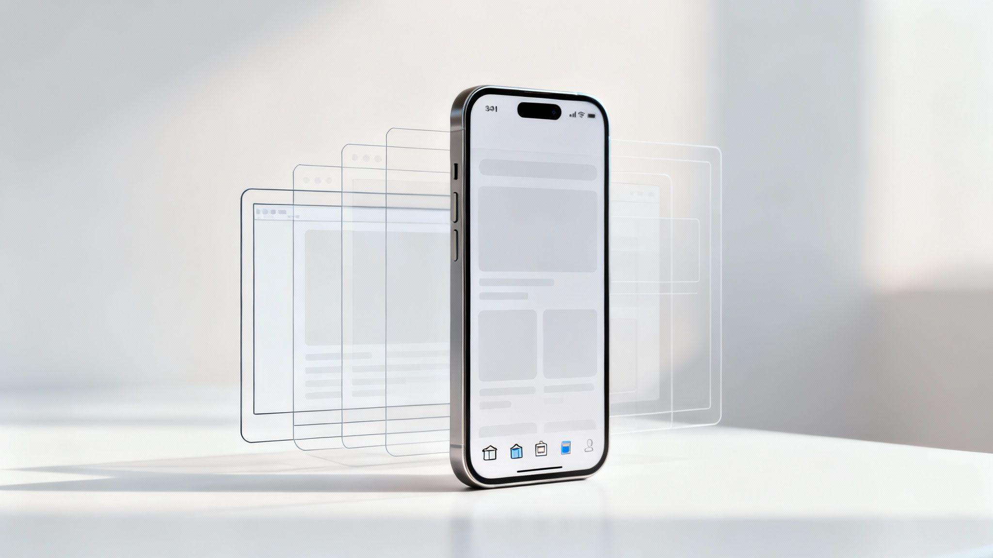
Mobile-first design means you design for the smallest screen first—smartphones—then scale up to tablets and desktops. It ensures your content is clear, navigation is touch-friendly, and pages load fast.
Actionable Tip: Sketch a simple mobile wireframe before any desktop mockup to lock in your priorities.
Key Features Of Mobile First Design
- Content Prioritization ensures users see key information first.
Actionable Tip: List your top three messages and place them at the top of your mobile layout. - Touch-Friendly Navigation uses large buttons and simple menus.
Actionable Tip: Make all tappable areas at least 48×48 pixels. - Asset Optimization compresses images and minifies code for quick loading.
Actionable Tip: Save images as WebP and run CSS/JS through a minifier. - SEO Boost improves mobile search rankings by meeting Google’s mobile requirements.
Actionable Tip: Run a Lighthouse audit and aim for 90+ on mobile.
Core Principles
| Principle | Description |
|---|---|
| Content First | Show only essential information |
| Touch Targets | Create large, easy-to-tap elements |
| Fast Assets | Compress files for faster loading |
Design from small to large to force focus and speed.
Starting with a phone layout keeps you lean. Since the first iPhone in 2007, intuitive, touch-ready interfaces became must-haves. By 2022, 73% of people aged 10+ owned a mobile phone, and mobile has driven over 50% of web traffic since 2017.
Actionable Tip: Check if over 50% of your site visitors use mobile—if so, mobile-first design is non-negotiable.
For e-commerce insights, read the CMSWire article on mobile-first e-commerce trends.
This guide will give you real-world examples and step-by-step tips—especially when you use Solo AI Website Creator to build your mobile-first site.
Understanding The Key Concepts
Mobile-first design flips the process: start with a smartphone layout and scale up. That focus simplifies features to what users need.
- Progressive Enhancement builds a solid mobile base first, then adds richer features for larger screens.
Actionable Tip: Identify core mobile features, then list desktop-only enhancements. - Content Prioritization forces you to decide which elements earn space on small screens.
Actionable Tip: Rank all page sections by importance and hide secondary content initially. - Touch-Friendly Navigation relies on generous tap targets to reduce errors.
Actionable Tip: Test your menu on a real phone and adjust tap areas until taps never miss. - Breakpoints & Fluid Grids let layouts stretch and shrink smoothly.
Actionable Tip: Set breakpoints where your content feels cramped, not just at device widths. - Asset Optimization trims images and code so pages load in under two seconds.
Actionable Tip: Automate image compression in your build process.
Core Mobile First Principles
- Content Prioritization reveals essentials first to maintain clarity.
- Touch-Friendly Navigation eliminates frustration with large, forgiving tap areas.
- Breakpoints & Fluid Grids ensure layouts flex across viewports.
- Asset Optimization slashes load times by shrinking resources.
Key Insight: Mobile-first echoes progressive enhancement from the early web days.
When you use Solo AI Website Creator, these principles are built into every template, letting you focus on messaging, not code. Learn more about user-focused design in our user experience design guide.

Historical Origin And Impact
The term “mobile-first” gained traction in 2010 when Google’s then-CEO Eric Schmidt urged a shift from desktop-first thinking. Small businesses that adopted it saw lighter pages, happier visitors, and longer sessions.
Actionable Tip: Compare your mobile and desktop bounce rates—if mobile is higher, optimize further.
Next, explore how mobile-first delivers faster load times, lower bounce rates, and higher conversions.
Benefits Of Mobile First Design
Designing for mobile first means fewer distractions and faster pages.
- Reduced Load Times: Images compressed and code minified can hit sub-two-second loads.
- Lower Bounce Rates: Up to 50% drop when users see content instantly.
- Improved SEO: Google favors mobile-first pages in search.
- Higher Conversions: Approximately 30% more form submissions on optimized pages.
These gains translate directly into ROI for both small businesses and enterprises.
Actionable Tip: Use Lighthouse scores to track load time improvements weekly.
Measuring Performance Gains
Tools like Lighthouse and real user monitoring (RUM) make tracking straightforward:
- Lighthouse Audits highlight bottlenecks and offer fixes.
- RUM captures real-device slowdowns.
- Regular Audits after each update keep your site fast.
| Metric | Before Mobile First | After Mobile First |
|---|---|---|
| Load Time | 3.5 s | 1.8 s |
| Bounce Rate | 65% | 35% |
| Conversion Rate | 8% | 12% |
Actionable Tip: Trim unused JavaScript to boost First Contentful Paint by 20% or more.
Design thumb-friendly buttons and clear form inputs to widen your audience. Solo AI Website Creator includes built-in performance checks—no coding needed.
Maximizing Conversions And SEO
A lean codebase not only speeds up pages but also simplifies maintenance and reduces security risks.
- Audit assets to identify large images and scripts.
- Replace bulky files with compressed versions using Solo AI Website Creator’s optimizer.
- Test with Lighthouse to confirm speed gains.
- Monitor SEO impact via Google Analytics.
Actionable Tip: Add a clear call-to-action at the top of your mobile layout and measure its click-through rate for one week.
By adopting mobile-first design, you secure faster load times, stronger search visibility, and higher conversions.
- Better Accessibility benefits users with screen readers and alternative inputs.
Core Principles And Responsive Patterns
Think of your layout as a rubber band—stretchy, flexible, and never rigid. Fluid layouts use percentages and relative units so every element scales naturally. Flexible images fill their containers without distortion. And breakpoints trigger at content breakpoints, not arbitrary device widths.

Key Principles
- Fluid Layouts: Use CSS Grid or Flexbox with relative units.
Actionable Tip: Start withdisplay: grid; grid-template-columns: 1frand expand at breakpoints. - Flexible Images: Apply
max-width: 100%andheight: auto.
Actionable Tip: Always set both properties to prevent overflow. - Breakpoint Strategies: Trigger layout changes based on content needs.
Actionable Tip: Test text wrapping to find where columns should collapse.
Common Responsive Patterns
- Hamburger Menus hide navigation under an icon to free screen space.
- Card Stacks align content vertically for easy thumb scrolling.
- Prioritized Content Blocks surface key actions front and center.
Key Insight: Your layout should open or close smoothly as the screen size shifts.
Choosing Breakpoints Based On Content
- Below 480px: Switch to single-column for clear text.
- Around 768px: Introduce multi-column grids.
- Beyond 1024px: Add extra margins and larger images.
Actionable Tip: Resize your browser and watch for awkward breaks—set breakpoints there.
CSS Techniques For Smooth Transitions
Pair media queries with Flexbox or Grid and add transition properties to soften shifts.
- Use
@media (min-width: 768px)for tablet styles. - Scale spacing by 1.5× at each breakpoint.
- Define typography in
remorvwfor fluid text. - Serve WebP images and enable lazy loading for offscreen assets.
Learn more in our guide on making a site mobile friendly.
Solo AI Website Creator weaves these tactics into every template—fluid grids, responsive images, and content-driven breakpoints—so you can focus on fine-tuning your content. Test on real devices, tweak until it feels right, and watch your site adapt effortlessly.
Implement Mobile-First Design With Solo AI Website Creator
Building a mobile-first site is simpler than you think. With Solo AI Website Creator, you won’t touch a line of code.
Project Setup Process
- Sign in and click “New Project.”
- Name your site and choose the Mobile-First template category.
- Notice how fluid grids and touch-ready menus are highlighted before editing.

Hands-On Editing
- Reorder menu items for clear prioritization.
- Compress hero images with the built-in optimizer to reduce load time by up to 40%.
- Enable fluid grids so columns flow naturally across screens.
- Adjust font scaling for crisp text on small devices.
Actionable Tip: Resize buttons to 48px touch targets and preview on a simulated handset.
Solo AI Website Creator shows a real-time performance meter that flags heavy assets and suggests quick fixes.
Performance Checklist
- Layout loads in under 2 seconds average.
- Touch targets are no smaller than 48×48px.
- Image compression set to at least 70% quality.
- Lazy loading enabled for offscreen media.
- Lighthouse score above 85.
Following these steps often drives a 30% boost in engagement.
Testing And Deployment
Test on real devices alongside emulators. If you spot shifts, tweak margins and padding in the inspector. When ready, publish to your custom domain or use free hosting. You can switch domains, import Google Analytics, and set up SEO tags with one click. For more details, see getting started with Solo AI Website Creator.
Your mobile-first site is live—time to engage your on-the-go audience.
Common Mistakes To Avoid
Even pros can stumble if they rush mobile-first basics. Watch out for these pitfalls:
- Loading large assets above the fold stalls First Contentful Paint.
- Undersized touch targets (<48px) force users to zoom.
- Missing viewport meta tags makes pages render at desktop scale.
- Skipping performance tests hides regressions until after launch.
Overusing JavaScript
Extra scripts block the main thread and delay interactions. Replace heavy JS with native CSS animations and lazy-load noncritical code.
Actionable Tip: Inline only essential scripts and delay the rest.
Missing Viewport Tag
Without <meta name="viewport" content="width=device-width,initial-scale=1">, your layout shrinks on mobile. Always include it in <head>.
- Optimize images to under 100KB.
- Resize touch areas to at least 48px.
- Run performance tests on real devices.
- Limit above-the-fold scripts to under 10KB.
Use Solo AI Website Creator’s audit tool to catch bottlenecks early.
Mobile First Design FAQ
Have you wondered what sets mobile-first apart from standard responsive design? Instead of shrinking desktop layouts down, you start with minimal, touch-ready screens, simpler navigation, and optimized images. This mindset ensures small-screen users get a experience before you scale up.
Testing Mobile Layouts
Use both emulators and real devices. Add network throttling in Lighthouse or BrowserStack to mimic slow connections. Manual checks on 3G/4G reveal real-world issues.
Key Performance Metrics
- First Contentful Paint: When content first appears.
- Time to Interactive: When users can tap or swipe.
- Cumulative Layout Shift: Ensures elements don’t jump around.
When To Go Mobile First
- Over 50% of your visitors use mobile.
- Fast, touch-friendly interactions matter.
- Smaller assets can boost SEO and conversions.
Start mobile-first to protect user experience and drive conversions.
Ready to begin? Kick off your mobile-first build with Solo AI Website Creator and watch your site thrive on every device.
How is mobile-first design different from standard responsive design?
Mobile-first design begins with the smallest screen and adds enhancements for larger devices later. Instead of shrinking a desktop layout down, it starts with essential content, simple navigation, and optimized assets so the core experience works well on phones first.
What are the main principles of mobile-first design?
The core principles are content prioritization, touch-friendly navigation, flexible layouts, and fast-loading assets. That means showing essential information first, using large tap targets, setting breakpoints where content becomes cramped, and compressing images and code to keep pages fast.
What touch target size should mobile-first interfaces use?
Tappable elements should be at least 48×48 pixels. Larger, forgiving touch areas reduce missed taps, prevent frustration, and make menus, buttons, and form controls easier to use on small screens.
What benefits can mobile-first design deliver?
Mobile-first design can cut load times, lower bounce rates, improve search visibility, and increase conversions. Example results include load times improving from 3.5 seconds to 1.8 seconds, bounce rate dropping from 65% to 35%, and conversion rate rising from 8% to 12%.
What mistakes should you avoid when implementing mobile-first design?
Avoid loading large assets above the fold, using touch targets smaller than 48 pixels, skipping the viewport meta tag, and neglecting performance testing. Overusing JavaScript is another common problem because extra scripts block the main thread and delay interactions.