How to Reduce Website Bounce Rate
This article was assisted with AI. We may include links to partners.
To lower your website's bounce rate, you first have to figure out why people are leaving. It usually comes down to a mismatch between what visitors expected and what they actually found on your page. This could be anything from slow load times and confusing navigation to content that doesn't solve their problem. This guide provides actionable tips to fix these core issues, helping you give visitors a reason to stick around and explore.
Understanding Why Visitors Really Leave Your Site
Before you can fix a high bounce rate, you need to understand what that number is telling you about your visitor's experience. Sometimes, a visitor leaves because they found their answer in seconds—that's a win. But more often, they leave because your site didn't deliver what it promised.
The real work is to move past the numbers and diagnose the root causes. For that, you need a clear framework to find the problem areas.
Pinpointing the Leaks
Start by looking at your website analytics to see which specific pages have the highest bounce rates. Don't worry about the site-wide average at first; focus on your most popular pages where visitors are leaving quickly. If you need a refresher on this, you can learn more by exploring our guide on how to track website visitors.
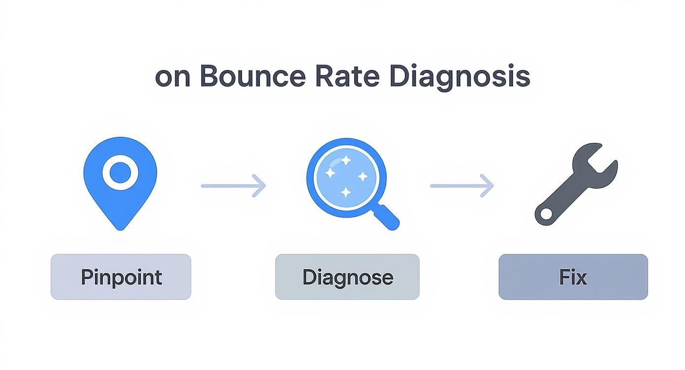
The diagnostic process is a straightforward flow: find the problem page, figure out why it's happening, and then implement a fix.

This simple model helps you focus on the pages that will have the biggest impact on your overall bounce rate.
What Is a “Normal” Bounce Rate Anyway?
Context is everything. What’s considered a "high" bounce rate for an e-commerce store might be perfectly fine for a blog. That's why it's important to look at industry benchmarks.
For instance, the food and drink industry sees an average bounce rate of around 65.52%. Meanwhile, e-commerce sites often aim for a much lower range, somewhere between 20% to 45%. Knowing where your industry stands helps you set realistic goals.
Actionable Tip: A high bounce rate isn't always bad. If a user lands on your contact page, finds your phone number, and calls you without clicking anywhere else, the visit was a success—even though it counts as a bounce. Always consider the purpose of the page.
Understanding why visitors leave is a huge piece of the puzzle. To get the full picture, it's also a good idea to learn how to measure customer satisfaction. This provides deeper insights into what your visitors are thinking.
To get started, here’s a quick reference for what might be going wrong.
Diagnosing Common Causes of High Bounce Rates
Here’s a breakdown of common reasons visitors leave and how they affect the user's experience.
| Common Cause | Impact on Visitor | How to Fix It |
|---|---|---|
| Slow Page Speed | Frustration and impatience; visitor leaves before content loads. | Performance Optimization |
| Misleading Title/Meta | The page content doesn't match what the search result promised. | Content & SEO Alignment |
| Poor Mobile Experience | The site is hard to read or use on a phone. | Responsive Design |
| Confusing Navigation | Visitor can't find what they're looking for easily. | Improve Site Structure |
| Aggressive Pop-ups | Intrusive ads or forms block the content immediately. | Improve User Experience |
| Single-Purpose Pages | A blog post or contact page that answers one specific need. | Often not a problem to fix. |
Looking at your analytics with this in mind can help you quickly categorize issues and create a plan.
Optimize Website Speed for a Better First Impression
A slow website can cause visitors to leave before they even see your content. Visitors make a quick judgment in seconds, and site speed is a huge part of that first impression. A fast, responsive site feels professional and trustworthy.
This is directly tied to your bounce rate. Data shows that when a page's load time goes from 1 second to 3 seconds, the probability of a bounce increases by 32%. At 5 seconds, the bounce rate can jump by 90%. You can see more of the numbers on website load time on hostinger.com.
For freelancers and small businesses, every second counts. The good news is you don't need to be a technical expert to make a real difference.
Tame Your Images
Large, unoptimized images are one of the most common causes of a slow website. High-resolution photos look great, but they are often large files that take a long time to load, especially on a mobile phone. The goal is to reduce the file size without making the image look blurry.
You can do this with two simple actions:
- Resizing: Before uploading an image, resize it to the actual dimensions it will appear on your site. For example, a blog post graphic rarely needs to be 4000 pixels wide. A quick edit can significantly reduce the file size.
- Compression: After resizing, use a free online compression tool. These services remove unnecessary data from the image file, making it smaller with little to no visible drop in quality.
Just these two steps can dramatically improve your page load times. If you want to go deeper, our guide on how to optimize website speed has more advanced techniques.
Audit Your Plugins and Third-Party Scripts
Every plugin, widget, or script you add to your site—whether it's for social media or analytics—can slow it down. While many are essential, it's easy to accumulate old or unnecessary extras over time.
Actionable Tip: Take a few minutes to review every plugin and script running on your site. If you aren't actively using it or it doesn't provide real value to your visitors, remove it. When it comes to performance, a simpler setup is almost always faster.
Using an all-in-one platform like the Solo AI Website Creator gives you a head start. It handles performance optimizations—like efficient code and automatic image compression—from the beginning. This means your site is built to be fast without you having to manage the technical details.
Align Your Content with What Visitors Expect
When someone clicks a link to your site, they arrive with a specific goal. They have a question and believe your page has the answer.
If your content doesn't instantly confirm they're in the right place, they will likely leave. The key to lowering your bounce rate is to close the gap between what they expect and what you provide.
Think of your page title and headline as a promise. If you promise “Quick 5-Minute Dinner Ideas” but the visitor lands on an article about the history of Italian cuisine, you've broken that promise. They feel misled, leave, and signal to Google that your page isn't a good match for that search.

This mismatch is a major—and fixable—reason for a high bounce rate. The goal is to make a visitor think, "Yes, this is exactly what I was looking for," within seconds.
Craft Headlines That Deliver on Their Promise
Your headline is the first thing most people will read. It needs to be clear, direct, and match the search term or ad that brought them there. Avoid clever or vague headlines that make people work to understand your page's topic.
A freelance photographer might be tempted to use a headline like "Capturing Life's Fleeting Moments." A potential client searching for "wedding photographer in Boston" is more likely to stay if the headline is "Boston Wedding Photographer for Unforgettable Memories." It immediately confirms they’re in the right place.
Structure Your Content for Easy Scanning
Most people don't read websites word-for-word; they scan for keywords and phrases that answer their question.
If your page is a solid wall of text, it's difficult to read. You need to make your key points stand out so visitors can find what they need quickly.
Smart formatting makes your content less intimidating and helps people absorb information.
Here’s how to make any page instantly more scannable:
- Use Descriptive Subheadings: Instead of generic subheadings like "Our Services," try "Our 3-Step Design Process." This tells the reader exactly what to expect.
- Write Short Paragraphs: Keep paragraphs to one to three sentences. The white space makes your text easier to read.
- Use Bullet Points: Lists are perfect for breaking down features, benefits, or steps. They are easy to scan and digest.
Research shows that 79% of people scan new webpages, while only 16% read word-for-word. If your content isn't designed for scanners, you're missing the majority of your audience.
Use Visuals to Tell Your Story
Visuals are powerful communication tools. A photo, infographic, or short video can often explain a concept faster and more effectively than text alone.
For a service-based freelancer, this could be a gallery of your finished work. For a consultant, it could be a diagram explaining your process.
Visuals break up long blocks of text and give the reader's eyes a place to rest. This encourages them to stay on the page longer, which is a simple and direct way to lower your bounce rate.
Create a Seamless User Experience and Navigation
Nothing makes a visitor leave faster than confusion. A clunky, frustrating website is like a maze with no exit. A great user experience (UX) is your best tool for keeping people on your site.
The goal is to make your website feel effortless and intuitive. A visitor should never have to stop and think, "Where do I click next?" Clear, predictable navigation is essential. When someone can easily find your services, blog, or contact page, they are far more likely to stay and explore.
Simplify Your Site Navigation
Think of your main navigation menu as a roadmap for your website. If that map is cluttered with too many options or uses confusing labels, visitors may get lost and give up.
To keep things simple and effective:
- Limit Your Menu Items: Stick to five to seven main categories. More than that can be overwhelming and cause visitors to leave instead of choosing.
- Use Clear Language: Avoid industry jargon. Use straightforward terms like "Services," "About Us," and "Contact."
- Make Your Search Bar Obvious: If your site has a lot of content (like a blog or portfolio), a prominent search bar is a lifesaver. Place it in the header where people expect to find it.
Crafting a logical menu is a foundational first step. For a deeper dive, check out our post on website navigation best practices.
Design for Effortless Reading
The overall design and readability of your pages play a massive role. If your text is too small or the color contrast is poor, it creates an uncomfortable experience that encourages people to leave.
Simple elements like fonts and whitespace affect usability. Ample whitespace—the "empty" area around text and images—gives your content room to breathe, making it easier to read. Pair that with a clean, simple font that is legible on both desktop and mobile screens.
Actionable Tip: A well-designed user experience builds trust. An easy-to-navigate site signals professionalism and makes visitors feel confident in your brand.
For anyone using the Solo AI Website Creator, you get a huge head start. The platform's professionally designed templates are already optimized for good UX, giving you a solid, user-tested foundation.
This focus on getting users to click through your site is critical. A site like X (formerly Twitter) sees a high bounce rate around 72%, but a platform like PayPal maintains a low 19.5% bounce rate for desktop users because visitors are constantly exploring different pages.
Features that improve the user journey, like virtual dressing rooms for an e-commerce store, can dramatically improve engagement. A seamless UX guides visitors from one valuable page to the next, making their visit both productive and enjoyable.
Master Mobile Design and Compelling CTAs
A large portion of your audience is browsing from their phones. A clunky mobile experience is one of the fastest ways to increase your bounce rate.
If someone has to pinch and zoom to read your text or tap a button, they're gone. Thinking "mobile-first" is the minimum requirement for keeping people engaged.

This means your website must be fully responsive, automatically adjusting to fit any screen. Text should be large and easy to read. Buttons need to be big enough for a thumb to tap easily. Your layout must be clean and uncluttered.
If you're building with the Solo AI Website Creator, this is all handled for you. Every template is responsive from the start, providing a solid foundation for a great experience on any device.
Craft Calls-to-Action That Demand a Click
Your site needs to tell visitors exactly what to do next. This is where a strong Call-to-Action (CTA) comes in. A CTA is a button or link that prompts an immediate response, like "Book a Consultation" or "Download My Free Guide."
Without clear CTAs, visitors are left without direction. They might read your content and like what they see, but if there's no obvious next step, they'll just leave. A potential customer becomes another bounce statistic.
To create CTAs that work, focus on these three things:
- Placement: Put your most important CTA "above the fold"—the part of the screen visitors see without scrolling.
- Design: Use a contrasting color that makes your CTA button stand out from the rest of the page.
- Copy: Instead of a generic "Submit," write action-oriented text that highlights the benefit. For example, "Get My Free Quote Now" is much more compelling.
Actionable Tip: A well-placed CTA transforms a passive visitor into an active participant. It provides a clear path forward, guiding them deeper into your site and directly reducing your bounce rate.
Find What Motivates Your Audience with Simple Tests
You don't have to guess what messaging will work best. A simple A/B test can give you data on what drives clicks. An A/B test means showing two different versions of an element (like a button) to different groups of visitors to see which one performs better.
For instance, you could test two versions of a CTA button on your homepage:
- Version A: "Learn More"
- Version B: "See Our Work"
Run the test for a few weeks and let the data tell you which phrase is more effective. Making small, data-backed tweaks like this can significantly improve your click-through rates and lower your bounce rate.
Still Have Questions? Let's Clear Things Up

Understanding website metrics can feel complicated. Here are some straightforward answers to common questions from freelancers and small business owners.
What Is Considered a Good Bounce Rate for a Website?
There’s no single "good" number because it depends on your website's purpose.
For e-commerce and lead-generation sites, a bounce rate between 20-45% is a solid target. You want people clicking around and exploring.
For a blog or a news article, a bounce rate from 65-90% can be perfectly fine. If someone lands on your post, gets the information they need, and leaves, the visit was a success, even though it counts as a bounce.
Actionable Tip: Stop chasing a universal number. Aim for under 40% if you’re selling something or gathering leads. Otherwise, compare your bounce rate to your own past performance and focus on steady improvement.
How Long Does It Take to See a Lower Bounce Rate?
This depends on what you fixed. Some changes deliver results quickly, while others take more time.
If you've made a technical fix—like improving your site speed or fixing broken links—you could see a lower bounce rate within a few days. Users notice these improvements immediately.
For strategic changes, like rewriting your content or redesigning your site's navigation, you’ll need to be more patient. It typically takes a few weeks to a month to gather enough data in Google Analytics to see a clear trend. Try to make only one major change at a time so you know exactly what is working.
Can a High Bounce Rate Hurt My SEO Rankings?
Google has said that bounce rate isn't a direct ranking factor, but it can indirectly affect your SEO.
When a visitor clicks your link from the search results, takes one look, and immediately clicks the "back" button to choose a different result, it sends a signal to Google.
This behavior suggests that the other result was a better answer for that search. If this happens often enough, Google might conclude your page isn't as relevant, and your rankings could decline over time.
Learning how to reduce your website bounce rate is a key part of a healthy SEO strategy. It shows that you’re delivering value, which is what search engines want to reward.
Ready to build a website designed from the ground up to keep visitors engaged? The Solo AI Website Creator handles the technical heavy lifting—like mobile optimization and fast load times—so you can focus on your content. Create your free website today and give your visitors a reason to stay.
