
You know you need a professional website, but the blank page is the problem. Should your homepage lead with services, reviews, a booking button, or a portfolio? Should it look polished and corporate, warm and personal, or modern and animated? Most small business owners waste time guessing, then end up rebuilding later.
A better move is to study professional website examples with a purpose. Not to copy a site pixel for pixel, but to identify patterns that fit your business, your customers, and the action you want people to take. That matters because many buyers start their journey on Google, which raises the stakes for having a professional site that looks credible and gets found in search, according to Folio Websites' website design statistics roundup.
If you're comparing inspiration sources and trying to turn ideas into a live site fast, this guide will help. These are the top 7 places designers and strategists use to find professional website examples, plus practical notes on how to borrow the right ideas and rebuild them with high-converting custom websites principles in mind, even if you're not technical.
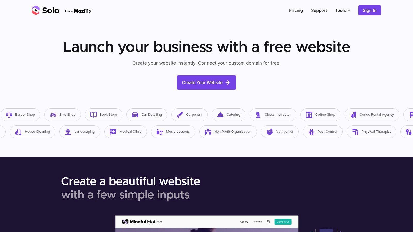
1. Solo AI Website Creator

A common small business scenario goes like this: you find a real estate site with a strong property search, a medical site that builds trust fast, and a consultant site with clean service sections. The hard part is turning those ideas into a website that fits your business without hiring a designer and a developer for every change.
Solo AI Website Creator is useful at that point. It does more than show polished layouts. It gives non-technical owners a way to rebuild the parts that help sales: section order, calls to action, proof, contact paths, and search-friendly page structure.
That makes Solo different from the gallery sites later in this guide. Galleries are strong for research. Solo is the build step.
Best use case for Solo AI Website Creator
Use Solo when you already know the kind of site you need, but you need help getting from rough inspiration to a publishable draft quickly. I'd use it for service businesses, solo operators, nonprofits, clinics, agencies, and local companies that need credibility, clear messaging, and lead capture more than custom engineering.
It is less suited to projects with unusual app-like functionality, complex ecommerce logic, or heavy custom integrations. In those cases, a developer-led build usually gives you more control.
How to find the right inspiration by industry, then recreate it in Solo
Start with your industry, not visual style. A professional website for a dentist needs different trust signals than one for a realtor or videographer.
Use this filter:
- Real estate: Look for map or listing-style organization, neighborhood credibility, agent bio placement, and lead forms above the fold.
- Medical: Study how clinics present credentials, accepted insurance, services, reviews, and appointment actions.
- Legal or consulting: Focus on authority sections, case results or outcomes, FAQs, and a clean consultation path.
- Home services: Prioritize service area coverage, phone-first calls to action, review blocks, and simple quote forms.
- Creative businesses: Pay attention to portfolio layout, before-and-after sections, and concise service packaging.
Then rebuild those patterns in Solo with a simple sequence:
- Choose the closest business category. This gives you a starting structure that matches how customers buy in your field.
- Write a plain-English hero section. State who you help, what you do, and what the visitor should do next.
- Add one proof section early. Reviews, certifications, years in business, or recognizable clients all work.
- Build your core service blocks. Keep labels client-friendly. “Kitchen Remodeling” beats “Residential Solutions.”
- Place your main conversion action high on the page. Booking, quote request, call, or consultation should appear before visitors have to hunt for it.
- Tighten your search snippet. A clear title and summary improve how your site appears in results. Solo's meta description generator for small business pages helps speed that up.
Practical ways to borrow ideas without copying whole sites
The safest approach is to borrow one pattern at a time.
Take a medical clinic as an example. You might like one site's calm headline, another site's doctor bio layout, and a third site's appointment button placement. Recreate those as separate decisions inside Solo. Do not import the whole style blindly. A feature that works for a multi-location practice can feel bloated on a solo provider site.
The same rule applies in real estate. A large brokerage homepage may need search tools and listing filters. A solo agent often gets better results from a cleaner homepage with neighborhood expertise, recent sales, testimonials, and one strong lead form.
Use inspiration to choose structure and trust cues. Use Solo to simplify them for your actual sales process.
Features worth building first
Business owners often spend too long on fonts, colors, and animation. The higher-return move is to set up the parts that help a customer act.
Start here:
- Primary call to action: booking, quote request, consultation, or call
- Trust section: reviews, credentials, affiliations, or results
- Service summary: short, scannable cards or sections
- Contact path: form, calendar link, click-to-call, or location details
- Basic SEO setup: page titles, descriptions, and service keywords
- Visual proof: photos, portfolio items, or even generate hyper-realistic video content for richer landing pages if your brand relies on visual presentation
If your homepage headline is stuck, keep the existing homepage copy generator. It is a fast way to get a workable draft, then refine the wording to sound like your business.
Solo works well for owners who need to make smart choices quickly. It shortens the distance between “I like that site” and “my site is live,” which is why it belongs first on a list about professional website examples.
2. Awwwards
Awwwards is where you go to see what top-tier designers are doing right now. The work is juried, highly curated, and often visually ambitious. If you want to understand where premium web design is headed, this is one of the strongest libraries of professional website examples available.
That said, many small businesses make the wrong move here. They browse motion-heavy agency sites, fall in love with the polish, and try to force that style onto a plumbing company, local clinic, or solo consultancy. The result usually looks expensive and confusing.
Best use case for Awwwards
Use Awwwards to study specific techniques, not to copy entire websites. Look at navigation patterns, spacing, typography pairing, image treatment, and how sites introduce authority. For freelancers and agencies, it's also useful for understanding how premium brands present case studies and differentiation.
A few practical filters to apply while browsing:
- Choose by industry first: Search for examples close to your category before looking at "cool" work.
- Steal structure, not effects: A good section order is more valuable than a dramatic animation.
- Check mobile behavior: If a concept looks great on desktop but collapses on phone, skip it.
Some of the best Awwwards sites are bad templates for small business websites. They impress peers more than they help buyers act.
Awwwards also helps sharpen your eye for metadata and search presentation. Once you've got inspiration for page hierarchy, write a tighter search snippet with Solo's meta description generator. That's a practical follow-through because looking professional in search results matters before anyone even lands on the page.
One more caution. Awwwards often rewards novelty. Novelty can be useful, but it's not the same as clarity. If your customer needs to book an appointment, request a quote, or call your office, keep that action obvious. If you're also working on richer media after your site launch, you can pair the site with pages that generate hyper-realistic video content for campaigns or landing pages without making your main website harder to use.
3. CSS Design Awards
CSS Design Awards feels a bit more structured than some inspiration galleries. The judging framework emphasizes UI, UX, and innovation separately, which makes it useful when you want to study a site beyond surface visuals.
For business owners, this matters because a professional website isn't just a "nice design." It has to guide people through a decision. In one web design case study roundup, documented improvements included a 43% reduction in cart abandonment, a 156% increase in mobile conversions, and an 89% improvement in page load speeds. Those outcomes are tied to user flow, responsiveness, and performance, not decoration alone.
What CSSDA is good at
CSSDA is strongest when you're evaluating how a site balances polish with usability. Look closely at how winning entries handle menus, visual hierarchy, transitions, and content blocks. Ask a blunt question while browsing: would a first-time visitor know what to do in five seconds?
Use it this way:
- Study one pattern at a time: Compare hero sections separately from navigation, testimonial blocks, or forms.
- Watch for friction: If a design hides key actions behind motion or too many clicks, don't copy it.
- Validate implementation basics: After adapting a visual idea, run your styling through a basic check with Solo's CSS validator so presentation doesn't break across devices.
How to translate inspiration into a usable small business site
If you're in real estate, medical, or local services, focus on sections that shorten the path to action. That means clear service labels, visible contact options, and proof close to the decision point. A stylish site that delays the next step won't help much.
CSSDA is also helpful for spotting restraint. Some award-winning sites use limited color, steady spacing, and simple animation to create a premium feel. That's usually easier to adapt into Solo AI Website Creator than highly custom visual effects.
4. Siteinspire
Siteinspire is one of the easiest galleries to browse when you already know your business type. Its filtering by style, type, subject, and platform makes it more practical than galleries that lean heavily on prestige alone.
If you're a non-technical owner, searching gets easier here. A real estate agent can look for image-led layouts and service-led pages. A medical clinic can search for cleaner, trust-heavy designs. A consultant can look for minimal pages with strong bio sections and inquiry flows.
How to browse Siteinspire without getting overwhelmed
Don't open twenty tabs. Pick a narrow brief first. For example: "I need a homepage for a therapist with calm visuals, clear services, and a strong contact path." Then review examples against that brief only.
A simple scan method works well:
- Header: Is the call to action visible right away?
- Hero: Does it explain the service in plain language?
- Middle section: Does it build trust with proof, process, or credentials?
- Footer: Can a visitor still act without scrolling back up?
Field note: The best inspiration isn't always the flashiest example. It's the one that solves the same buyer hesitation your website needs to solve.
Siteinspire is also useful for matching tone to audience. Medical, legal, and financial businesses usually need calm confidence. Creative studios and startups can push more personality. If you build in Solo AI Website Creator after browsing Siteinspire, keep that tone consistent in the copy, images, and section order. Mixing a corporate layout with casual messaging often feels off, even if each part looks good alone.
5. Best Website Gallery
Best Website Gallery is the quiet workhorse on this list. It has a long-running archive and tends to surface polished, real-world websites that feel more buildable than some award-driven showcases.
That's why it's useful for small businesses. You can find professional website examples that look finished and credible without immediately running into heavy motion, unusual navigation, or experimental storytelling. For owners who need something practical, that makes browsing faster.
Where it beats trendier galleries
Best Website Gallery is strong for comparative research. You can look at multiple agency sites, restaurant sites, portfolio sites, or service businesses and quickly notice repeated patterns. Those repeated patterns are often the safe bets.
Look for these signals:
- Consistent section flow: Hero, proof, services, about, contact.
- Readable type choices: Headlines are distinct, body text is easy to scan.
- Reasonable image use: Photos support the message instead of crowding it.
- Visible trust cues: Testimonials, recognitions, client logos, or outcomes.
The credibility angle matters. According to Brilliant Directories' write-up on stats that build website trust, established websites often strengthen trust by displaying metrics like registered users, visitors, subscribers, followers, leads matched, or revenue from leads when those figures are relevant and truthful. That's a useful lesson from gallery browsing. If you have real proof, show it where buyers will see it.
Best fit
Use this gallery if you want a professional site that feels proven rather than trendy. It's especially good for consultants, local firms, service providers, and freelancers who need a clean benchmark before rebuilding inside Solo AI Website Creator.
What it won't do as well is expose you to cutting-edge interaction trends. If you want the newest startup visual language, Godly is stronger. If you want section-by-section assembly help, Land-book is stronger.
6. Godly
Godly is highly selective and very current. If Awwwards is broad prestige, Godly often feels more like a sharp snapshot of modern product, startup, and creative web taste.
This is the place to study motion, rhythm, and modern landing page composition. It's especially useful if you're building for SaaS, tech consulting, digital products, or a personal brand that needs to look current without feeling generic.
What to borrow from Godly
Borrow the pacing. Good Godly examples tend to move quickly from promise to product to proof. They often use tighter headlines, cleaner screenshots, and stronger call-to-action hierarchy than more editorial galleries.
That said, there are trade-offs. If you're a dentist, accountant, or local home service business, some Godly patterns can feel too startup-oriented. Use them selectively.
A smart way to adapt Godly inspiration:
- Take the headline style: Short, direct, benefit-led.
- Take the spacing: Clean sections with enough breathing room.
- Take the proof layout: Reviews, logos, or results grouped tightly.
- Skip the complexity: Keep unusual scroll effects and layered motion out unless they serve comprehension.
Why selective inspiration matters
One useful lesson from stronger case study presentations is that visitors respond better when websites connect a business problem to a concrete feature and a measurable result. The Solid Digital analysis of effective case study structures highlights filterable grids, use-case organization, and clear storytelling as stronger approaches than dumping visuals on a page.
That's a good reminder when browsing Godly. If the page looks modern but doesn't explain the offer clearly, it's not a good model for your business. In Solo AI Website Creator, keep the look current but make the path obvious: what you do, who it's for, why trust you, and how to get started.
7. Land-book
Land-book is the most actionable source on this list when you aren't looking for a full site. You're looking for a hero section, a testimonial block, a pricing layout, or a better footer. That makes it ideal for assembling a website page by page.
For small businesses, this is often the missing link. Full galleries are inspiring, but they can be hard to implement because you're comparing complete websites. Land-book lets you compare components. That's much closer to how a real site gets built.
Best way to use Land-book
If you're rebuilding in Solo AI Website Creator, don't start with the whole homepage. Start with the one section your current site handles badly. Maybe your hero is vague, your testimonials are buried, or your pricing is confusing.
Then use Land-book to find two or three alternatives for that single section.
- Hero sections: Good for sharpening your value proposition.
- Testimonials blocks: Good for adding trust near decision points.
- Pricing sections: Good for clarifying packages or service tiers.
- FAQ layouts: Good for reducing objections before inquiry.
One reason this approach works is that credibility and transparency are often built from small elements placed in the right spots. The Brilliant Directories article on credibility-focused stats pages points out that metrics and proof work best when they're sprinkled across homepages, about pages, and pricing pages rather than dumped in one place. Land-book is useful because it helps you see how those micro-decisions look in practice.
Build your website like a series of decisions, not a single design event. One strong hero section can improve the whole page more than a full visual overhaul.
Who gets the most value from it
Land-book is especially strong for freelancers, agencies, coaches, consultants, and local service businesses. It helps when you know what your site should say but don't know how to structure each section so it looks professional.
Top 7 Professional Website Examples Comparison
| Resource | Implementation complexity | Resource requirements | Expected outcomes | Ideal use cases | Key advantages |
|---|---|---|---|---|---|
| Solo AI Website Creator | Very low, no-code, guided setup | Minimal time, basic content inputs; free tier available | Fully hosted, SEO-ready site with booking/contact features in minutes | Small businesses, freelancers, nonprofits needing fast launch and bookings | Rapid setup, built‑in business features, free custom domain hosting |
| Awwwards | Low to medium for browsing; medium for submission | Browse free; submissions paid; high design familiarity for entrants | High‑quality, experimental design examples and prestige badges for winners | Agencies and creatives seeking recognition or trend benchmarking | Jury‑curated prestige, deep filtering by tech/style, global visibility |
| CSS Design Awards (CSSDA) | Low to medium for browsing; medium for submission | Submission fees; polished portfolio needed for competitive entries | Recognized design awards with panel feedback and winner certificates | Agencies and studios aiming for judged recognition and publicity | Transparent judging/fees, regular showcased winners, clear categories |
| Siteinspire | Low, editorial browsing and filtering | Free to browse; curated taxonomy useful for targeted searches | Curated, industry/tagged design examples for inspiration and references | Designers seeking industry- or use‑case-specific examples | Granular filters, strong taxonomy, regular editorial picks |
| Best Website Gallery | Low, browseable curated archive | Free browsing; large historical archive | Practical, production-ready design references with historical context | Designers and SMBs wanting polished, pragmatic examples | Consistent editorial taste, extensive real‑world archive |
| Godly | Low, selective, small curated feed | Free browsing; submissions sometimes closed | Very current, motion-focused site examples and interaction patterns | SaaS and startup landing-page design, motion/interaction inspiration | Up-to-date taste, concise weekly curation, clear tagging |
| Land-book | Low to medium, section-focused browsing | Free tier with paid Pro for advanced tools (Figma copy, downloads) | Actionable page sections and components for wireframing and build | Designers assembling page structures, teams needing section examples | Massive sections library, Copy to Figma, board saving and filters |
From Inspiration to a Live Website in Minutes
A business owner usually hits the same wall at this point. You save 15 strong examples, notice a few ideas you like, then stall because none of those sites were built for your service, your buyers, or your sales process.
A better method is to work backward from the job your website needs to do.
If you run a real estate business, study listing layouts, agent bio blocks, map placement, and inquiry forms. If you run a medical practice, focus on provider credibility, insurance information, appointment flow, and location details. If you sell professional services, look for clear positioning, case studies, testimonials, and a contact path that feels low friction.
Each gallery helps with a different part of that process. Awwwards and CSS Design Awards are useful for spotting higher-end visual standards, but some ideas need simplification before they fit a small business site. Siteinspire and Best Website Gallery are better references for practical industry patterns. Godly is strong for current SaaS and startup presentation. Land-book is especially useful when you need one section, such as a hero, pricing block, FAQ, or testimonial layout, rather than a whole site direction.
Solo AI Website Creator is the build step. Use it after you have three clear choices: one layout pattern, one trust element, and one conversion element.
Here is the simplest way to turn inspiration into a finished site:
Pick one source by industry. Search for examples close to your business type, not just sites that look polished.
Choose one section to model. Start with the hero, services, testimonials, booking area, or FAQ.
Keep the structure, not the branding. Borrow the layout logic, then rewrite the copy for your offer and audience.
Build the page in Solo AI Website Creator. Add your business details, photos, reviews, service list, and call to action.
Check the mobile version. Make sure the headline, button, and contact method are easy to use on a phone.
That approach keeps the project focused. It also prevents the common mistake of stitching together too many trends that fight each other.
For example, a real estate agency might pull a clean property-search style header from Siteinspire, a testimonial pattern from Best Website Gallery, and a contact or inquiry section idea from Land-book. A medical clinic might borrow a trust-first hero, doctor profile cards, and a clear appointment section. In both cases, the goal is the same: rebuild proven parts that support the customer's next step.
Keep the standards practical. Put the main message near the top. Answer the first questions early. Add proof where hesitation tends to appear. Remove effects or extra sections that slow down contact, booking, or purchase.
A professional website earns trust fast, fits the expectations of its industry, and gives people a clear path to act. If you're ready to stop collecting examples and turn them into a live site, Solo AI Website Creator gives you a fast way to build the essentials, including mobile-friendly pages, SEO settings, forms, booking links, reviews, and analytics.