
You know you need a website. What usually stops small business owners isn't the idea. It's the pile of decisions that shows up right after it.
Should you hire a designer? Use a template? Write the copy first? Worry about SEO now or later? And if you're not technical, even simple terms can make the whole project feel bigger than it needs to be.
The good news is that small business website design doesn't have to start with code, design theory, or a long agency brief. It starts with a business question: what does this site need to do for you? Once that answer is clear, the rest gets much easier. You can simplify the pages, write sharper copy, avoid unnecessary features, and choose tools that remove technical work instead of adding more of it.
Why Your Business Needs More Than Just a Website
A lot of owners still think of a website as a digital business card. That mindset is outdated. Websites now act as a direct revenue channel for small businesses, with 98.7% of SMB owners expecting their site to contribute to revenue and 43% saying training and implementation are their top barriers according to Duda's SMB web design survey.
That combination matters. Owners know the website affects sales, but many still get stuck when the process becomes technical. I've seen that happen when a business spends too much time comparing platforms, obsessing over fonts, or trying to build every possible page before publishing anything useful.
A business site should do work. It should answer questions, build trust, collect leads, take bookings, sell products, or move someone to contact you. If it doesn't help a visitor take action, it's not pulling its weight.
Practical rule: Treat your website like a staff member with a job description. If you can't define that job in one sentence, the design will drift.
One helpful way to simplify the process is to review the critical website features for SMBs before you build. That kind of checklist keeps you focused on what supports trust and action instead of what just looks fashionable.
For non-technical owners, the smartest move is usually to separate strategy from implementation. Decide what your business needs. Let the software handle layout, responsiveness, and publishing. That's where AI-assisted tools have changed the process. Instead of learning how websites are built under the hood, you can focus on your offer, your message, and the steps a customer should take next.
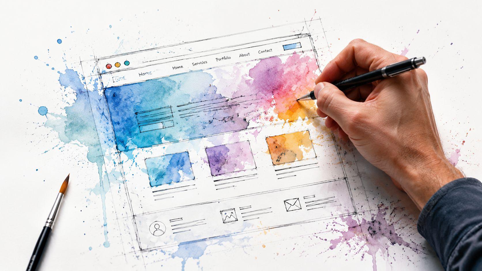
Start with a Blueprint Not a Brush
Most website problems begin before anyone touches a design tool. The site isn't unclear because the colors are wrong. It's unclear because the business never decided what the site is supposed to do.
The U.S. Small Business Administration recommends validating demand, market size, saturation, pricing, and direct competitors before making build decisions, which is why a structured website process should begin with business objectives first, not visual design, as outlined in the SBA's market research and competitive analysis guidance.

Define the one job your site must do
A small business website usually has one primary job, even if it supports several secondary ones.
For example:
- Local bakery: take cake inquiries, show menu items, and make location details easy to find
- Freelance photographer: display portfolio work, explain packages, and collect contact form submissions
- Consultant: describe services, build authority, and book discovery calls
- Home service company: show service areas, answer common questions, and generate quote requests
If you try to make one site do everything equally, visitors won't know where to go. A stronger approach is to choose one main conversion action and support it across the site.
Build a sitemap with plain language
A sitemap sounds technical, but for a small business it can be a short page list on paper or in a notes app, and that is all that is needed.
Start with the pages a customer needs:
| Business type | Core pages |
|---|---|
| Bakery | Home, Menu, Custom Orders, About, Contact |
| Photographer | Home, Portfolio, Services, About, Contact |
| Consultant | Home, Services, Case Overview, FAQ, Contact |
| Restaurant | Home, Menu, Reservations, Location, Contact |
This simple exercise prevents a common mistake. Owners often start with a theme and then cram content into whatever pages the template offers. Do it the other way around. Decide the pages first. Then fit the design to the business.
Study competitors without copying them
Look at three to five direct competitors and answer basic questions:
- What do they lead with on the homepage?
- What pages appear in their main navigation?
- Where do they ask visitors to take action?
- What feels confusing, slow, or bloated?
You're not looking for inspiration boards. You're looking for patterns and gaps.
If every competitor buries pricing, that may be your chance to be clearer. If every competitor has a cluttered homepage, a simpler one can become an advantage.
If you want a useful breakdown of what happens after planning, this guide to the web development stage helps connect your blueprint to the actual build process.
Crafting Your Content and Brand Identity
Once the blueprint is clear, gather the raw materials. Many projects stall at this stage. Owners open a website editor too early, then stop because they don't have the text, photos, or brand decisions ready.
Content-first small business website design is faster and usually better. When the words and visuals are prepared upfront, the design has something real to organize.
Keep brand identity simple
For most small businesses, brand identity doesn't need a massive strategy document. It needs consistency.
Start with three basics:
- Logo or wordmark: something clean and readable
- Color palette: a small set of colors you can use repeatedly
- Tone of voice: friendly, premium, direct, warm, formal, or practical
If your business serves families, your language might feel approachable and reassuring. If you run a legal or financial service, clarity and professionalism may matter more than personality. What matters is consistency from page to page.
A helpful starting point is this guide on how to create a brand identity, especially if you're trying to make basic brand choices without overcomplicating them.
Write copy that answers customer questions
Small business owners often write websites like brochures. They describe the business, list services, and stop there. Customers need more than that. They want to know whether you solve their problem.
A practical page-by-page approach works better:
- Homepage: say what you do, who it's for, and what action to take next
- About page: explain why you do the work and why people trust you
- Services page: describe outcomes, process, and fit
- Contact page: reduce friction and tell people what happens after they reach out
Good website copy is specific without sounding stiff. If you need help sharpening your writing, these essential SEO content writing practices are useful because they balance readability with search visibility.
Good copy doesn't try to sound impressive. It tries to sound clear enough that the right customer says, "Yes, this is for me."
Choose visuals that support trust
Photos and graphics affect credibility quickly. Visitors may not articulate why a site feels trustworthy, but they notice when images look dated, generic, or inconsistent.
Use the best option your budget allows:
- Professional photos: strongest choice for service businesses, teams, spaces, and products
- High-quality stock images: acceptable when selected carefully and used sparingly
- AI-generated visuals: useful for filler or concept imagery, but they shouldn't replace real business photos where trust matters
If you have five strong images and clear text, that's enough to launch. You don't need a huge media library to get started.
Designing an Experience That Converts Visitors
A nice-looking site can still fail if people can't use it. That's the core idea behind user experience. In plain terms, UX means your website helps visitors do what they came to do without friction.
For small businesses, the biggest UX mistakes are usually simple. Too much text on the homepage. No obvious call to action. Menus with too many choices. Contact forms that ask for unnecessary information. Pages that work poorly on phones.
GoodFirms reports that 73.1% of respondents identified poor responsiveness across devices as a major issue, and nearly three-quarters of users judge a business's credibility by its design in the findings summarized here on small business web design research.

Make the homepage do less, better
The homepage doesn't need to tell your entire story. It needs to orient the visitor and move them forward.
A strong homepage usually includes:
- Clear headline: what you do and who you help
- Primary action: book, call, request a quote, shop, or contact
- Proof: reviews, client names, examples, or certifications
- Short section flow: problem, solution, offer, proof, next step
What doesn't work is cramming every service, every testimonial, every announcement, and every paragraph onto one page. When everything competes for attention, the important action gets buried.
Turn key pages into conversion tools
Think of each page as a tool with a job.
A booking page isn't just informational. It should reduce back-and-forth. A menu page should help someone decide quickly. A services page should remove uncertainty. A contact page should feel easy, not demanding.
This is also where tools can help. Solo AI Website Creator can generate a website from simple inputs, supports custom domain hosting, booking integration, contact forms, review imports, and Google Analytics integration. For a non-technical owner, that's useful because it removes a lot of the setup work that usually slows down launch.
Use helpful features only when they reduce friction
Extra features aren't automatically helpful. Add them when they make the next step easier.
Consider tools like:
| Feature | Best use case | What to watch for |
|---|---|---|
| Booking form | Service businesses | Keep required fields minimal |
| Review section | Local businesses | Use recent, relevant reviews |
| Portfolio gallery | Creative services | Curate tightly, don't overload |
| Live chat | High-intent visitors | Someone needs to monitor it |
If you're evaluating support tools, this breakdown of web chat widgets for B2B SaaS is a useful example of how chat can help or hurt depending on how it's implemented. The same principle applies outside SaaS. A widget is only useful if it makes communication easier.
A conversion-focused site doesn't ask, "What else can we add?" It asks, "What can we remove so the next step is obvious?"
Preparing Your Website for Launch
Launch day shouldn't feel like a technical exam. For most small business websites, the pre-launch work comes down to a short checklist: search basics, speed basics, and publishing basics.

Handle the SEO basics first
Search engine optimization sounds bigger than it is at this stage. Before launch, focus on the basics that help search engines understand each page.
Check these items:
- Page title: give each page a unique, descriptive title
- Meta description: write a short summary that explains what the page offers
- Image alt text: describe images in plain language
- Headings: organize content so the main topic is obvious
- URLs: keep them readable and specific
This isn't advanced SEO. It's basic clarity. A homepage title like "Home" tells search engines almost nothing. A title that names the service and location tells them much more.
For a broader pre-publish review, this website launch checklist is a practical reference to run through before you point your domain live.
Keep the site fast and light
Page speed affects whether people stay long enough to act. A Google/SOASTA analysis found that when page load time increases from 1 to 3 seconds, bounce probability rises by 32%, according to Mailchimp's summary of small business website design tips.
That has a direct design implication. Small businesses often get better results from lean pages than from ambitious ones packed with sliders, animation, heavy video backgrounds, and oversized image files.
A simple pre-launch speed checklist:
- Resize images: don't upload giant files if they display small
- Limit decorative effects: movement should support the message, not distract from it
- Reduce unnecessary sections: shorter pages often perform better than cluttered ones
- Preview on mobile: that's where weak layouts usually show up first
This walkthrough is worth watching before you hit publish:
Make domain and hosting feel manageable
Many owners get stuck here because domain names and hosting sound infrastructure-heavy. In simple terms, your domain is your web address. Hosting is what makes the site available online.
You don't need to become a technician to launch. The practical decision is whether your platform handles hosting for you or whether you need to manage separate services. All-in-one systems reduce moving parts. That matters when your goal is to get online cleanly and stay focused on the business itself.
After You Launch Your Site Is Not Finished
A website launch isn't the end of the project. It's the point where the site starts giving you feedback.
That feedback shows up in behavior. Which pages do people visit? Where do they leave? Which form gets used? Which service page gets ignored? That's what analytics are for. They're not just charts. They're a record of what visitors are doing.

Use analytics like customer listening
Connect your site to analytics and check a small set of signals regularly:
- Top pages: which pages attract attention
- Drop-off points: where people stop engaging
- Contact or booking paths: what pages lead to action
- Device behavior: whether mobile visitors struggle more than desktop visitors
You don't need to become a data analyst. You need enough visibility to spot friction. If lots of people reach a service page but very few contact you, the issue may be the page message, the call to action, or the form itself.
Launch gives you assumptions. Visitor behavior gives you evidence.
Maintenance is part of the business model
Traditional website upkeep can become expensive. The average annual maintenance cost for a professionally designed small business website is around $1,200, according to Wix's roundup of small business website statistics.
That's one reason many owners now prefer sites they can update themselves. When changing hours, swapping photos, updating services, or posting new work requires a developer every time, small edits get postponed. Then the site starts aging in public.
A practical maintenance rhythm is simple:
- Monthly: test forms and check key links
- Quarterly: refresh service details, photos, or testimonials
- As needed: update hours, offers, pricing language, or portfolio examples
A maintained site feels alive. An ignored site undermines trust.
Your Website Is Your Hardest-Working Employee
A well-designed small business website doesn't need to be flashy. It needs to be clear, useful, and easy to manage.
That's the shift many owners need to make. Stop treating the website like a design project first. Treat it like an operating asset. Plan the goal, map the pages, prepare the content, keep the experience simple, launch with the basics in place, and improve it based on real visitor behavior.
You don't need to learn code to do that. You don't need a perfect brand system before you publish. You do need a practical process and the discipline to keep the site focused on business outcomes.
If your site helps the right customer understand what you do, trust you, and take the next step, it's doing its job. That's what effective small business website design looks like in practice.
Start with the clearest version of your business. Build the smallest site that can do real work. Improve it once it's live.
If you're ready to turn that plan into a live site without getting buried in technical setup, try Solo AI Website Creator. It gives non-technical owners a practical way to publish a professional website quickly, connect a custom domain, and manage core business features without the usual web design overhead.