
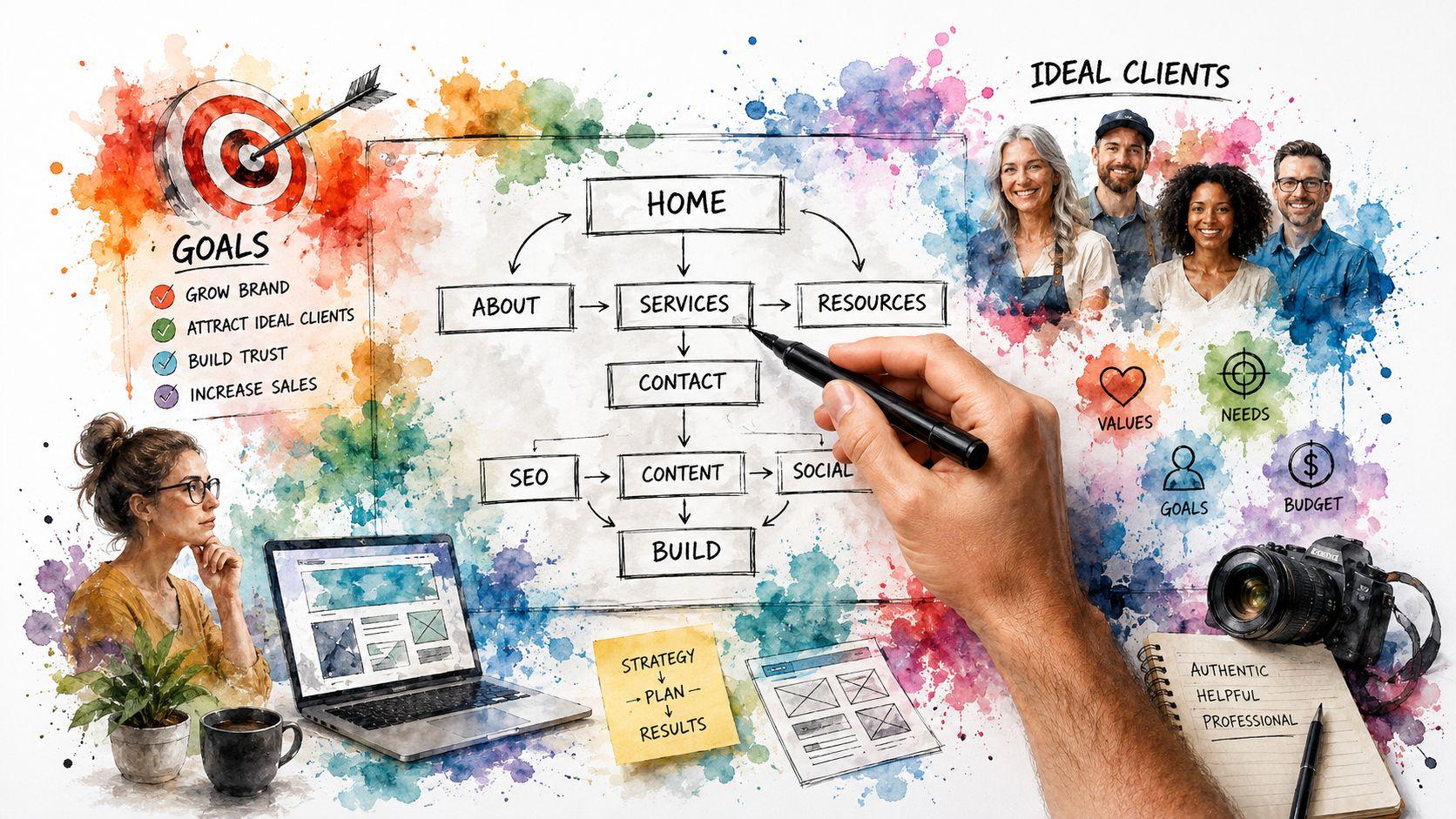
You're probably staring at a half-finished homepage, a blank template, or a collection of notes that don't yet feel like a real business website.
That's normal. Most coaches don't struggle because they lack insight or experience. They struggle because website design for coaches gets framed as a visual project when it's really a client journey machine. A strong site doesn't just look polished. It moves a visitor from curiosity to trust to action.
That shift changes everything. Instead of asking, “What pages should I have?” ask, “What does a potential client need to believe before they'll book?” Instead of chasing clever design trends, build a path that answers doubts, proves fit, and makes the next step obvious.
Before You Build Your Website's Strategic Foundation
A coaching website has one main job. It needs to help the right person quickly understand who you help, what you help them do, and what they should do next. That's why a strong homepage should tell visitors “who you are, what you do and how you can help,” while also including a call to action to book a session, as noted in this guide on high-conversion coaching websites.

If your site tries to do five jobs at once, it usually does none of them well. Coaches often want a site to explain their philosophy, share their story, host a blog, sell multiple offers, and bring in leads. All of that can exist, but one action needs to sit above the rest. For most solo coaches, that action is a consultation booking or inquiry.
Start with the client, not the template
The biggest early mistake is choosing colors and layouts before defining the audience. A template can't fix fuzzy positioning.
Write down these three things before you touch design:
- Who you serve: Be specific enough that a visitor can instantly self-identify. “Career changers in mid-career” is stronger than “people seeking clarity.”
- What problem they want solved: Focus on the result they're actively searching for, not the abstract transformation you deliver.
- What first step you want them to take: Book a discovery call, apply for coaching, or submit an inquiry. Pick one primary action.
A website becomes easier to build once those answers are clear. Navigation gets simpler. Copy gets sharper. Design choices stop feeling random.
Practical rule: If a stranger reads your homepage headline and still has to guess whether you're for them, your positioning isn't ready.
Shape an offer people can understand
Many coaches know how they work but haven't packaged that work in a way buyers can evaluate. Visitors don't need your full methodology on the homepage. They need a clear offer with a visible path.
A useful offer usually includes:
- The audience
- The outcome
- The format
- The next step
For example, “Leadership coaching for first-time managers” is clear. “Transform your potential” is not. One tells a buyer whether to stay. The other makes them work.
Treat the site as an operating system
Modern platforms now bundle the pieces coaches usually need into one workflow, including booking, forms, testimonials, SEO tools, and launch steps. That reflects a larger shift. Coaching websites aren't just online brochures anymore. They're integrated client-acquisition systems.
That also means accessibility and clarity matter from day one. If your text is hard to read, your buttons are vague, or your forms are confusing, you're losing people before trust can form. If you need a practical reference while reviewing layouts, the wcag 2.1 aa guidelines are a useful standard for readable, usable design decisions.
A simple foundation checklist
Before building pages, make sure you can answer these questions in one sentence each:
- Who is this site for
- What exact result do I help them pursue
- Why should they trust me
- What should they do next
If those answers feel vague, stop there and refine them. Good design can amplify a clear strategy. It can't rescue an unclear one.
Structuring Your Site for Maximum Client Conversion
A high-converting coaching site doesn't need a lot of pages. It needs the right pages doing the right jobs. Each page should move the visitor one step forward.
The cleanest way to think about website design for coaches is this. Every page either attracts, builds trust, or prompts action. Some pages do more than one, but each should have a dominant role.
What each page is there to do
Here's a practical structure that works for most coaching businesses.
| Page | Primary Goal | Must-Have Element |
|---|---|---|
| Home | Clarify fit fast | One clear call to action |
| About | Build personal trust | Credibility plus relatable story |
| Services | Sell the offer | Outcome-focused service descriptions |
| Testimonials | Reduce skepticism | Specific client feedback |
| Contact or Booking | Remove friction | Simple form or calendar |
| Blog or Resources | Support discovery and trust | Useful content tied to client problems |
The mistake isn't usually missing pages. It's giving pages the wrong job. A homepage that reads like an autobiography won't convert. An About page that sounds like a resume won't connect. A Services page that lists session length without explaining outcomes won't persuade.
Your homepage needs to work in seconds
Most visitors won't read top to bottom. They scan, judge, and decide whether to continue. That's even more important on mobile. Since mobile accounts for the majority of web traffic worldwide, a coaching site's mobile hero section should be single-purpose, with a one-line positioning statement, one primary CTA, and a trust element visible without scrolling, according to these mobile-first coaching website practices.
That means your top section should do three things immediately:
- State who the offer is for: Example, “Career coaching for senior professionals ready for a meaningful pivot.”
- Show the action: “Book a consultation” is stronger than “Learn more.”
- Add one proof cue: A testimonial snippet, credential, or process cue helps reduce doubt.
A crowded hero section usually signals unclear priorities, not rich storytelling.
The About page should answer one hidden question
Visitors land on the About page when they're asking, “Can I trust this person enough to talk to them?”
That page should not be a timeline of your life. It should connect your experience to the client's problem. A good structure is:
- A short opening about who you help
- A concise reason you do this work
- A credibility layer, such as training, experience, or approach
- A bridge back to the client with a CTA
Keep the focus outward. Your story matters only when it helps the reader feel understood.
Services pages should sell outcomes, not hours
Many coaches undercut themselves by describing logistics first. Buyers care less about session count than they care about what changes through the work.
A stronger services page usually includes:
- The problem this offer addresses
- Who it's for and who it isn't for
- What the process looks like
- What happens next if they're interested
This is also where objections get handled. If someone wonders whether the coaching is structured, personalized, or practical, answer that directly.
A lot of coaches benefit from reviewing user behavior after launch. If you want to understand where people click, where they stop scrolling, and which sections get ignored, Stamina's guide to heat maps is a solid primer.
Navigation should reduce choices
Visitors don't need a maze. In practice, simpler navigation converts better because it lowers cognitive load. If your menu is packed with overlapping pages, your structure is doing too much sorting for the visitor.
A lean coaching site often works well with:
- Home
- About
- Work With Me
- Results or Testimonials
- Blog
- Book a Call
If you publish regularly, your content can support discovery and authority over time. The articles on the Soloist blog are a useful example of how educational content can support a service website without overwhelming the main conversion path.
A sitemap that behaves like a journey
Think of the journey like this:
- A visitor lands on Home.
- They confirm you help someone like them.
- They check About or Testimonials to evaluate trust.
- They review Services to understand the offer.
- They reach Contact or Booking and act.
That's the machine. Every page either tightens that path or weakens it. If a page doesn't help someone move forward, rewrite it, simplify it, or remove it.
Writing Words and Choosing Images That Connect
Trust breaks when a site sounds inspirational but says almost nothing. That happens a lot in website design for coaches because the industry leans hard on warmth, transformation, and personal branding.
Warmth matters. So does personality. But vague copy creates friction, especially when a buyer is comparing several coaches in one sitting.

The stronger approach is a proof stack. The International Coaching Federation guidance summarized here points to a better mix: specific outcome framing, 2–3 outcome-based testimonials, and a concrete explanation of the process. That's why a proof stack closes the credibility gap, especially for skeptical buyers.
Vague copy loses serious prospects
Here's the kind of homepage copy that sounds polished but underperforms:
“Helping you step into alignment and create the life you deserve.”
It's emotionally pleasant. It also raises basic questions. What kind of coaching is this? Who is it for? What changes? How does it work?
A sharper version sounds more grounded:
“Career coaching for experienced professionals who feel stuck in the wrong role and want a clearer next move.”
That line does more work because it names the person, the problem, and the direction of the outcome.
Build your proof stack
A practical proof stack has four layers:
- Specific positioning: Say who you help and what problem you address.
- Outcome-based testimonials: Use testimonials that mention the client's starting point, the experience, and what changed.
- Process clarity: Explain how your coaching works in plain language.
- Visible next step: Make booking or inquiry easy.
If your testimonial says, “She's amazing,” it doesn't help much. If it says the client went from confusion to a clear plan, that supports a decision.
Explain the mechanism of change
Many coaching sites fall short. They imply transformation but don't explain the process behind it.
You don't need to publish proprietary frameworks. You do need to reduce uncertainty. Tell people whether you use weekly sessions, structured reflection, accountability, exercises, feedback, or planning tools. Buyers relax when they can picture the experience.
A simple formula works well:
- We clarify the problem
- We identify the goal
- We work through a structured process
- You leave with decisions, habits, or actions
That's far more reassuring than abstract language about breakthrough and expansion.
Choose images that support credibility
Images should make the site feel human, not decorative. For coaches, that usually means real photos first, stock imagery second.
Use visuals that do these jobs:
- Show you clearly: Visitors want to see the person behind the service.
- Match the tone of your coaching: Calm, direct, corporate, creative. Your visuals should align with your actual style.
- Avoid visual clutter: A few strong images outperform a gallery of mismatched ones.
If you're struggling with wording, study plain-language techniques that enhance your communication skills. Clear writing doesn't make your brand less personal. It makes your expertise easier to trust.
A quick test: Remove your name and photo from the page. If the copy still makes clear who the coaching is for and how it works, your message is probably strong.
The Technical Steps to a Professional Launch
The technical side feels bigger than it is. Most coaches don't need a custom development project. They need a clean setup that supports booking, inquiries, search visibility, and a professional first impression.
That's also why the economics of building a site have changed. DIY tools can start at around £5 per month, while agency-built coaching websites may start at around £2,000, as outlined in this overview of life coach website platform options. The point isn't that agencies are wrong. It's that a coach can now launch something credible without waiting for a large budget.

Pick a platform that matches your operating style
If you want control and flexibility, platforms like Wix, Squarespace, and Duda are common options. If you want a faster setup flow, Solo AI Website Creator can generate a site foundation from a few business inputs and supports essentials like booking integration, contact forms, and SEO settings. The right choice depends less on features and more on how much setup work you want to handle yourself.
Don't choose based on design novelty. Choose based on whether you can maintain the site after launch.
Set up the pages that matter first
A professional launch doesn't require a huge site. Start with the minimum set that supports trust and action:
- Homepage: Clear positioning and CTA
- About page: Human connection and credibility
- Services page: Offer details and process
- Testimonials section or page: Social proof
- Contact or booking page: Fast next step
Many launches frequently stall at this point. Coaches keep drafting extra pages before the core journey is ready. Publish the essential path first.
Connect booking and contact tools
If your site makes people leave to schedule, you're adding friction. Embed or connect a booking calendar so prospects can act while they're motivated.
Your contact form should also stay simple. Ask only for what you need to start the conversation. Long forms feel like work and often get ignored.
Useful fields usually include:
- Name
- What support they're looking for
- Any key context you need before the first call
If you also take payments online, keep that step tied to a clearly defined service, not a vague promise.
Handle basic SEO without turning it into a project
SEO means helping search engines understand your pages. Coaches often overcomplicate this.
For a practical launch, focus on:
- Clear page titles
- Short page descriptions
- Headings that match what the page is about
- Service language your clients use
If you call your service “identity recalibration mentorship” but your clients search for executive coaching or career coaching, your wording is working against discoverability.
The tools section on Soloist is useful for seeing the kind of practical website functions service businesses often need at launch.
A walkthrough can make the setup feel less abstract, especially if you're a visual learner.
Run a launch check before you publish
Before you go live, test the site like a potential client would.
- Open it on your phone: Check the headline, button, and booking path.
- Click every main link: Broken paths damage trust fast.
- Submit your own form: Make sure inquiries arrive.
- Read the copy out loud: Awkward phrasing stands out immediately.
- Ask one ideal client to review it: You want clarity feedback, not design opinions.
A professional site isn't one with fancy motion or custom code. It's one that feels clear, credible, and easy to use from the first visit.
Turning Website Visitors into Booked Clients
Launching the site isn't the finish line. It's the start of a feedback loop.
The coaches who get consistent results from their websites treat them like living systems. They watch how people move through the site, where interest drops, and where action stalls. Then they adjust.
What to look at each month
You don't need a complex dashboard. A few simple questions will tell you a lot:
- Which page gets the most attention
- Which pages keep people engaged
- Where do visitors leave without acting
- Which blog topics bring the right kind of traffic
- How many people reach the booking or contact page
Those patterns help you identify weak points in the client journey. If people reach the Services page but don't click through, the offer may be unclear. If they land on a blog post and disappear, the article may need a stronger next step.
Most conversion problems on coaching websites come from clarity gaps, not traffic gaps.
Diagnose the likely issue before changing the design
Don't start with a redesign. Start with the bottleneck.
If the homepage isn't converting, check these in order:
- Headline clarity
- Strength of the primary CTA
- Trust signals near the top
- Whether the offer feels specific
- Mobile readability
If the About page gets traffic but doesn't lead to inquiries, the problem is often one of two things. Either the page is too self-focused, or it doesn't guide the visitor back toward a service or booking step.
If blog content attracts readers but few leads, add stronger bridges. A useful article should point naturally toward an offer, a contact page, or a next piece of content.
Test small changes, not big overhauls
A lot of coaches make the mistake of changing everything at once. Then they can't tell what worked.
A better approach is to test one meaningful change at a time:
- Replace a vague headline with a direct one
- Change “Learn More” to “Book a Consultation”
- Move one testimonial higher on the page
- Shorten the top section on mobile
- Clarify the first sentence on the Services page
That's how a website becomes a client journey machine. You remove hesitation one decision point at a time.
Use content as a trust bridge
Your site can also convert people who aren't ready today. That's where educational content helps. A blog post, FAQ, or guide can answer the questions buyers ask before they book.
Guest contributions can play a role too, especially if they expand your reach or add perspective for your audience. If you're thinking about content partnerships, the guest post guidelines on Soloist show the kind of standards that keep content useful instead of promotional.
A practical monthly review routine
At the end of each month, review your site with this short checklist:
- Check the top landing pages: Are they aligned with your current offer?
- Review your CTA buttons: Are they clear and consistent?
- Read one page on mobile: Does the message still land quickly?
- Update one proof element: Add or improve a testimonial, result description, or process explanation.
- Improve one weak page: Don't aim for perfection. Aim for one better step.
A coaching website doesn't need to be complicated to work. It needs a clear path, convincing proof, and consistent upkeep. When those pieces line up, the site stops acting like a brochure and starts behaving like part of your sales process.
If you want a simpler way to get that process online, Solo AI Website Creator gives coaches a practical starting point for launching a professional site with booking, contact forms, and SEO basics already built into the setup.