
A potential customer hears about your business, searches your name on their phone, and lands on your homepage while standing in line, sitting in a parking lot, or comparing you with two local competitors. In those first few seconds, they look for three things: what you do, whether you seem trustworthy, and what to do next. If any of that is hard to find, they leave.
For a small business, a useful website does not start with flashy design. It starts with clear messaging, fast mobile reading, and a simple path to contact, book, call, or buy. That is the standard people judge against now.
This roundup is built as a blueprint, not a design gallery.
Each example shows a different type of small business site, explains what is working strategically, and points to ways to recreate the same strengths with Solo AI Website Creator. If you are still comparing tools before you build, this guide to the best AI website builders for small businesses can help you narrow the options. For visual presentation ideas beyond traditional small business sites, studying product-focused experiences like WearView AI can also sharpen your sense of layout, hierarchy, and trust cues.
The goal is simple. Help you spot patterns that work, then apply them to your own site without overcomplicating the process.
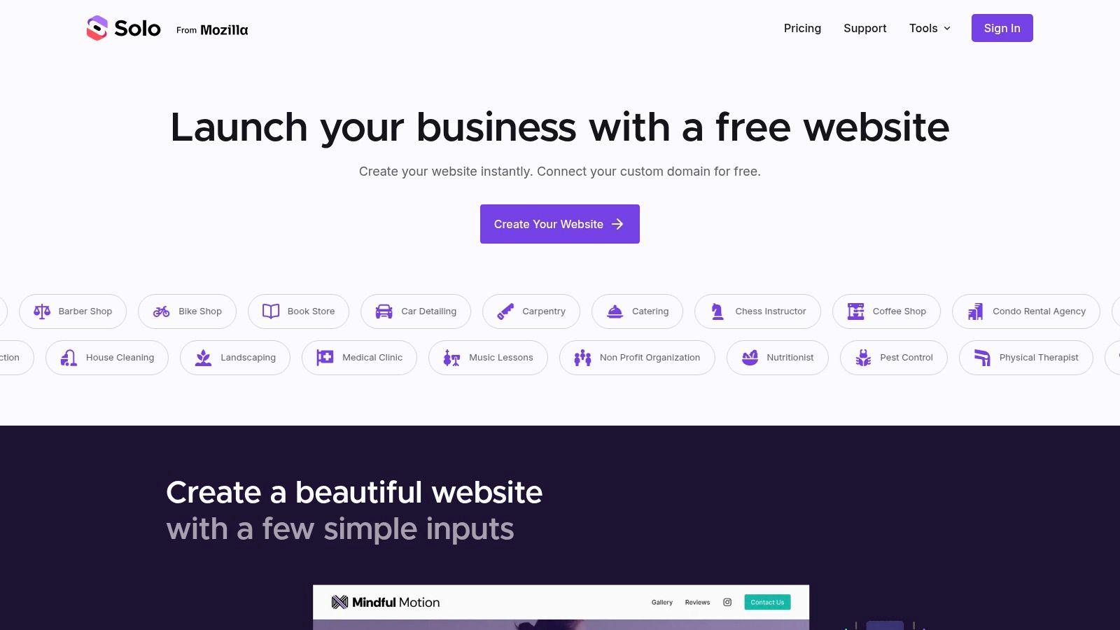
1. The All-in-One Starting Point with Solo AI Website Creator

A lot of small business websites stall before they start. The owner has a logo, a rough idea of services, maybe a few photos, and then gets stuck choosing pages, writing copy, and deciding what the homepage should ask visitors to do. Solo AI Website Creator works well as a starting point because it handles those early decisions fast and gives you a structure you can edit instead of a blank screen.
That matters more than perfect customization at the beginning.
For a local service business, the first version of a site usually needs five things: a clear headline, a short services section, proof, a contact path, and mobile-friendly pages that load cleanly. Solo AI Website Creator can assemble that core setup quickly, which is why it belongs at the top of a practical list like this. It helps owners get online, then improve from real customer questions instead of guessing in advance.
What works
The strategic advantage is speed with enough structure. You are not just getting a template. You are getting a draft of the decisions that usually slow small businesses down, including page layout, content hierarchy, and conversion points such as booking, calling, or sending a message.
There is a trade-off. AI can give you a strong first draft, but it cannot know your business better than you do. The fastest way to get value from a generated site is to tighten the headline, swap in real photos, trim vague phrases, and make sure every button leads to one clear action.
Use this checklist:
- Lead with a plain-English hero section: Say what you do, where you do it, and who it is for.
- Choose one primary action: Call, book, request a quote, or visit. Do not split attention across too many buttons.
- Add proof early: Reviews, client logos, before-and-after images, or a short credibility statement near the top of the page.
- Keep service labels literal: Visitors scan for familiar terms, not brand language.
- Fix contact friction: Put your phone, form, or booking link where people can find it without scrolling far.
That is the blueprint angle behind this example. The goal is not to admire the build. It is to spot the parts that make a small business website useful and copy those parts for your own site with less trial and error.
If you are still sorting through tools, this comparison of AI website builders for small businesses can help you choose based on setup style, editing control, and business type.
One more practical note. Your website should match how you handle leads after someone reaches out. If your business depends on calls and intake, the same thinking used in this playbook for law firm client intake applies here too: make the first contact step clear, fast, and easy to complete.
For owners who sell visual products, tools like WearView AI can help improve presentation assets. The site itself still needs to do the basic job well: explain the offer, build trust, and give visitors a next step.
2. The Polished Professional for a Local Law Firm

Someone lands on a law firm site because a problem already feels urgent. They are not browsing for inspiration. They are checking three things fast: can this firm handle my case, do I trust these attorneys, and how do I contact them right now.
That is why strong local law firm websites feel calm and ordered. Restrained color palettes, clear type, real attorney photos, and straightforward navigation do more than improve aesthetics. They lower stress and make the next step obvious.
The trade-off is real. A firm can look modern, but if the design starts acting like a tech startup site, trust drops. Flashy animation, vague taglines, and generic stock photos often weaken the message. For this category, clarity usually beats creativity.
A homepage for a local firm works best when it answers practical questions early. What kinds of cases do you take? Which cities or counties do you serve? How does a potential client start a consultation?
Put the phone number, office location, and consultation action near the top of every page. People who need legal help should not have to search for basics.
Here is the blueprint worth copying from this type of site:
- Lead with a specific headline: Name the practice area and service region in plain language.
- Show real attorney credibility: Use actual headshots, bar admissions, years in practice, and a short bio summary.
- Write service pages for clients: Replace legal jargon with common questions and direct answers.
- Make intake easy: Offer a short contact form, click-to-call button, and clear expectation for response time.
The example is useful, not just attractive. You can recreate the same structure in Solo AI Website Creator by generating core pages first, then tightening the wording so each page matches how prospects search and decide. Start with Practice Areas, About the Attorneys, Reviews, and Contact. Then make sure every page points to one contact action.
The website only does part of the job. If a firm still relies on missed calls, delayed callbacks, or a hard-to-find intake form, the site will underperform even if it looks polished. That is why the same operational logic in this playbook for law firm client intake should shape the website too. The handoff from visitor to consultation needs to be fast and clear.
3. The Creative Studio for a Graphic Design Agency
A creative agency has to prove taste before a prospect reads a single paragraph. That's why many of the strongest agency sites lead with work, not biography. The homepage acts like a curated gallery, with standout projects, concise captions, and just enough motion to show craft without slowing the page down.
This model works because agencies sell judgment. Clients want to see visual range, but they also want confidence that the team can shape a coherent brand system. A cluttered portfolio undercuts that instantly.
The right kind of visual-first
Minimal copy isn't the same as weak messaging. The best creative studio sites still answer three basic questions quickly: what do you make, who do you work with, and how do projects start?
Where these sites often fail is performance. Heavy video backgrounds, oversized image files, and animation layered on animation can make a design studio site feel impressive in a desktop review and frustrating on a phone.
One case study showed what technical cleanup can do. A Progressive Web App redesign produced a 43% reduction in cart abandonment, a 156% increase in mobile conversions, an 89% improvement in page load speeds, and $2.3M in additional first-quarter revenue. That example was e-commerce, but the lesson applies broadly. Visual sites still need speed discipline.
A creative site can be bold, but every moving part needs a job. If animation doesn't help attention, hierarchy, or clarity, remove it.
To replicate this style on your own site:
- Lead with 3 to 6 best projects: Fewer strong examples beat a crowded archive.
- Write short project summaries: Focus on the business problem and visual outcome.
- Keep motion light: Use transitions to guide attention, not entertain.
- Make contact easy: Add a simple inquiry form instead of forcing long application-style forms.
4. The Service Provider for a Local Salon

A customer is standing outside your shop, phone in hand, deciding whether to book now or try the salon down the street. Your website either helps that decision happen fast or gets in the way.
That makes salon sites different from portfolio-heavy businesses. The homepage does not need to tell a long brand story first. It needs to answer practical questions quickly: What services do you offer? Can I book right now? Where are you located? Can I trust your team with my hair, skin, or nails?
The strongest examples treat the website like a conversion tool, not a brochure. They put booking at the top of the page, show a short service menu, add real photos of the space and staff, and include enough proof to reduce hesitation. Reviews, stylist bios, pricing cues, and location details do more work here than clever copy.
Build the page around the booking decision
Booking should appear in more than one place because visitors decide at different moments. Put it in the hero, keep it in the navigation, and repeat it after your service highlights. On mobile, the path matters even more. If a client has to pinch, scroll, and hunt for appointment options, you lose the booking.
A salon homepage should prioritize:
- Fast booking access: Place the main booking button high on the page.
- Clear service categories: Group cuts, color, styling, nails, or spa services in a way that is easy to scan.
- Trust signals: Use real client reviews, team photos, and short stylist introductions.
- Local decision details: Show hours, address, phone number, parking notes, and cancellation policy.
If appointments drive most of your revenue, this guide to a website creator with booking system shows what to look for before you build.
Here is the trade-off I usually recommend. Do not cram every service variation onto the homepage. A long menu feels thorough, but it often slows people down. Feature your most-booked categories first, then let the booking flow handle add-ons, durations, and staff selection.
To recreate this style with Solo AI Website Creator, start with a homepage built around one action. Add a prominent booking button, a concise services section, short team bios, and a clean contact block with map and hours. Then review the site on your own phone. If booking takes more than a few taps, simplify it.
5. The Content-Driven Business for a Nutrition Coach
A nutrition coach doesn't usually win business with design alone. They win by sounding knowledgeable, approachable, and specific. That's why content-driven sites work so well for coaching, consulting, therapy, and other advice-based services.
This type of website blends two roles. It acts as a sales page for your services and a publishing platform for useful articles. The homepage earns trust quickly, and the blog helps new people discover you through search over time.
Why this format is underrated
Many galleries of small business website examples lean toward highly visual industries. That's useful if you run a cafe, product brand, or design studio. It's less helpful if your business depends on guidance, trust, and explanation.
That gap matters. A research summary on small business examples notes that service-based businesses are often underrepresented, while visually driven businesses dominate those collections in this analysis of the gap in service-based website inspiration. Coaches, therapists, and consultants need a different model: clearer copy, stronger FAQs, and educational content that lowers uncertainty.
Educational content works when it answers the exact questions prospects already ask before they buy.
For a nutrition coach, useful page structure looks like this:
- Homepage promise: Explain who you help and the type of outcome you support.
- Service options: One-on-one coaching, group plans, or meal guidance.
- Authority content: Publish practical articles in plain language.
- Trust section: Include testimonials, credentials, and your coaching philosophy.
Keep blog topics narrow and useful. "Healthy eating tips" is too broad. "Simple breakfasts for busy parents" or "What to eat before an early workout" is closer to what people search and share.
6. The Single-Purpose Site for a Freelance Copywriter

A one-page site can work very well for a freelancer with one clear offer. A copywriter, photographer, consultant, or virtual assistant often doesn't need a large website. They need a sharp homepage that moves in a straight line from introduction to proof to contact.
This format is especially effective when your service is simple to explain and your sales process starts with a conversation. It cuts distractions and gives every section a role.
When one page is enough
The structure is usually simple. Start with a strong headline, explain what you write, show a few samples or outcomes, add testimonials, and finish with a contact form. If the page is well organized, visitors don't miss extra navigation.
This approach also helps keep performance tight. One reason lightweight sites work is that they avoid unnecessary complexity. In one documented example, a performance-focused WordPress setup on Lapptops.net reached page speeds under 1.5 seconds, PageSpeed scores above 95 on mobile and 98 on desktop, while bounce dropped 41% and conversions increased 29%. The platform details aren't the point here. The point is that simpler architecture often supports better user behavior.
A strong one-page freelancer site should include:
- A direct headline: Say what you do and for whom.
- A narrow offer: Don't list every possible service if one is your main seller.
- A proof section: Samples, testimonials, or notable client types.
- A low-friction contact form: Ask only for the basics.
If you find yourself adding five different audiences, eight services, and long backstory sections, that's usually a sign you need either a tighter positioning statement or a multi-page site.
7. The Local Restaurant for a Neighborhood Cafe

A customer is standing on the sidewalk, phone in hand, deciding between two cafes. They are not studying your brand story. They want the menu, hours, address, and a clear next step. If those details are hard to find, they move on.
That is why good restaurant websites work more like service tools than digital brochures. The strongest ones make the decision easy. They show what you serve, what the space feels like, and how to visit or order, all without forcing people to hunt through the page.
The pattern is easy to spot in cafe sites that convert well. Utility comes first. Atmosphere supports it. A sharp food photo helps, but not if the menu is buried in a PDF or the hours are missing from mobile view.
For a neighborhood cafe, the homepage should handle four jobs fast:
- State the offer clearly: Say what kind of cafe you are and what makes you worth the stop.
- Show the key details early: Address, hours, phone, and ordering or reservation link should appear near the top.
- Make the menu easy to read on a phone: Use a web page menu or clean section blocks instead of a tiny downloadable file.
- Use a small set of purposeful photos: Feature signature drinks, popular items, and a real view of the space.
A lot of owners get this wrong by copying high-end restaurant design. Full-screen video, oversized image carousels, and abstract welcome copy can look polished, but they add friction for people who are trying to make a quick decision.
This is also a good fit for the article's bigger pattern: inspiration with a blueprint. If you want to recreate this kind of site with Solo AI Website Creator, start with your business category, then add your menu sections, hours, location, and ordering link first. Photos come after the basics are in place. That sequence usually produces a better result than starting with visual style.
If you want a practical walkthrough, this guide on how to create a restaurant website covers the setup steps in more detail.
If a hungry visitor cannot find your menu in seconds, the design is not doing its job.
Comparison of 7 Small Business Websites
| Example | Implementation complexity | Resource requirements | Expected outcomes | Ideal use cases | Key advantages |
|---|---|---|---|---|---|
| The All-in-One Starting Point: Solo AI Website Creator | Very low, no-code, minutes to launch | Basic business info, images, brief copy; optional calendar & payment setup | Fast live site, basic SEO, immediate lead capture and bookings | Freelancers, small businesses, service providers needing quick presence | Ultra-fast setup; free hosting; built-in bookings, forms, payments |
| The Polished Professional: A Local Law Firm | Low–medium, template customization and professional content | Professional headshots, detailed service copy, testimonials, contact form fields | Credibility, qualified consultation requests, trust signals | Local law firms, accountants, consultants | Conservative design builds trust; pre-qualifying contact form; strong CTA |
| The Creative Studio: A Graphic Design Agency | Medium, custom visuals and animations required | High‑quality project images, case studies, motion assets, portfolio CMS | Portfolio-driven inquiries, brand differentiation, showcase of skill | Design agencies, studios, visual creatives | Visual-first impact; animation and portfolio emphasis; standout aesthetics |
| The Service Provider: A Local Salon | Low–medium, booking integration focused | High-quality photos, pricing list, booking calendar integration | Increased bookings and conversions, clear service selection | Salons, spas, wellness services | Booking-first layout; mobile-optimized widget; clear pricing menus |
| The Content-Driven Business: A Nutrition Coach | Medium, ongoing content and SEO work | Regular blog posts, photography, lead magnets, email capture system | Organic traffic, authority building, lead generation via content | Coaches, consultants, knowledge-based businesses | Content-led SEO; sustained audience growth; effective lead magnets |
| The Single-Purpose Site: A Freelance Copywriter | Low, one-page, focused build | Concise portfolio samples, bio, testimonials, contact form | High conversion for a single offer; streamlined contact leads | Freelancers, micro-businesses, single-offer professionals | Lean, conversion-focused design; simple mobile UX; minimal friction |
| The Local Restaurant: A Neighborhood Cafe | Low–medium, menu and reservation emphasis | Professional food photography, HTML menu text, hours, reservation system | Clear menu access, improved reservations and local discoverability | Restaurants, cafes, food service businesses | Prominent menu/location info; tappable contact; appetizing visuals |
From Inspiration to Action in Minutes
The best small business website examples all follow the same underlying rule. They make the next step obvious. Whether that's booking a haircut, requesting a legal consultation, reading an article, or checking a cafe menu, the page helps visitors act without confusion.
That's also why small business websites don't need to be complicated to work. They need the right structure for the business model. A law firm needs trust and contact visibility. A salon needs frictionless booking. A freelancer needs a focused pitch. A nutrition coach needs useful content and proof of expertise.
There are also a few technical basics you can't ignore. Mobile experience matters because people browse on phones constantly. Clarity matters because visitors leave quickly when information is buried. Strong calls to action matter because even interested people won't always search for the next step on their own.
Several patterns came up repeatedly across these examples:
- Clear purpose beats clever design: Visitors should know what you do right away.
- Trust signals need to be visible: Reviews, headshots, credentials, and real photos help.
- Navigation should stay simple: Most small businesses need fewer pages than they think.
- Mobile usability isn't optional: Buttons, menus, forms, and booking tools have to work cleanly on a phone.
If you're stuck, don't start by chasing a perfect custom design. Start by choosing the model that fits your business best. Then borrow its structure. That's usually enough to move from an outdated site, or no site at all, to something that supports real growth.
Solo AI Website Creator is one practical option if you want to turn these patterns into a live site quickly. It gives small businesses a way to launch with core elements like contact forms, bookings, review imports, and SEO-oriented structure without needing to build every section manually.
A website won't solve every business problem. But it can remove a lot of preventable friction. For most owners, that's the difference between a site that just exists and one that brings in leads.
If you're ready to apply these small business website examples to your own business, try Solo AI Website Creator. It's a practical way to launch a professional site with bookings, contact forms, review imports, and SEO-friendly structure without needing technical setup.